Confidential client deliverable · Enter the passcode you were given
Imagine Wireless · Powered by OoklaConfidential
ATL · Rev 1 Baseline
Venue Network Intelligence Report · Rev 1 · First issue
Network baseline for Hartsfield-Jackson Atlanta across seven concourses and two terminals
Over the nine passenger-building footprints, the three carriers are close. Three buildings are
ties, and each carrier leads at least one. At the gate areas, only AT&T's median 5G signal is healthy, on
the smallest 5G footprint of the three (5G on 40% of its tiles). Each carrier's single lowest building is
Concourse F or the International Terminal.
3 of 9
Passenger buildings are ties. AT&T leads Concourses C, D, E, and F. T-Mobile leads Concourse A. Verizon leads the International Terminal. Leaders are named from building readings only.
2
Buildings that hold each carrier's single lowest reading: the International Terminal for AT&T (49%) and T-Mobile (27%), and Concourse F for Verizon (36% of tiles healthy). Concourse F: AT&T 55%, T-Mobile 38%. International Terminal: Verizon 61%.
133 of 201
Gate points with healthy AT&T 5G. AT&T is the only carrier above the line there, though it reports 5G on only 40% of its tiles. T-Mobile has 31 and Verizon 12. The two are tied at the median only: Verizon is the weakest by more than 1 dB at 88 gate points, T-Mobile at 10. 59 gate points are weak for all three.
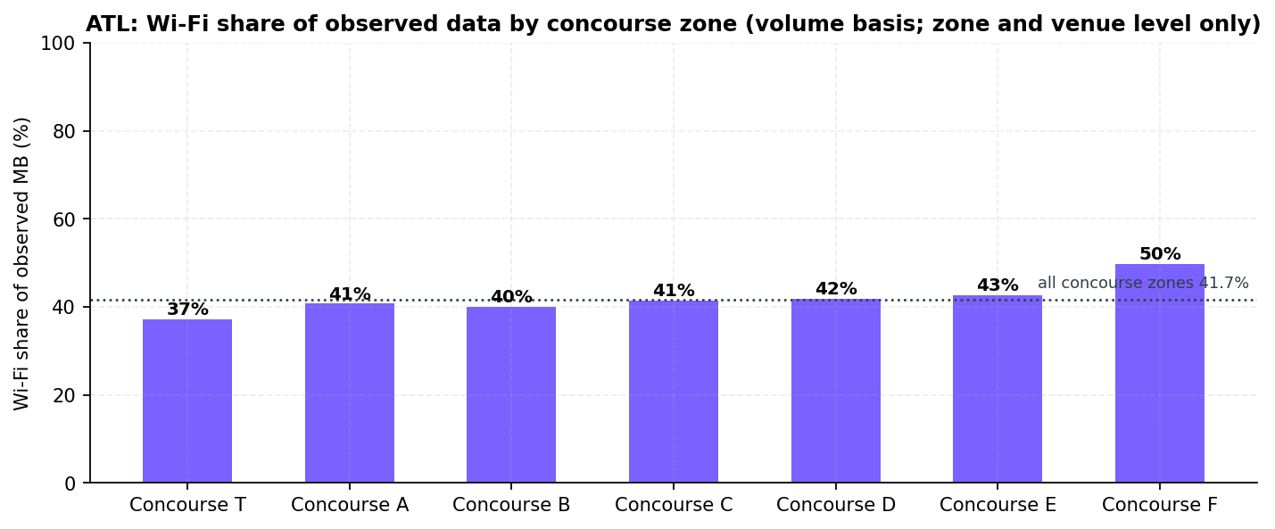
41.7%
Wi-Fi share of observed data on tiles in a concourse zone (n=26,630). 42.5% over the whole study area (n=44,155). Not attributable to any one Wi-Fi network.
Prepared by the Imagine Wireless Network Intelligence Platform · Powered by Ookla
201 gate points · 284 venue points · 44,634 unique tiles (85,763 carrier-tile observations) · 371 estimated site centroids · 12 months
Data window 2025-09-01 to 2026-08-31 · Issued 2026-09-21 (rev 1) · Freshness 21 days at issue
Prepared for City of Atlanta Department of Aviation stakeholder review
Confidential
Summary
Executive summary
Buildings first · gate areas second · baseline purpose
Over the passenger-building footprints, the three carriers are close. Of the 9 buildings, 3 are ties.
AT&T leads 4, T-Mobile leads Concourse A, and Verizon leads the International Terminal.
This report names a leader only from readings over the buildings. The data is a year of signal
readings from Android phones, grouped into tiles: patches of ground about 9 m by 11 m. A tile is
healthy when its 5G signal is at or above −95 dBm. The following table shows, for each building, the share
of healthy tiles and the median 5G reading.
Building (OSM footprint)
AT&T
T-Mobile
Verizon
Verdict
Domestic Terminal
54% · −95.0n=354
56% · −95.0n=440
55% · −94.0n=378
Three-way tie
Concourse T
70% · −92.0n=203
70% · −93.0n=256
71% · −91.0n=217
Two-way tie (AT&T, Verizon)
Concourse A
81% · −91.0n=177
87% · −89.0n=222
71% · −91.0n=211
T-Mobile leads
Concourse B
72% · −91.0n=181
74% · −92.0n=228
71% · −91.5n=208
Three-way tie
Concourse C
89% · −87.0n=166
80% · −92.0n=211
65% · −91.5n=196
AT&T leads
Concourse D
87% · −88.0n=119
60% · −93.0n=150
77% · −90.5n=142
AT&T leads
Concourse E
69% · −92.0n=339
50% · −95.0n=464
53% · −95.0n=379
AT&T leads
Concourse F
55% · −94.0n=157
38% · −97.0n=217
36% · −99.0n=166
AT&T leads
International Terminal
49% · −96.0n=49
27% · −97.0n=60
61% · −93.0n=59
Verizon leads
Each cell: share of tiles with healthy 5G (at or above −95 dBm) · median 5G RSRP in dBm · n = tiles over the footprint. Leader rule (section 4.7): a carrier leads a building only when it is alone at the top on both measures. It must top the healthy share by more than 1 point and the median by more than 1 dB. Otherwise every carrier within those margins of the top on either measure is tied. The rule runs on the unrounded values.
The international side is the weakest place measured. Each carrier's single lowest
building is one of two: the International Terminal for AT&T (49%) and T-Mobile (27%), and Concourse F for
Verizon (36%). Every carrier is healthy on more than half the tiles over 7 of the
9 buildings.
At the gate areas, only AT&T clears the healthy 5G line
AT&T is healthy at 133 of 201 gate points, on the smallest 5G footprint of the three (5G on 40% of its
tiles). T-Mobile (31) and Verizon (12) sit below the line. The two are tied at the median only: Verizon is
the weakest carrier by more than 1 dB at 88 gate points, T-Mobile at 10. 59 gate points are weak for all
three carriers.
A gate area is the ground within 80 m of a gate. At the median gate, only 22.4% of that ground lies over a
building footprint. The rest is apron, the paved area where aircraft park. This report calls these readings
apron-weighted: a gate-area number describes mostly the apron, not the seating area.
The airport-owned neutral-host DAS was replaced inside the window
The airport owns the distributed antenna system (DAS), an in-building system built to be shared by several
carriers, called a neutral host. A fact tagged held comes from a source document
pinned in this build and checksummed in the verification bundle.
The Atlanta City Council approved a replacement DAS on May 19, 2025. T-Mobile and AT&T signed, with a
January 2026 target date held.
Verizon's participation in the new system, the integrator, and the per-building cutover dates are not held. This report has no
source document for them.
What this issue can and cannot evaluate
This issue is a baseline. Its readings mix the old and new systems, so it cannot evaluate the new system on
its own. No capital recommendation follows from this data alone (section 13).
Three asks
The in-building record, per building and per carrier (Recommendation 1).
A like-for-like re-measurement per building, starting with Concourse F and the International Terminal
(Recommendations 2 and 3).
A walk test inside two piers, to measure the building-versus-apron gap this report can only infer
(Recommendation 4).
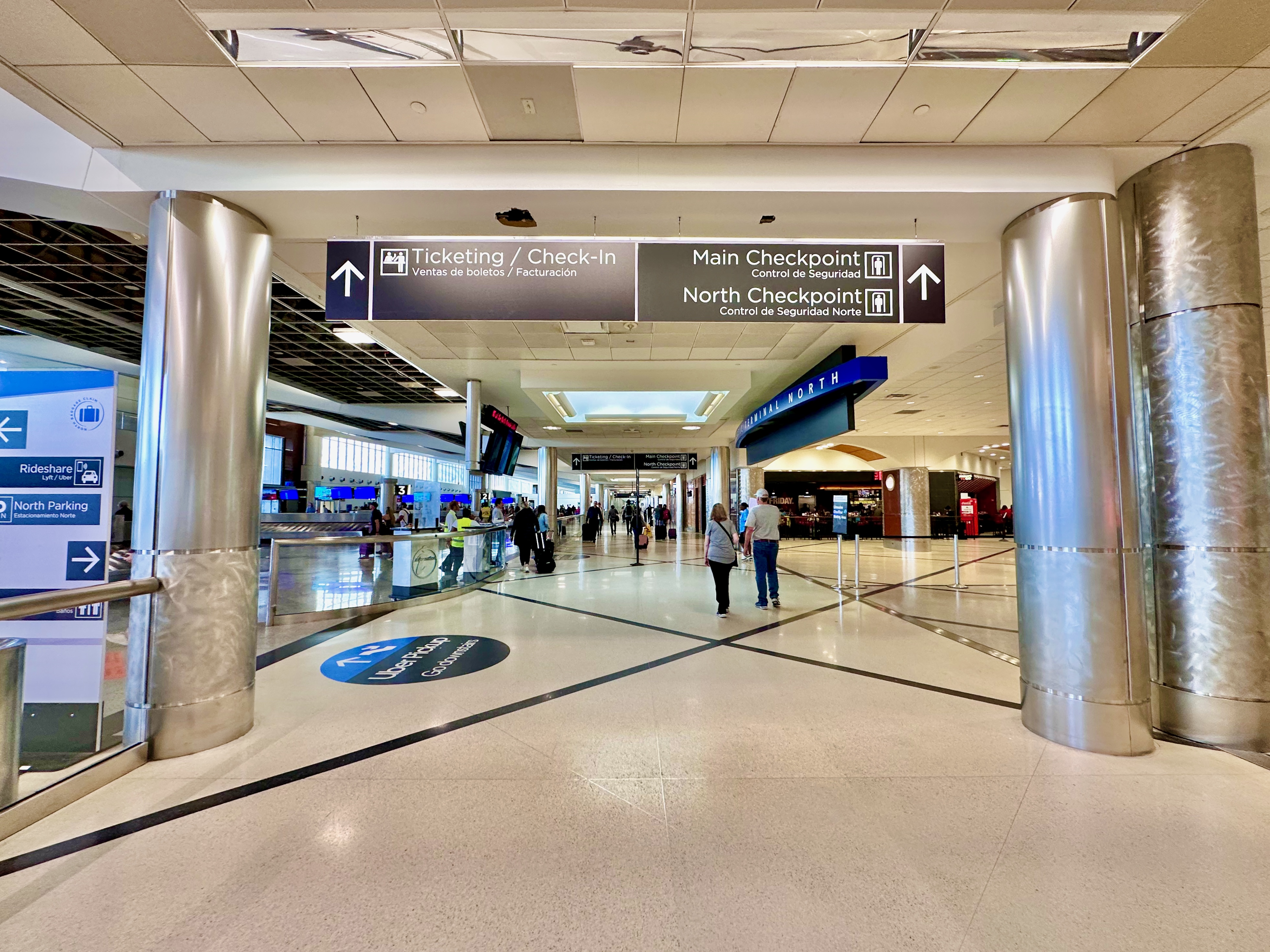
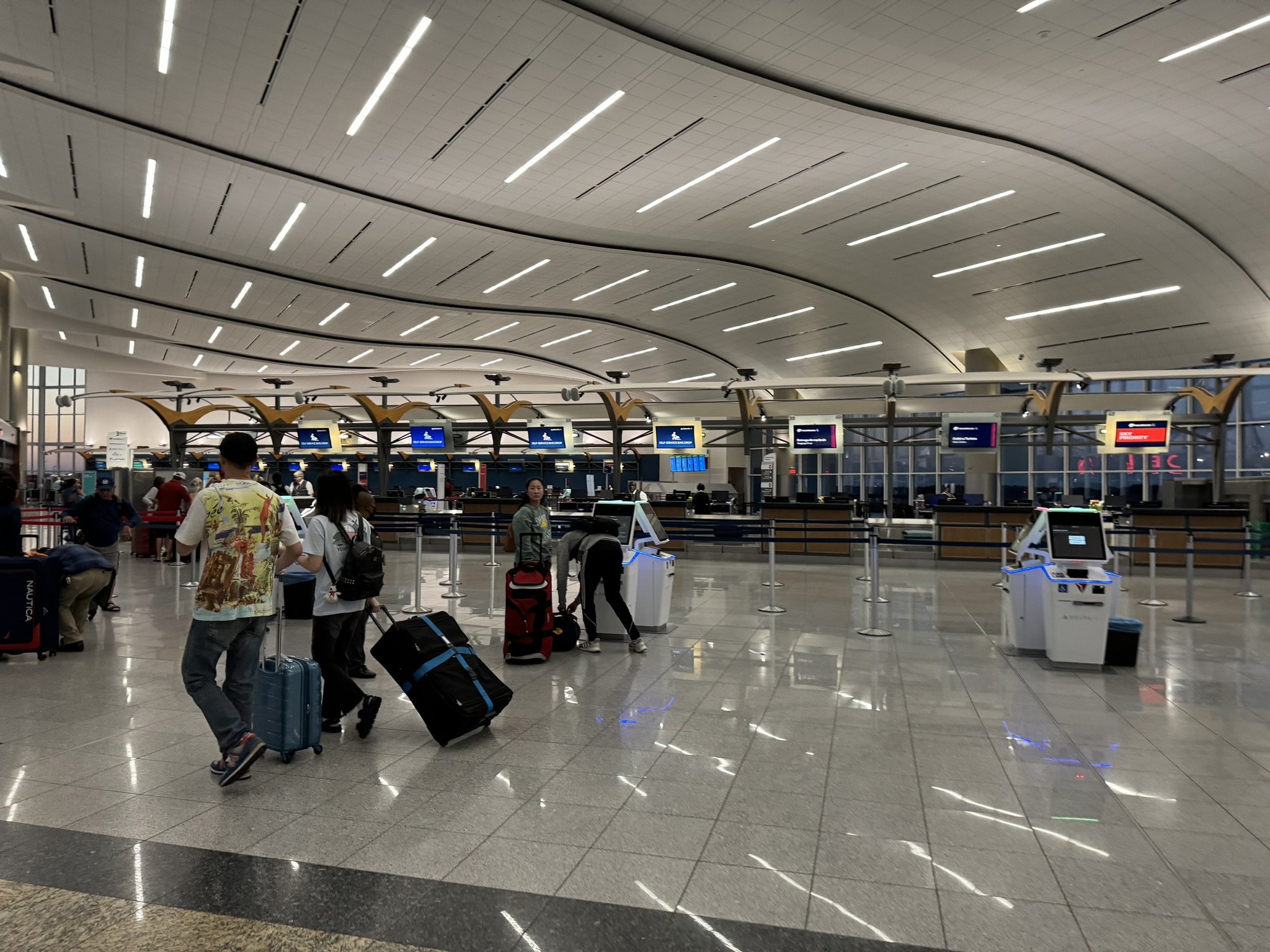
Photo · Domestic Terminal ticketing and check-in hall, May 2023Wikimedia Commons
Domestic Terminal ticketing and check-in hall, with the Main and North Checkpoint signage, May 2023. Photo: Harrison Keely, CC BY 4.0, via Wikimedia Commons.
Section 1
Executive readout
Buildings first · then gate areas · then context
Each carrier's building readings come first, and its gate-area readings second. Buildings
decide the leader. Gate areas are reported as counts and shares, never as a lead.
What a gate-area number is at ATL
Each gate figure aggregates the tiles within 80 m of a gate point. At ATL that circle reaches the apron on both
sides of each pier.
The following table gives, per concourse, the median share of the gate area that lies over a building
footprint. The highest at any gate is 68%. A gate-area figure is mostly an outdoor apron reading.
Concourse
T
A
B
C
D
E
F
Share of the gate area over a building footprint (median)
21.8%
22.8%
23.2%
23.9%
15.2%
22.6%
34.2%
Over the buildings: the leader basis
The following table lists the building verdicts and their margins (section 4.7). Every ranked cell
clears the 30-tile floor.
Building
Verdict
Top share margin
Top median margin
Domestic Terminal
Three-way tie
0 points
1.0 dB
Concourse T
Two-way tie (AT&T, Verizon)
1 point
1.0 dB
Concourse A
T-Mobile leads
6 points
2.0 dB
Concourse B
Three-way tie
2 points
0.5 dB
Concourse C
AT&T leads
8 points
4.5 dB
Concourse D
AT&T leads
11 points
2.5 dB
Concourse E
AT&T leads
17 points
3.0 dB
Concourse F
AT&T leads
17 points
3.0 dB
International Terminal
Verizon leads
12 points
3.0 dB
Healthy shares and medians per building are in the Executive summary table. Leader rule (section 4.7): a carrier leads a building only when it is alone at the top on both measures. It must top the healthy share by more than 1 point and the median by more than 1 dB. Otherwise every carrier within those margins of the top on either measure is tied. The rule runs on the unrounded values. Concourse B is a three-way tie because the top share and the top median belong to different carriers.
Carrier readings side by side
Reading
AT&T
T-Mobile
Verizon
Over the building footprints
Buildings led
C, D, E, F
Concourse A
International Terminal
Highest building (healthy)
Concourse C 89%
Concourse A 87%
Concourse D 77%
Lowest building (healthy)
International Terminal 49%
International Terminal 27%
Concourse F 36%
At the gate areas (n=201 gate points)
5G median
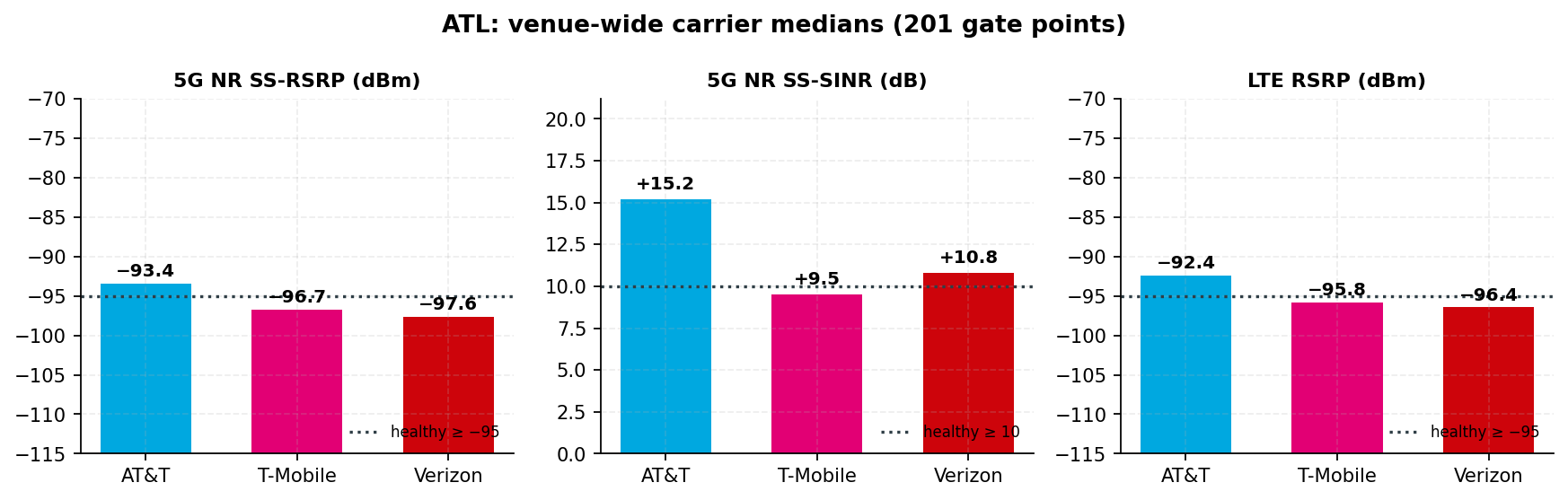
−93.4 dBm
−96.7 dBm
−97.6 dBm
Healthy 5G gate points
133 (66.2%)
31 (15.4%)
12 (6.0%)
Within 1 dB of the line
60
72
34
At risk · critical
68 · 0
170 · 0
189 · 0
Strongest 5G by more than 1 dB
138
11
0
Weakest 5G by more than 1 dB
0
10
88
5G SINR median · gate points healthy on SINR
+15.2 dB · 197 of 201
+9.5 dB · 76 of 201
+10.8 dB · 132 of 201
LTE median · gate points healthy on LTE
−92.4 dBm · 182 of 201
−95.8 dBm · 68 of 201
−96.4 dBm · 61 of 201
Strongest LTE reading
174
4
0
5G footprint (share of tiles)
40%
84%
70%
Strongest and weakest counts: 52 gate points tie at the top and 103 tie at the bottom. The 5G footprint mixes deployment with the panel's handset mix, so it is not compared across carriers (section 16).
AT&T
AT&T leads over 4 of 9 buildings. Its lowest building is the International Terminal, at 49% of tiles
healthy.
At the gate areas it is the only carrier above the healthy line. It is 3.3 dB ahead of T-Mobile and
4.2 dB ahead of Verizon, both above the 1 dB noise floor. It reports 5G on only 40% of its tiles, and 17% of its
tiles are 5G present and healthy, against T-Mobile 34% and Verizon 27% (section 3.0). Its LTE layer is the
strongest of the three.
T-Mobile
T-Mobile leads over Concourse A and ties over the Domestic Terminal and Concourse B. Its lowest building
is the International Terminal, at 27%.
At the gate areas it is 1.7 dB below the healthy line. Its median is 0.9 dB from Verizon's, inside
the noise floor, so the two are tied at the median. Per gate point, Verizon is the weakest by more than 1 dB at 88
and T-Mobile at 10. 8 of its 11 strongest gate points are in Concourse A. Its SINR median is the lowest of the
three. Its LTE median (−95.8 dBm) is below the line and 0.6 dB from Verizon's, a tie.
Verizon
Verizon leads over the International Terminal and ties over the Domestic Terminal, Concourse T and
Concourse B. Its lowest building is Concourse F, at 36%.
At the gate areas it is 2.6 dB below the line and healthy at the fewest points. Its LTE median
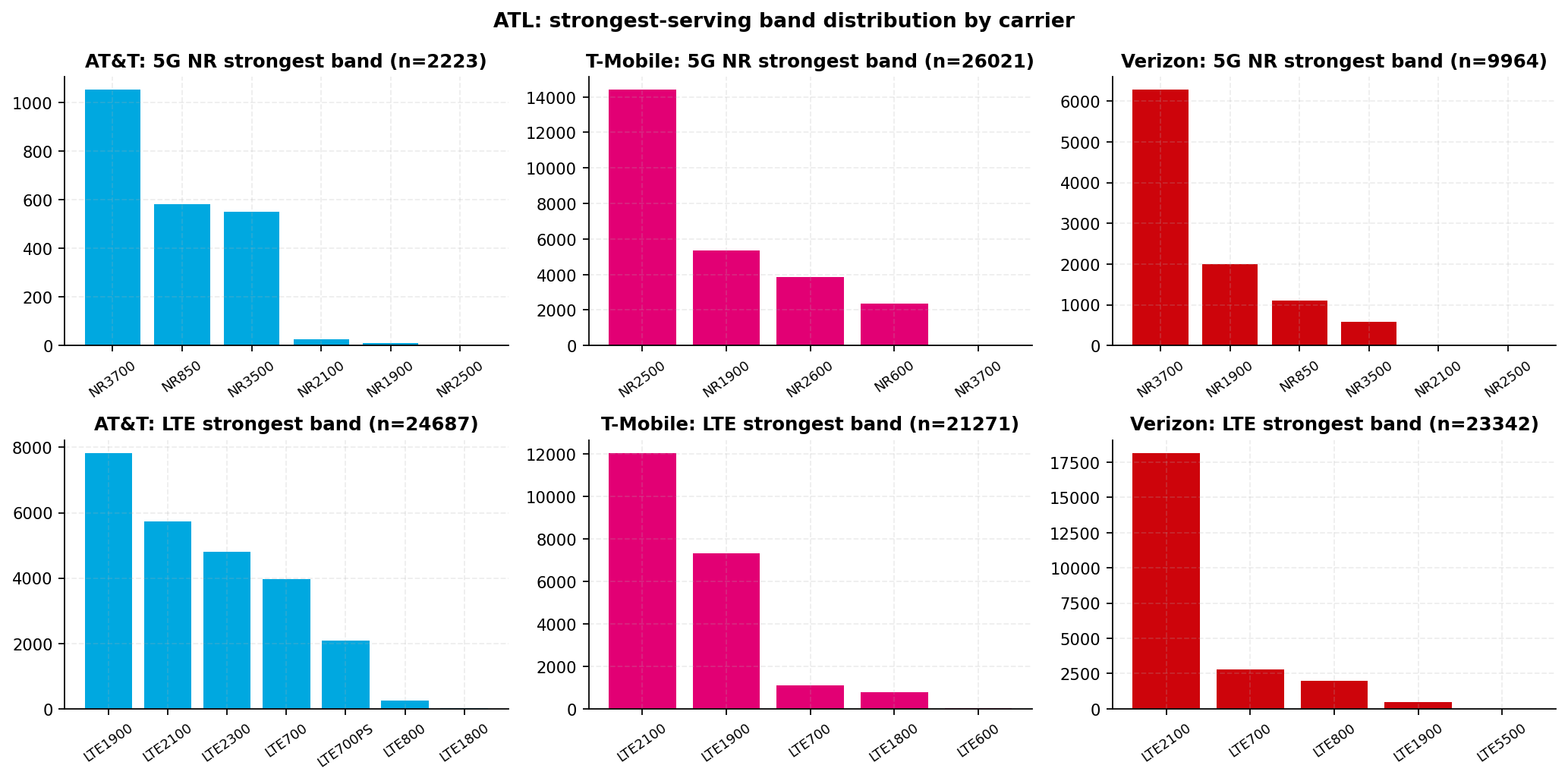
(−96.4 dBm) is below the line, tied with T-Mobile's. Its 5G is NR3700 on 63% of its 9,964 band-reporting 5G
tiles. NR3700 is Ookla's label for 5G on spectrum near 3700 MHz, the mid-band called C-band (section 9.1).
Per terminal complex (gate-area counts)
Complex
Gate points
AT&T
T-Mobile
Verizon
Domestic Terminal complex (T, A, B, C, D)
157
−92.9 · 113 (72%)
−96.2 · 31 (20%)
−97.4 · 11 (7%)
International Terminal complex (E, F)
44
−95.3 · 20 (45%)
−97.5 · 0 (0%)
−98.0 · 1 (2%)
Each cell: gate-area 5G median in dBm · healthy 5G gate points (share).
How the order holds
At the gate median, AT&T is first by 3.3 dB over T-Mobile and 4.2 dB over Verizon. Both margins clear the
1 dB noise floor (section 16).
T-Mobile and Verizon are 0.9 dB apart at the median, under the floor, so this report does not rank one above
the other there. The tie is at the median only. Per gate point, Verizon is the weakest by more than 1 dB at
88 and T-Mobile at 10. T-Mobile is listed first only because its median is numerically higher.
Only AT&T's median sits above the −95 dBm line. The order reproduces from the tile export alone.
The in-building record and what it does not settle
The airport-owned neutral-host DAS was first commissioned in 2010. It has more than 700 antennas across the
terminal, atrium, concourses and the underground transportation mall, plus a separate public-safety layer
held.
On May 19, 2025 the Atlanta City Council approved carrier agreements for a replacement DAS. T-Mobile and
AT&T signed, and the airport scheduled completion for January 2026, inside this window
held. The airport states the new system covers the passenger facility from curbside
to gate held.
Verizon's participation in the new system is not held. Verizon is not named in the 2025 release, and it was on
the 2010 system.
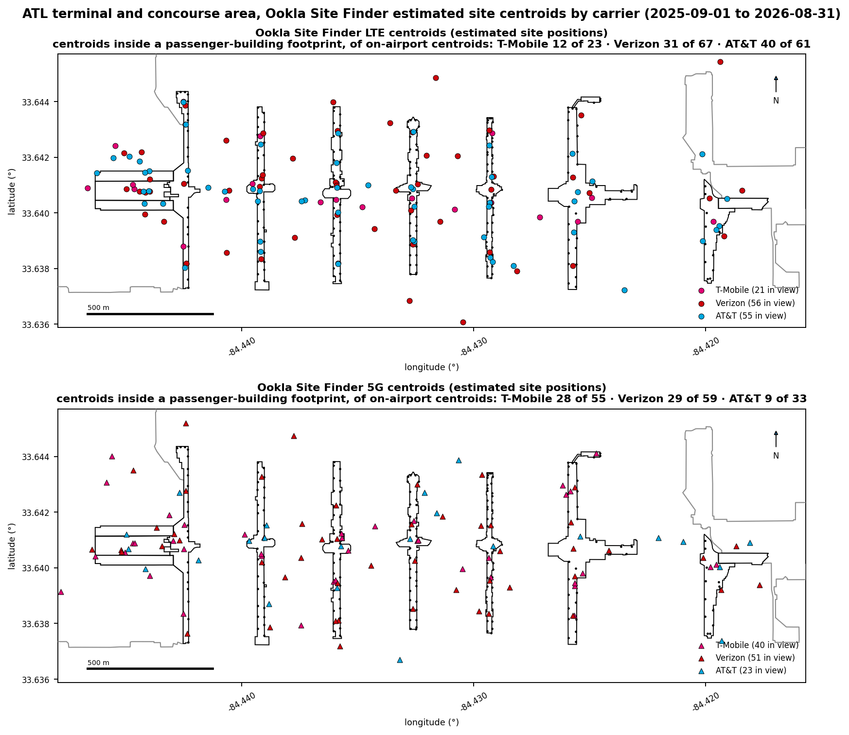
Ookla's Site Finder estimates where each serving node sits from the same crowdsourced tiles. Each estimated
position is a site centroid. It places centroids within the building footprints for all three carriers
(the following table). These are estimates, not a registry. A centroid within a 60 m wide pier is consistent
with a node in that pier, not a macro site.
The centroids do not show whose in-building system serves each carrier. The open questions are which
carriers the new system carries, which bands and power each carrier's in-building layer carries, and whether its
5G rides on it. Section 8 lists what the record does not hold. Recommendation 1 asks for it.
Site Finder centroids within the building footprints
AT&T
T-Mobile
Verizon
LTE (of on-airport)
40 of 61
12 of 23
31 of 67
5G (of on-airport)
9 of 33
28 of 55
29 of 59
What the pattern is consistent with (inference)
Band first. AT&T's strongest 5G band is NR3700 on 47% of its 2,223 band-reporting 5G tiles, plus NR3500 on
another 25%. That is the highest-frequency mix of the three. NR3700 and NR3500 are C-band, 5G mid-band spectrum
near 3700 and 3500 MHz.
T-Mobile's is NR2500 on 55% of 26,021. Verizon's is NR3700 on 63% of 9,964. Weak inference: a C-band
signal that reads 3.3 dB stronger than a 2.5 GHz signal at the same gate point is consistent with a nearer
source. The sample is thin. Only 2,223 of AT&T's 10,316 5G tiles report a band, and 26.2% of those are
NR850.
Over the buildings the carriers separate by building, not by carrier. A multi-carrier in-building system with
uneven per-carrier loading produces that pattern. So does pier geometry acting on macro signals. Concourse C is
the sharpest case (section 4.5).
The export cannot separate the two, and this report does not state that any carrier's reading comes from
any in-building system.
Limits of every ranking in this report
Every ranking is signal-layer: RSRP and signal-to-interference-plus-noise ratio (SINR) from an Android
crowdsource panel. The export has no throughput or latency. It measures where signal is, not whether a
call or app fails.
The panel differs by carrier and is Android-only. Handset vintage decides which devices can report which 5G
band. Nothing is measured indoors. Gate and tenant values are tiles within 80 m of a point (section 16).
External benchmark, engaged with up front
Ookla's December 2025 article on the 50 busiest United States airports (Speedtest Intelligence, first half of
2025) named Hartsfield-Jackson one of five airports where airport Wi-Fi posted a higher median download speed
than any mobile provider. Its per-provider figures are public record, cited without a held copy not independently verified.
That is not in tension with this report. The article measures throughput. This report measures signal
level and quality, and carries no throughput or latency field. A strong signal can be congested, and a weak
signal can be fast when few devices share it.
Venue context
Hartsfield-Jackson is operated by the City of Atlanta Department of Aviation
held. Two terminal complexes are in service.
Element
What the record holds
Domestic Terminal
North and South halves, with the MARTA Airport Station between the two baggage-claim halls. Feeds Concourses T, A, B, C and D. The fact sheet publishes 155 domestic gates held
Maynard H. Jackson Jr. International Terminal
Opened in 2012. Concourse F (gates F1 to F14 on the official 2012 map) is attached; Concourse E is reached through the E-F connector. The fact sheet publishes 43 international gates held
Plane Train
Underground automated people mover linking all seven concourses with both terminals. A 3-mile loop, eleven four-car trains about every two minutes, more than 200,000 riders a day held
Concourse D widening
A $1.4 billion program, 2024 to 2029, widening the concourse from 60 to 90 feet. Five new gates opened September 17, 2025 and three more June 4, 2026, both inside this window. Sections were closed for construction throughout held
This report measures 201 gate points, 284 mapped venue points, 44,634 unique tiles (85,763
carrier-tile observations, one per carrier per tile), 44,155 usage tiles and 371 estimated site centroids over the
12 months ending 2026-08-31.
This issue cannot evaluate the replacement DAS. The export is a single 12-month aggregate with no
date split, and the per-building cutover dates are not held. The date-range comparison in section 15 is the
instrument for that question.
Provenance legend
Measured values compute from the Ookla exports at build time. held facts come from a
source document pinned and checksummed in this build. not independently verified facts
are public record cited without a held copy.
The Imagine knowledge-graph snapshot is pinned in this build and quoted inline as "Imagine knowledge graph". Its
leadership rows are held and no name is printed. Section 16 defines every threshold and basis.
Section 2
Venue snapshot and asset inventory
Operator · gate points · in-building record
ATL is two terminal complexes, seven concourses and nine passenger buildings. This section lists
what was measured and what the public record holds.
Element
Value
Notes
Airport / IATA / ICAO
Hartsfield-Jackson Atlanta International Airport / ATL / KATL
FAA large hub, rank 1 by calendar-2024 enplanements held. 106,302,208 total passengers in 2025 (91,437,847 domestic, 14,864,361 international), -1.6% versus 2024, and 805,268 aircraft operations held. Passengers count both directions, a different basis from the FAA enplanement figure in section 12.
Operating authority
City of Atlanta Department of Aviation
A municipal department. Carrier agreements, airport contracts and capital appropriations go to the Atlanta City Council, then the Mayor held
Terminal complexes analyzed
2
Domestic Terminal: Delta and Delta Connection on Concourses A, B, C and D; American, United, Southwest, JetBlue, Frontier, Alaska and others on T and C. 155 domestic gates published. International Terminal: Delta long-haul and foreign-flag carriers on Concourse F; Concourse E serves international and domestic flights. 43 international gates published all held
Zones for tile assignment
7
Concourses T, A, B, C, D (Domestic Terminal complex) and E, F (International Terminal complex). A tile goes to the nearest gate or tenant point within 500 m.
Passenger buildings (mask)
9
Domestic Terminal, Concourses T, A, B, C, D, E, F, and the International Terminal. Pinned OpenStreetMap footprints; the leader basis (section 4.7).
Gate points analyzed
201
T 21 · A 29 · B 32 · C 34 · D 41 · E 32 · F 12. OpenStreetMap inventory pinned 2026-09-21, zoned by the concourse letter in the gate ref; 180 of 201 sit within a footprint. Reconciled with the published list in section 2.1.
Mapped venue points
284
106 food · 47 retail · 42 transport_admin · 33 services · 21 admin · 19 other · 16 lounge. By zone: T 68 · A 25 · B 26 · C 22 · D 28 · E 24 · F 42 · outside zones 49. Google Places and OpenStreetMap capture, pinned 2026-09-21 points only. 299 points were captured; 15 were excluded as non-venue points (museum aircraft, vending machines, a hangar, private terminals and similar). 48 were refiled where the category contradicted the function, 4 of them lounges. Every call is listed in the audit dossier.
Carriers measured
3
AT&T · T-Mobile · Verizon. 44,634 unique tiles (85,763 carrier-tile observations); 44,155 All Networks usage tiles; 181 LTE and 190 5G estimated site centroids.
In-building cellular
Airport-owned neutral-host DAS, first commissioned in 2010, replaced inside the window
More than 700 antennas across the terminal, atrium, concourses and the underground transportation mall, plus a public-safety layer. May 19, 2025: Council approved carrier agreements for a replacement DAS. T-Mobile and AT&T signed. Completion scheduled for January 2026, so the window blends the legacy and new systems. Verizon's participation in the new system is not held. The airport states the new system covers curbside to gate across all concourses and both terminals, moves from 4G to 5G service, and upgrades public-safety radio distribution all held. What the record does not hold is listed once, in section 8.
Knowledge-graph coverage
Profile, two DAS deployment rows, financial-report and budget evidence, seven leadership rows (names withheld)
The Airport DAS Master (2026-07-28) records ATL as DAS: yes, self-owned, neutral host, operator unknown, integrator Johnson Controls, term 2018 to 2022. A field note records a 50 million dollar project installed by Johnson Controls and SMS. A 2025 neutral-host DAS row carries no vendor. The FY2025 financial report names a Distributed Antenna System Upgrade with no dollar figure. The FY2026 budget book has no DAS, Wi-Fi or cellular line. Airport Wi-Fi is recorded as airport-owned and run in house Imagine knowledge graph. The graph's enplanement count carries no year and is not published.
Public Wi-Fi
SSID ATL Free Wi-Fi
Run by the airport on its own network. Launched free in June 2014 with several hundred access points, at a City-approved cost of $5,622,249. No third-party concessionaire was found; the current equipment generation is not held held. The airport publishes no Wi-Fi usage figure.
Capital program
ATLNext, a 20-year program, with a new master plan toward 160 million annual passengers
The $1.4 billion Concourse D widening (2024 to 2029), the largest ATLNext project. Plane Train fleet renewal and a five-year operation and maintenance procurement, approved March 16, 2026. The $440 million South Red Deck (more than 7,000 spaces) opened June 1, 2026, inside this window held
Ground transport
Plane Train, ATL SkyTrain, MARTA Airport Station
Plane Train: eleven four-car trains on a 3-mile underground loop, about every two minutes, more than 200,000 riders a day. SkyTrain runs landside to the Rental Car Center. Context only not independently verified
Recognition
World's busiest airport by total passengers in 2025 (Airports Council International)
Top spot in 27 of the last 28 years. Best Airport over 40 million passengers in North America in the 2023 and 2024 Airport Service Quality awards, not among 2025 winners. 15th of 20 mega airports in the J.D. Power 2026 study, at 606 of 1,000. Context only not independently verified
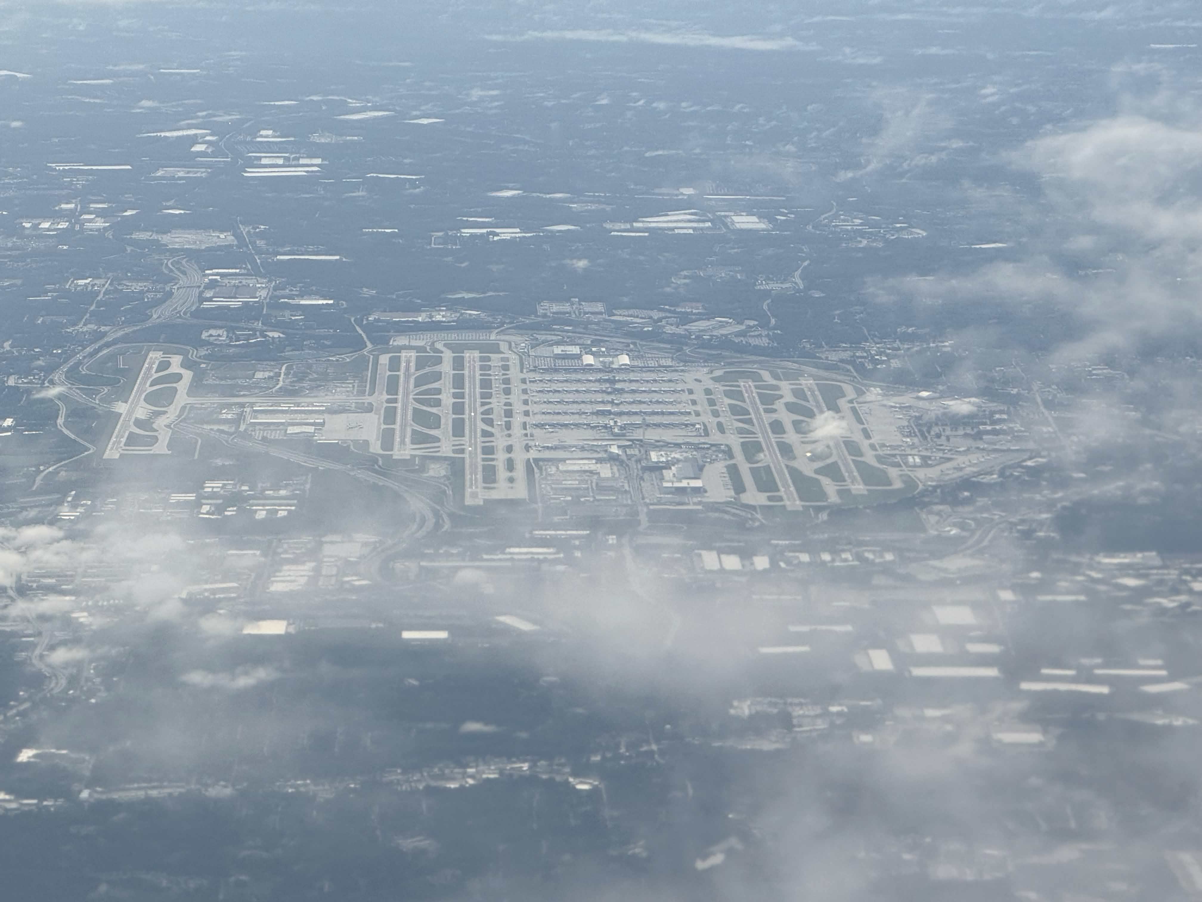
Photo · Aerial view over the airfield, May 2026Wikimedia Commons
Aerial view over the airfield, May 2026. Illustrative only. Individual concourses are not distinguishable in this frame. Photo: Zixed11, CC0, via Wikimedia Commons.
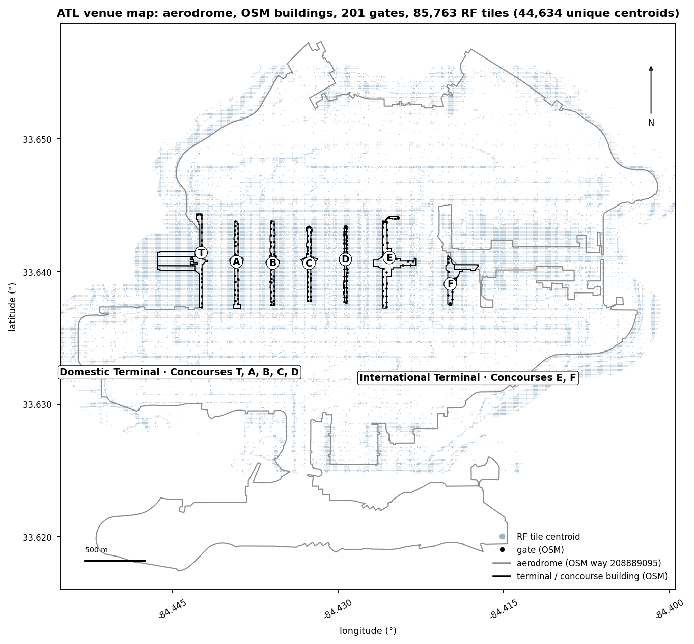
Fig. 1 · Venue map · aerodrome, nine OSM passenger buildings, 201 gate pointsSource · Ookla
FIG. 1. Venue map: aerodrome outline, the nine OpenStreetMap passenger buildings, 201 gate points with concourse letters, and the on-airport tile centroids (85,763 carrier-tile observations). North up, scale bar in meters. Source: Ookla Cell Analytics per-carrier RF tile export, 2025-09-01 to 2026-08-31.
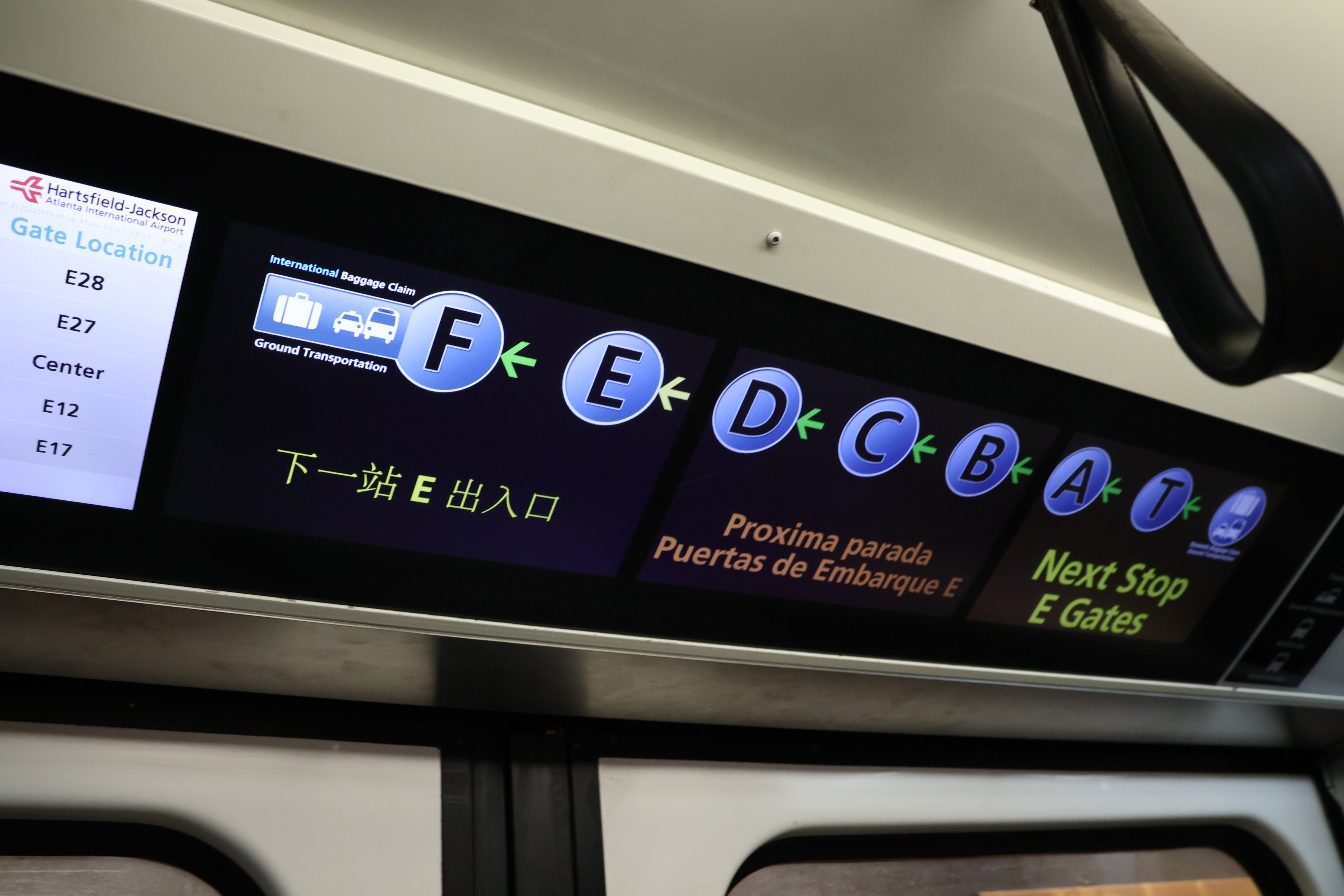
Photo · Plane Train in-car display, December 2023Wikimedia Commons
Plane Train in-car display with the concourse sequence F, E, D, C, B, A, T, December 2023. The train runs below the concourses through the transportation mall, which the airport-owned DAS has covered since 2010. Photo: DiscoA340, CC0, via Wikimedia Commons.
2.1 Measured gate inventory against the published gate list
The analysis uses 201 measured points. The airport fact sheet publishes 198 gates (155 domestic, 43
international) with no per-concourse count held.
A per-concourse list is held only for Concourse F, from the official 2012 map (F1 to F14). There, 2
published gates have no measured point, and every measured point is on the list.
Per-concourse counts are measured points
Every per-concourse count in this report is a count of MEASURED points. The Concourse D widening adds and
retires gate positions through 2029, so its count blends construction phases.
Aligning the OpenStreetMap inventory with the Department of Aviation's gate plan is a request in section 15. No
gate-named criterion in section 14 should be adopted before that is done.
Every cellular number here aggregates crowdsourced background scans from consumer Android devices (about 3% of
handsets). iOS is not sampled. Ookla bins them to map tiles of about 9 m by 11 m, then they are joined to gate and
tenant points.
The numbers describe where devices were over 12 months. They are not drive-test measurements. Every n counts
tiles, and every table carries its n.
3.0 Carrier summary
At the gate points, AT&T is the only carrier above the healthy 5G line. T-Mobile and Verizon are
tied below it at the median only. Per gate point, Verizon is the weakest by more than 1 dB at 88 and T-Mobile at
10.
Over all on-airport tiles the picture changes. Each 5G median below counts only tiles that report 5G.
The last column combines presence and level.
Carrier
5G footprint (% of tiles)
5G RSRP median over reporting tiles
LTE RSRP median
LTE-only tiles
5G present and healthy (% of all tiles)
n (tiles)
AT&T
40%
−98.0 dBm
−96.0 dBm
58%
17%
25,823
T-Mobile
84%
−97.0 dBm
−98.0 dBm
14%
34%
32,992
Verizon
70%
−98.0 dBm
−98.0 dBm
28%
27%
26,948
How to read the two tables together
Over all tiles, the three 5G medians sit inside the noise floor. On 5G present and healthy, the order differs
from the gate-point order.
A carrier whose handsets hold 5G only where it is strong gives a censored 5G median. At the gate points the
per-gate 5G tile n is comparable (median per gate AT&T 163, T-Mobile 180, Verizon 170 tiles, Appendix C).
Every carrier reads stronger at the gate points than campus-wide, because the gate area sits on the apron edge
of the piers. Cross-carrier 5G statements are read with the footprint share beside them and the building
basis (section 4.7) as the verdict.
FIG. 2. Venue medians across 201 gate points against the locked threshold ladder (section 16). The two received-power panels draw bars from −115 dBm, so a longer bar is a stronger signal. Source: Ookla Cell Analytics per-carrier RF tile export, 2025-09-01 to 2026-08-31.
Fig. 3 · SINR distribution per carrier at gate-point levelSource · Ookla
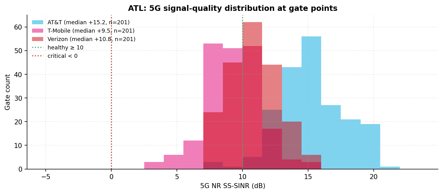
FIG. 3. SINR distribution per carrier at gate-point level. Read across carriers with care. SINR depends on the serving band's bandwidth and on neighbor loading. These carriers sit on different bands here (section 9.1 gives each carrier's strongest-serving band mix). So a cross-carrier SINR gap is not a like-for-like comparison. Source: Ookla Cell Analytics per-carrier RF tile export, 2025-09-01 to 2026-08-31.
Cross-carrier SINR, stated once and applied throughout
The three carriers are not on the same spectrum at this venue (section 9.1). A carrier mostly on sub-1 GHz 5G
will not produce an SINR distribution comparable to one mostly on mid-band.
Within a carrier, SINR across zones is a fair comparison. Across carriers it is context, not a ranking.
Fig. 4 · 5G NR RSRP by tile and carrier · locked coverage classSource · Ookla
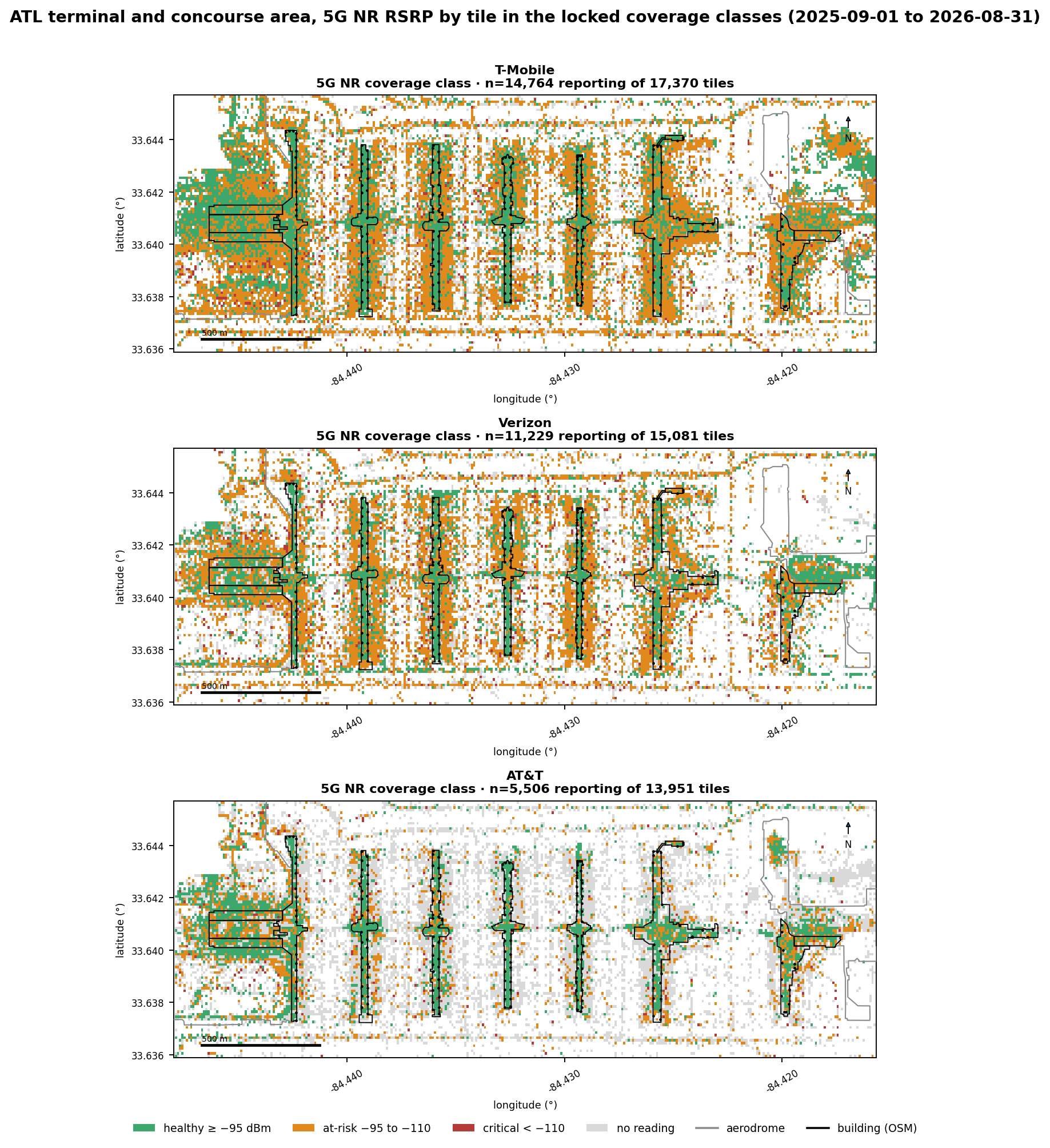
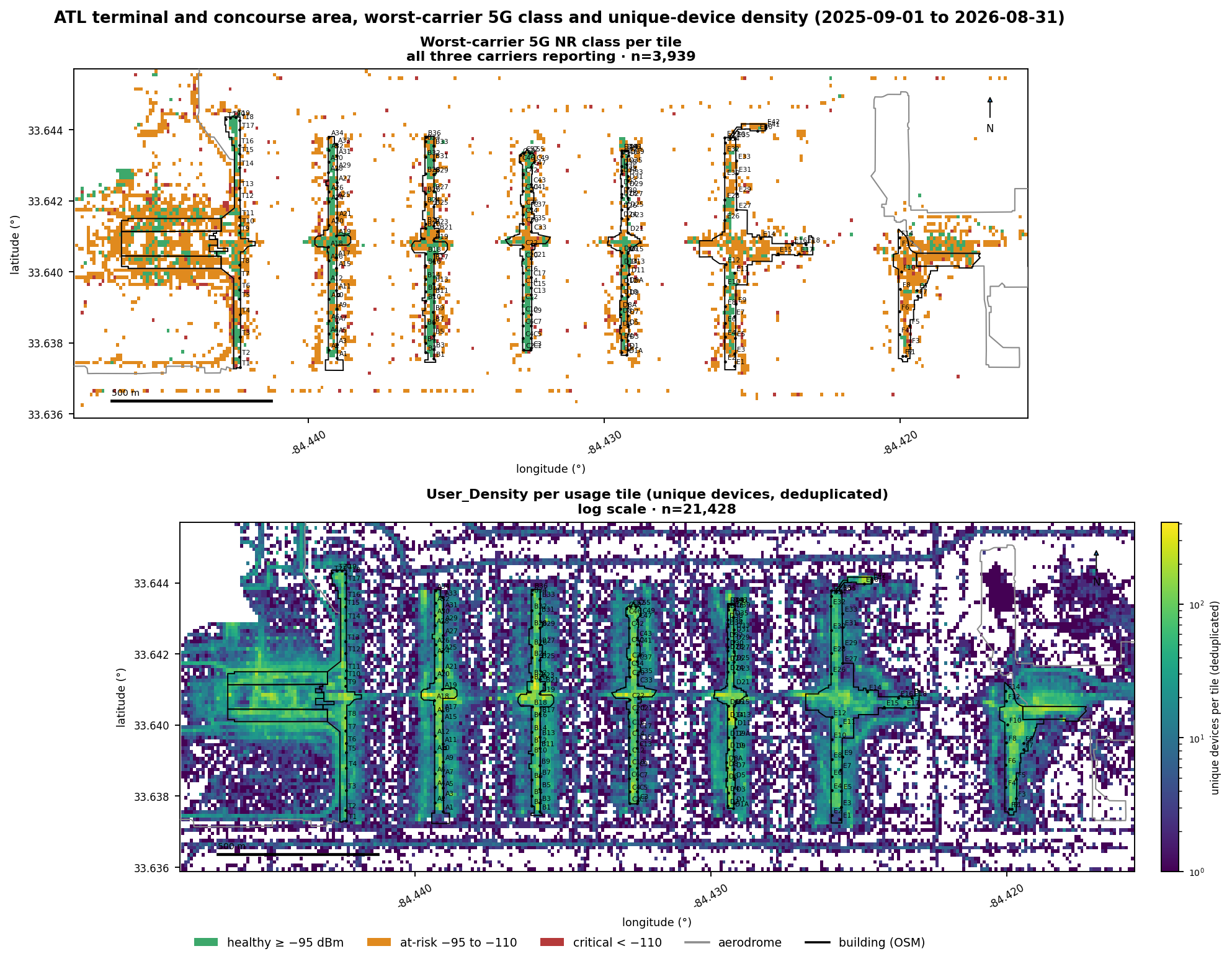
FIG. 4. Terminal and concourse area map of 5G NR RSRP by tile and carrier, colored by the locked coverage class. Grey tiles carry no 5G reading. Each tile is about 9 m by 11 m, and n is the tile count per panel. Source: Ookla Cell Analytics per-carrier RF tile export, 2025-09-01 to 2026-08-31.
What each carrier's readings show
What the AT&T readings show
AT&T leads over Concourses C, D, E and F. At the gate areas it is the only carrier above the healthy line (133
of 201 gate points), with the strongest LTE layer (174 of 201, median −92.4 dBm).
Its lowest building is the International Terminal (49% healthy, median −96.0 dBm). So the international side is
where a re-measurement would show the largest change for AT&T too.
Site Finder places 40 AT&T LTE and 9 AT&T 5G estimated nodes within the building footprints (section 9.3).
Its 40% 5G footprint is not read as coverage, because the panel's handset mix confounds it.
What the T-Mobile readings show
T-Mobile's strongest building is Concourse A (87% healthy). Its weakest is the International Terminal (27%,
median −97.0 dBm).
At the gate areas it is tied with Verizon at the median, below the healthy line, and healthy at 31 of 201 gate
points. It is the weakest by more than 1 dB at 10 gate points, against Verizon's 88. Its 5G SINR
median (+9.5 dB) is the lowest, on a different band mix.
Site Finder places 28 T-Mobile 5G nodes within the building footprints, the most of the three, and only 12 LTE
nodes (section 9.3). Estimated 5G nodes over the buildings plus a below-line gate-area median make T-Mobile
the clearest case for a walk test of what those nodes carry and at what power.
What the Verizon readings show
Verizon's strongest building is Concourse D (77% healthy). Its weakest is Concourse F (36%, median −99.0 dBm).
At the gate areas it is tied with T-Mobile at the median only, below the line, and healthy at the fewest gate
points (12 of 201). It is the weakest carrier by more than 1 dB at 88 of 201 gate points, against T-Mobile's 10.
Site Finder places 31 Verizon LTE and 29 Verizon 5G nodes within the building footprints (section 9.3). The
question is the same as T-Mobile's, plus one: whether Verizon is on the new DAS at all, which the record does
not hold.
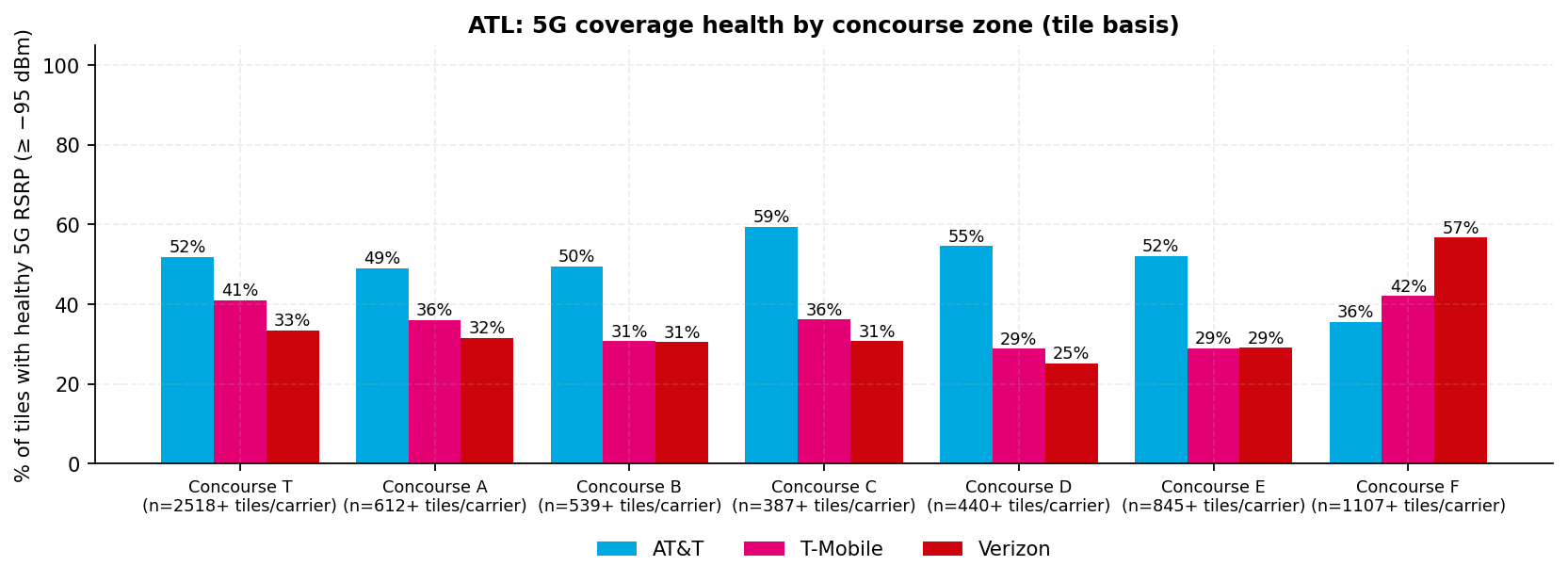
Healthy 5G share by concourse zone (tile basis)
Zones include apron, taxiway and roadway as well as building, so this table is not a leader board.
Building shares are in the Executive summary table. That is why Verizon's highest zone is Concourse F (57%) while
its lowest building is Concourse F (36%): the zone adds the apron around the pier.
Zone
AT&T
T-Mobile
Verizon
Concourse T
52%
41%
33%
Concourse A
49%
36%
32%
Concourse B
50%
31%
31%
Concourse C
59%
36%
31%
Concourse D
55%
29%
25%
Concourse E
52%
29%
29%
Concourse F
36%
42%
57%
Minimum n per zone (tiles)
387
1,514
1,259
3.1 AT&T results
AT&T is first at the 5G gate median, 3.3 dB ahead of T-Mobile, and the only carrier above the line.
It is healthy at 133 of 201 gate points, at risk at 68, critical at 0.
It is the strongest 5G reading by more than 1 dB at 138 of 201 gate points. That includes every gate
point in Concourses C and D (counts).
Strongest 5G by more than 1 dB (counts)
T
A
B
C
D
E
F
Measured gate points
21
29
32
34
41
32
12
AT&T
10
5
24
34
41
20
4
T-Mobile
1
8
0
0
0
0
2
Verizon
0
0
0
0
0
0
0
52 of the 201 gate points are ties within the 1 dB floor.
Its 5G reports on 40% of its on-airport tiles (10,316 of 25,823). Tiles with LTE but no 5G are 58% of
its tiles. Its 5G is NR3700 on 47% of its 2,223 band-reporting 5G tiles. NR3700 is Ookla's label for 5G near 3700 MHz,
the C-band mid-band.
Its zone shares run from 59% in Concourse C to 36% in Concourse F. FIG. 4 shows green along the piers
from Concourse B eastward and amber over Concourse F and the International Terminal. Its terminal-vs-periphery
proxy is −1.0 dB, inside the 1 dB noise floor, so it reads as no difference (section 5.2).
AT&T is the weakest carrier by more than 1 dB at 0 of 201 gate points. 103 points tie at the bottom.
3.2 T-Mobile results
T-Mobile's 5G gate median is −96.7 dBm, below the healthy line. It is tied with Verizon at the median
(0.9 dB apart) and 3.3 dB behind AT&T. It is healthy at 31 of 201 gate points, at risk at 170, critical at 0.
It reports 5G on 84% of its on-airport tiles (27,860 of 32,992), the widest footprint. Its 5G is NR2500
on 55% of its 26,021 band-reporting 5G tiles. That mid-band layer reads weaker than sub-1 GHz at the same
distance.
Its LTE median is −95.8 dBm, below the line and tied with Verizon's (0.6 dB apart). It is
healthy on LTE at 68 of 201 gate points and strongest at 4. Its zone shares run
from 42% in Concourse F to 29% in Concourses D and E, a tie within 1 point. It leads over Concourse A (section
4.7). Its terminal-vs-periphery proxy is +1.0 dB, inside the noise floor, so it reads as no difference (section 5.2).
T-Mobile is the weakest carrier by more than 1 dB at 10 of 201 gate points.
3.3 Verizon results
Verizon's 5G gate median is −97.6 dBm, tied with T-Mobile at the median and 4.2 dB behind AT&T. It is healthy at
12 of 201 gate points, the fewest of the three, at risk at 189, critical at 0.
It reports 5G on 70% of its on-airport tiles (18,800 of 26,948). Its 5G is NR3700 on 63% of its 9,964
band-reporting 5G tiles. Its LTE median is −96.4 dBm, below the line and tied with T-Mobile's. It is healthy on LTE at 61 of 201
gate points.
Its zone shares run from 57% in Concourse F to 25% in Concourse D. It leads over the International
Terminal (section 4.7). Its terminal-vs-periphery proxy is +2.0 dB (section 5.2).
Verizon is the weakest carrier by more than 1 dB at 88 of 201 gate points, the most of the three.
3.4 5G footprint and coverage-band attachment
5G footprint share is confounded
AT&T reports 5G on 40% of its tiles, T-Mobile 84%, Verizon 70%. A tile reports 5G only if a panel handset
could report that carrier's 5G band. So the share mixes deployment with the handset mix.
It is not a coverage measurement, it is not compared across carriers, and it is not charted on a shared
axis (section 16).
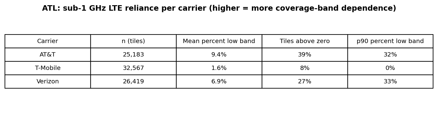
FIG. 5. LTE percent-low-band per carrier: mean, share of tiles above zero, and p90. Higher means more attachment to sub-1 GHz coverage bands. Source: Ookla Cell Analytics per-carrier RF tile export, 2025-09-01 to 2026-08-31.
Percent-low-band describes LTE attachment to sub-1 GHz, a coverage-grade band. Propagation, idle-mode
priorities and site geometry all drive it.
Carrier
LTE low-band mean
Tiles above zero
p90
n (tiles)
5G low band
Share of band-reporting NR tiles
AT&T
9.4%
39%
32%
25,183
NR850 on 582 tiles
26.2% of 2,223
T-Mobile
1.6%
8%
0%
32,567
NR600 on 2,376 tiles
9.1% of 26,021
Verizon
6.9%
27%
33%
26,419
NR850 on 1,095 tiles
11.0% of 9,964
Section 9.1 lists the bands.
3.5 RSRQ, channel quality (CQI), and optimization priority
Fig. 6 · 5G NR and LTE RSRQ distributions per carrierSource · Ookla
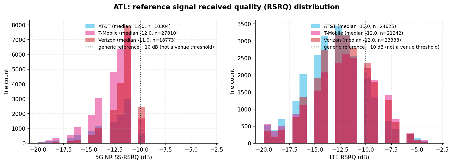
FIG. 6. 5G NR and LTE reference signal received quality (RSRQ) distributions per carrier. The dotted line is a GENERIC industry reference, not a threshold specified for this venue. Medians in this range are ordinary for a loaded network, and this is not a failure call. Read with SINR. Source: Ookla Cell Analytics per-carrier RF tile export, 2025-09-01 to 2026-08-31.
Fig. 7 · LTE CQI distribution and Ookla LTE optimization prioritySource · Ookla
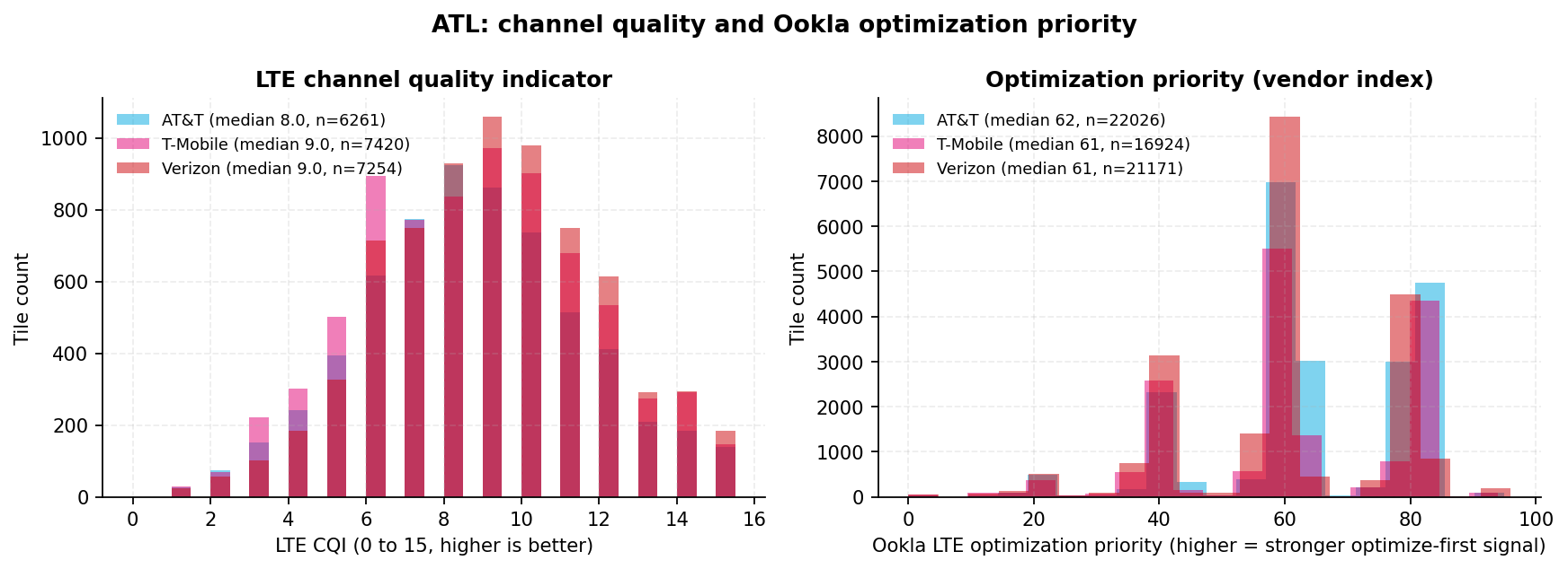
FIG. 7. LTE channel quality indicator (CQI) distribution and Ookla's LTE optimization priority index (vendor layer). Source: Ookla Cell Analytics per-carrier RF tile export, 2025-09-01 to 2026-08-31.
Carrier
RSRQ median NR / LTE
CQI median (n)
LTE optimization priority median (n)
AT&T
−12.0 / −13.0 dB
8.0 (6,261)
62 (22,026)
T-Mobile
−12.0 / −12.0 dB
9.0 (7,420)
61 (16,924)
Verizon
−11.0 / −12.0 dB
9.0 (7,254)
61 (21,171)
Every carrier's RSRQ median sits below the -10 dB line on both technologies. Medians of −11 to −14 dB
are ordinary on a loaded network, and the line is a generic reference, so this is not a failure call.
RSRQ degrades as load rises, so weak RSRQ on strong RSRP is consistent with a loaded serving layer. That
is an inference. The export carries no load field (section 16).
CQI is the closest throughput proxy in this export. Ookla's optimization priority flags tiles where
signal is strong but quality is poor. The medians are close. The signal is in the distribution tails.
Fig. 8 · Serving-cell volatility per carrier, LTE and 5GSource · Ookla
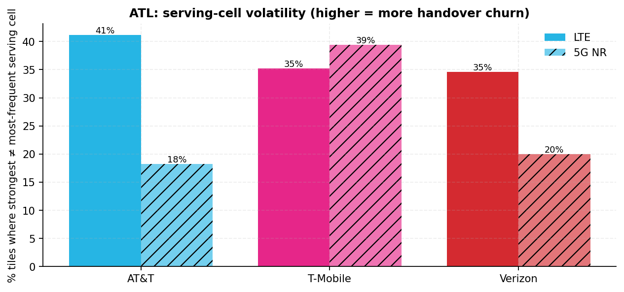
FIG. 8. Share of tiles where the strongest observed cell differs from the most-frequent serving cell. Proxy for handover instability and dominance conflict. Source: Ookla Cell Analytics per-carrier RF tile export, 2025-09-01 to 2026-08-31.
Where the strongest cell is not the most-frequent serving cell, the network is handing over between
competing cells.
Carrier
LTE churn (n)
5G churn (n)
AT&T
41% (24,709)
18% (2,223)
T-Mobile
35% (21,412)
39% (26,016)
Verizon
35% (23,371)
20% (9,964)
Cell fields populate only where Ookla resolved a serving cell, so these n are smaller than the RSRP n
(section 16). Churn blends macro-sector overlap with any in-building system's hand-off to the macro layer. The export carries no handover trace.
Section 4
The view by concourse zone
Seven concourses · nine buildings
This section compares the three carriers concourse by concourse. The zone figures show the spread
within each concourse area. Leaders are named only in section 4.7, over the building footprints.
What a concourse zone is
A tile belongs to the zone of its nearest gate or tenant point within 500 m. That gives hundreds of tiles
per carrier per zone, but the pool holds apron, taxiway and roadway as well as building.
Zones are the seven concourses: T, A, B, C and D on the domestic side, E and F on the international side.
The Concourse T zone also holds the Domestic Terminal landside (the parking decks, the economy lots and the
MARTA station). It is the one zone that mixes a pier with the landside.
Gate points per concourse set how gate results are shown. Four concourses clear the 30-point floor,
so their gate shares appear as percentages. The other three appear as counts only and are never ranked.
Concourse
Gate points (n)
Gate results shown as
Concourse T
21
Counts only
Concourse A
29
Counts only
Concourse B
32
Percentages
Concourse C
34
Percentages
Concourse D
41
Percentages
Concourse E
32
Percentages
Concourse F
12
Counts only
4.1 Healthy share and median RSRP by zone
These zone figures are not a leader board
Each zone pool includes apron, taxiway and roadway, so read the rows as the spread within a zone.
Section 4.7 carries the only basis on which this report names a leader.
Zone
AT&T healthy tiles
T-Mobile healthy tiles
Verizon healthy tiles
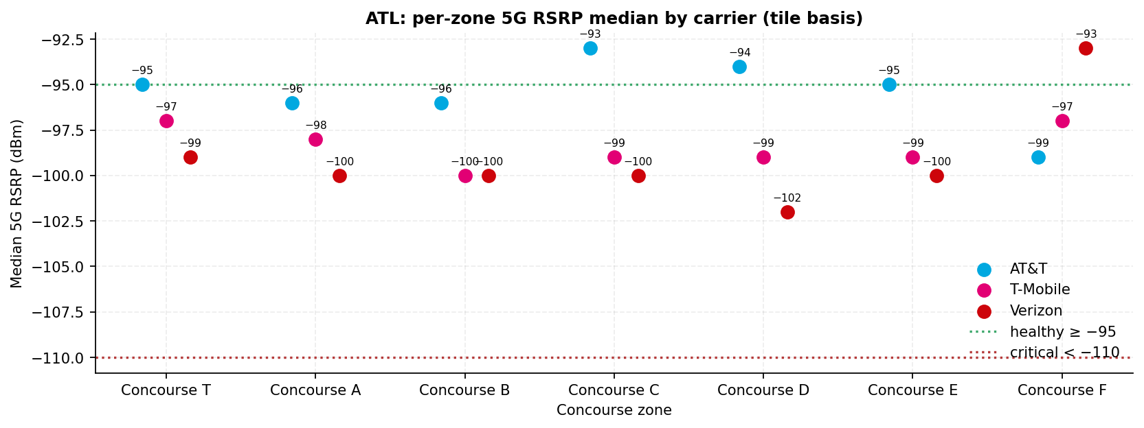
Median 5G RSRP (dBm) AT&T / T-Mobile / Verizon
Concourse T (DOM)
52%n=2,518
41%n=4,995
33%n=3,403
−95.0 / −97.0 / −99.0
Concourse A (DOM)
49%n=612
36%n=1,696
32%n=1,535
−96.0 / −98.0 / −100.0
Concourse B (DOM)
50%n=539
31%n=1,829
31%n=1,554
−96.0 / −100.0 / −100.0
Concourse C (DOM)
59%n=387
36%n=1,514
31%n=1,259
−93.0 / −99.0 / −100.0
Concourse D (DOM)
55%n=440
29%n=1,548
25%n=1,361
−94.0 / −99.0 / −102.0
Concourse E (INTL)
52%n=845
29%n=2,595
29%n=2,068
−95.0 / −99.0 / −100.0
Concourse F (INTL)
36%n=1,107
42%n=3,283
57%n=1,895
−99.0 / −97.0 / −93.0
Tile basis; n = tiles per carrier per zone. Healthy = tile 5G RSRP ≥ −95 dBm.
The carrier-to-carrier gap in healthy tile share is widest in Concourse D, at 30 points. It is
narrowest in Concourse A, at 17 points. Each carrier's lowest zone is different:
36%
AT&T lowest zone · Concourse F
29%
T-Mobile lowest zones · Concourse D and Concourse E, tied
25%
Verizon lowest zone · Concourse D
A zone and a building can point in opposite directions. Verizon's Concourse F zone is its best zone
(57% of 1,895 tiles healthy), yet the Concourse F building is its lowest building (36% of 166 tiles). The zone
pool is mostly apron, taxiway and roadway outside the pier, so section 4.7 governs any reading of the building.
Fig. 9 · Healthy 5G tile share by zone and carrierSource · Ookla
FIG. 9. Share of zone tiles with healthy 5G RSRP by carrier (tile basis; minimum n per carrier on the axis). Source: Ookla Cell Analytics per-carrier RF tile export, 2025-09-01 to 2026-08-31.
Fig. 10 · Median 5G RSRP by zone and carrierSource · Ookla
FIG. 10. Per-zone median 5G RSRP per carrier (tile basis). Source: Ookla Cell Analytics per-carrier RF tile export, 2025-09-01 to 2026-08-31.
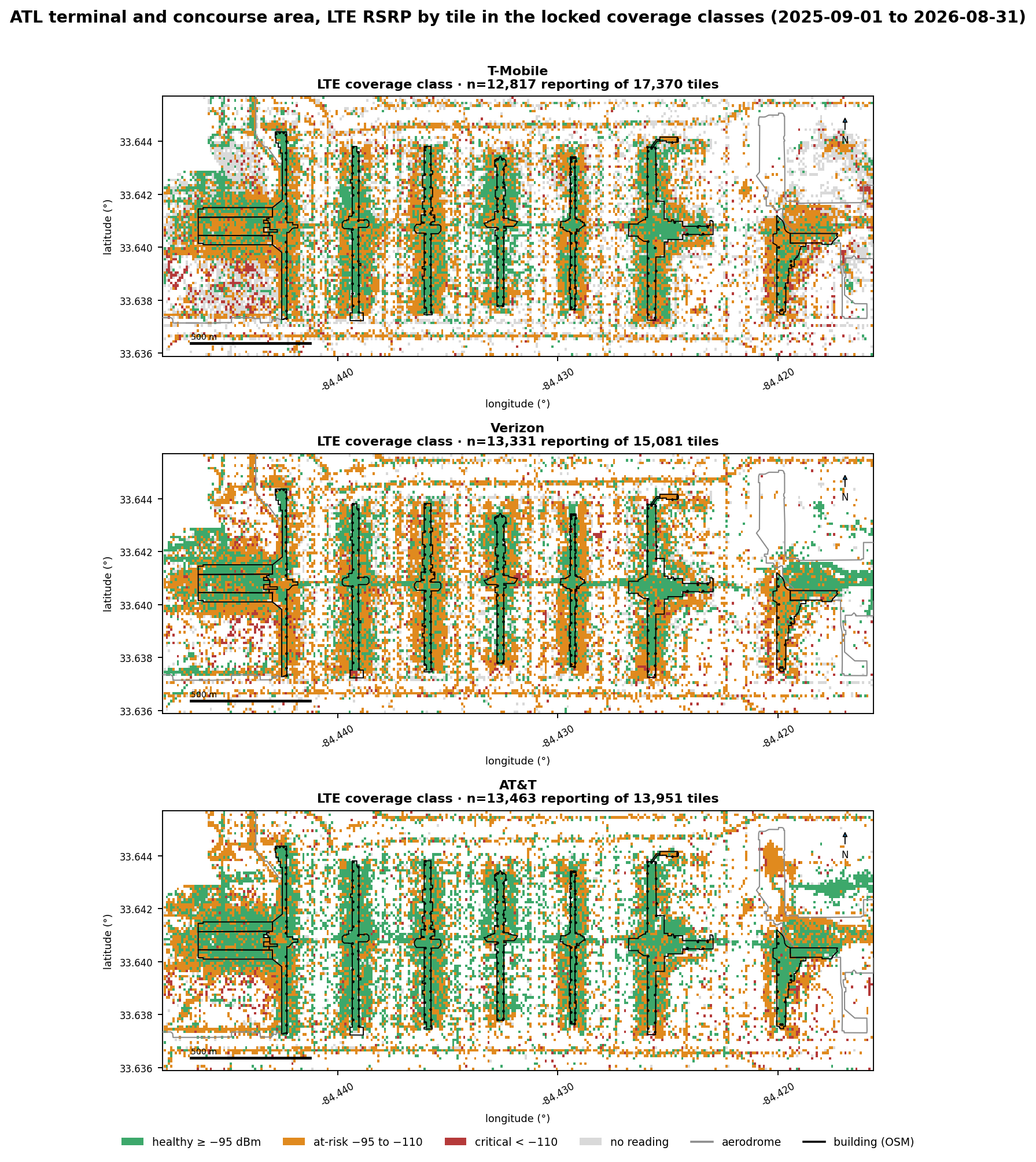
Fig. 11 · LTE RSRP by tile and carrier · terminal and concourse areaSource · Ookla
FIG. 11. Terminal and concourse area map of LTE RSRP by tile and carrier, colored by the locked coverage class. Grey tiles carry no LTE reading. Source: Ookla Cell Analytics per-carrier RF tile export, 2025-09-01 to 2026-08-31.
4.2 Coverage class and PCI diversity
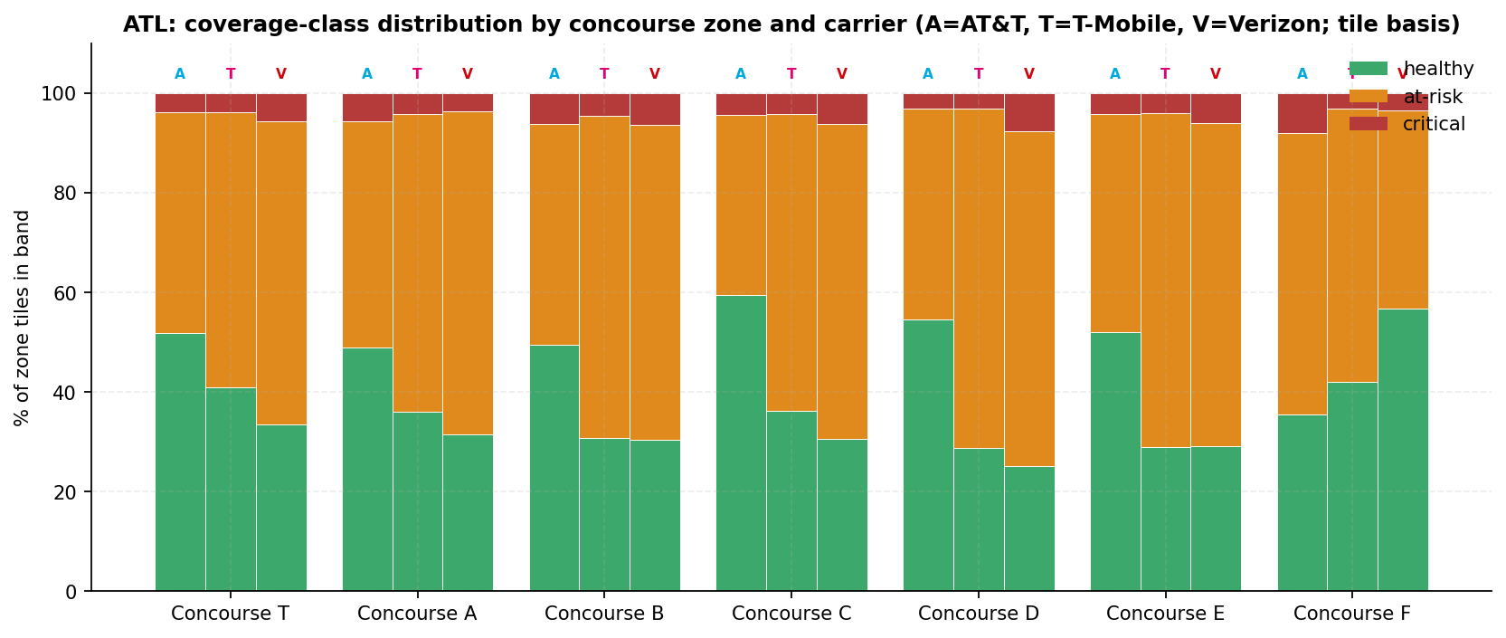
No gate point is critical for any carrier. Critical means 5G RSRP below −110 dBm, and the
count is 0 of 201 for AT&T, T-Mobile and Verizon. On the tile basis, a small critical share shows up in one
zone per carrier:
Carrier
Critical gate points (of 201)
Highest critical tile share
Zone
AT&T
0
8%n=1,107
Concourse F
T-Mobile
0
4%n=1,829
Concourse B
Verizon
0
8%n=1,361
Concourse D
Fig. 12 · Coverage-class distribution by concourse zone and carrierSource · Ookla
FIG. 12. Coverage-class distribution by concourse zone and carrier (tile basis; A = AT&T, T = T-Mobile, V = Verizon). Source: Ookla Cell Analytics per-carrier RF tile export, 2025-09-01 to 2026-08-31.
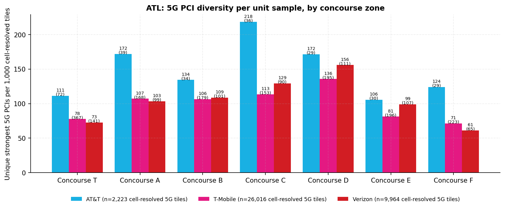
PCI diversity counts the distinct cells (physical cell identities) that serve a zone, macro or
in-building. Many cells with healthy SINR means several sectors serve the zone cleanly. Many cells with poor
SINR means they compete.
PCI diversity is a prompt, not a ranking
Raw counts are not comparable across carriers, because the cell-resolved samples differ: AT&T 2,223,
T-Mobile 26,016 and Verizon 9,964 tiles. That is why FIG. 13 draws the bars per 1,000 tiles.
Even normalized, the counts build up over 12 months across every 5G layer a carrier runs. Read a high
value as a reason to check SINR in the same zone.
Fig. 13 · 5G PCI diversity per 1,000 cell-resolved tiles, by zone and carrierSource · Ookla
FIG. 13. Unique strongest-serving physical cell identities (PCIs) per 1,000 cell-resolved tiles, per zone per carrier, with the raw unique count in brackets. Normalized because a unique count rises with sample size. Reads in both directions; always pair with SINR (section 16). Source: Ookla Cell Analytics per-carrier RF tile export, 2025-09-01 to 2026-08-31.
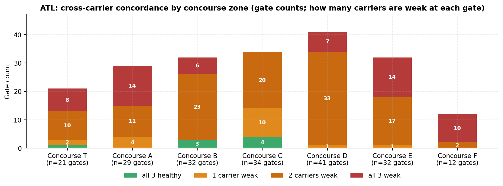
4.3 Cross-carrier concordance by gate
A gate that is weak for all three carriers points to the area around that gate, which at this
venue is mostly apron. A gate that is weak for one carrier points to that carrier's network.
8
Gate points healthy for all three carriers · of 201
18
Weak for one carrier · AT&T 0 · T-Mobile 4 · Verizon 14
116
Weak for two carriers · T-Mobile and Verizon 107 · AT&T and Verizon 9
59
Weak for all three · Concourse T 8 · A 14 · B 6 · D 7 · E 14 · F 10
Most weak gates are weak for two carriers or for all three. At the gate areas, T-Mobile and Verizon
are below the healthy line almost everywhere. AT&T is the carrier that keeps the all-weak count from being
higher.
Over the building footprints the picture is much closer, and the leader changes from building to
building (section 4.7). So this concordance reads as an apron condition, not a building condition.
Fig. 14 · Carriers below the healthy line per gate point, by concourse zoneSource · Ookla
FIG. 14. Per concourse zone: how many of the three carriers are below the healthy line at each gate point (gate counts). Source: Ookla Cell Analytics per-carrier RF tile export, 2025-09-01 to 2026-08-31.
4.4 Concourses T and A
The Domestic Terminal is split into North and South halves, with the MARTA Airport Station between
the two baggage-claim halls. It feeds Concourses T, A, B, C and D. The airport fact sheet publishes 155 domestic
gates across the complex held.
How to read the concourse tables
The building row comes first because it is the only leader basis. Gate rows use the area within 80 m of each
gate, which is mostly apron. Zone rows use the 500 m tile pool from section 4.1. Healthy = 5G RSRP ≥ −95 dBm.
The leader rule from section 4.7 applies: a carrier leads a building only when it is alone at the top on both
the healthy share, by more than 1 point, and the median, by more than 1 dB. Otherwise every carrier within those
margins of the top on either measure is tied.
Concourse T hosts American, United and Delta, with other domestic carriers
held. The airport places the Admirals Club across from gate T10, the United Club at
T11 and a Delta Sky Club near gate T6. Per-airline gate assignments are not held.
Concourse T
AT&T
T-Mobile
Verizon
Over the building: healthy · median
70% · −92.0 dBmn=203
70% · −93.0 dBmn=256
71% · −91.0 dBmn=217
Building verdict
Two-way tie (AT&T, Verizon); top share margin 1 point, top median margin 1.0 dB
Healthy gate points (count)
12 of 21
3 of 21
2 of 21
Gate-area median 5G
−94.8 dBm
−96.0 dBm
−97.4 dBm
Strongest 5G at a gate (count)
AT&T 10 · tie within 1 dB 10 · T-Mobile 1
Zone tiles healthyspread 19 points
52%
41%
33%
Concourse A hosts Delta Air Lines held, with Delta Sky Clubs at the
Concourse A centerpoint and near gate A17.
Concourse A
AT&T
T-Mobile
Verizon
Over the building: healthy · median
81% · −91.0 dBmn=177
87% · −89.0 dBmn=222
71% · −91.0 dBmn=211
Building verdict
T-Mobile leads; share margin 6 points, median margin 2.0 dB
Healthy gate points (count)
7 of 29
12 of 29
0 of 29
Gate-area median 5G
−95.3 dBm
−95.2 dBm
−96.6 dBm
Strongest 5G at a gate (count)
Tie within 1 dB 16 · T-Mobile 8 · AT&T 5
Zone tiles healthyspread 17 points
49%
36%
32%
Fig. 15 · Per-gate 5G RSRP · 50 Concourse T and A gate pointsSource · Ookla
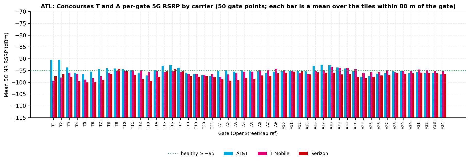
FIG. 15. Per-gate 5G RSRP across the 50 Concourse T and A gate points (OpenStreetMap inventory). Each bar is a mean over the tiles within 80 m of the gate. Bars rise from −115 dBm, so a longer bar is a stronger signal. Source: Ookla Cell Analytics per-carrier RF tile export, 2025-09-01 to 2026-08-31.
Photo · Concourse T at gate T10Wikimedia Commons
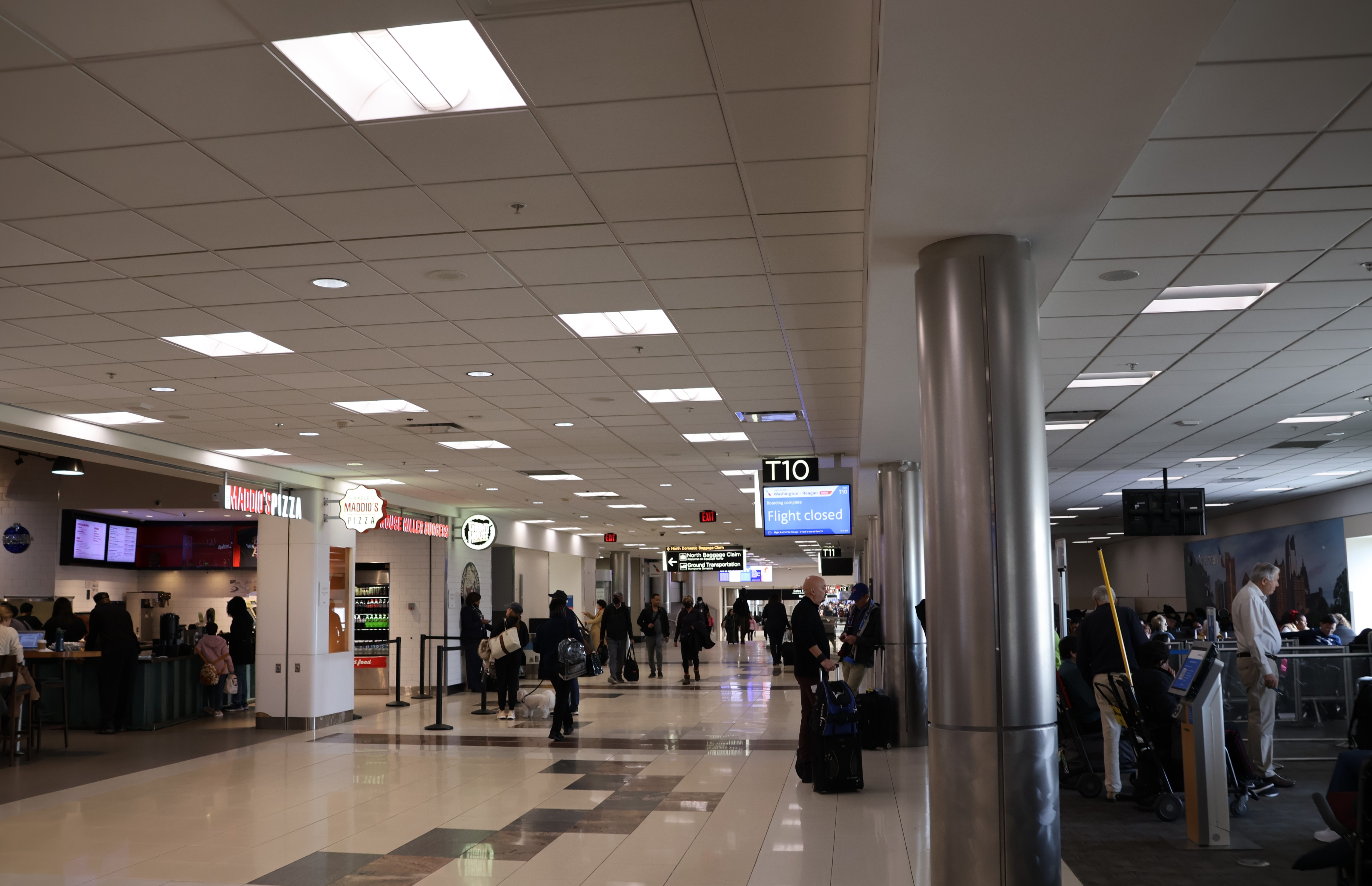
Concourse T corridor at gate T10, December 2023. Photo: DiscoA340, CC BY-SA 4.0, via Wikimedia Commons.
Photo · Concourse A at gate A19Wikimedia Commons
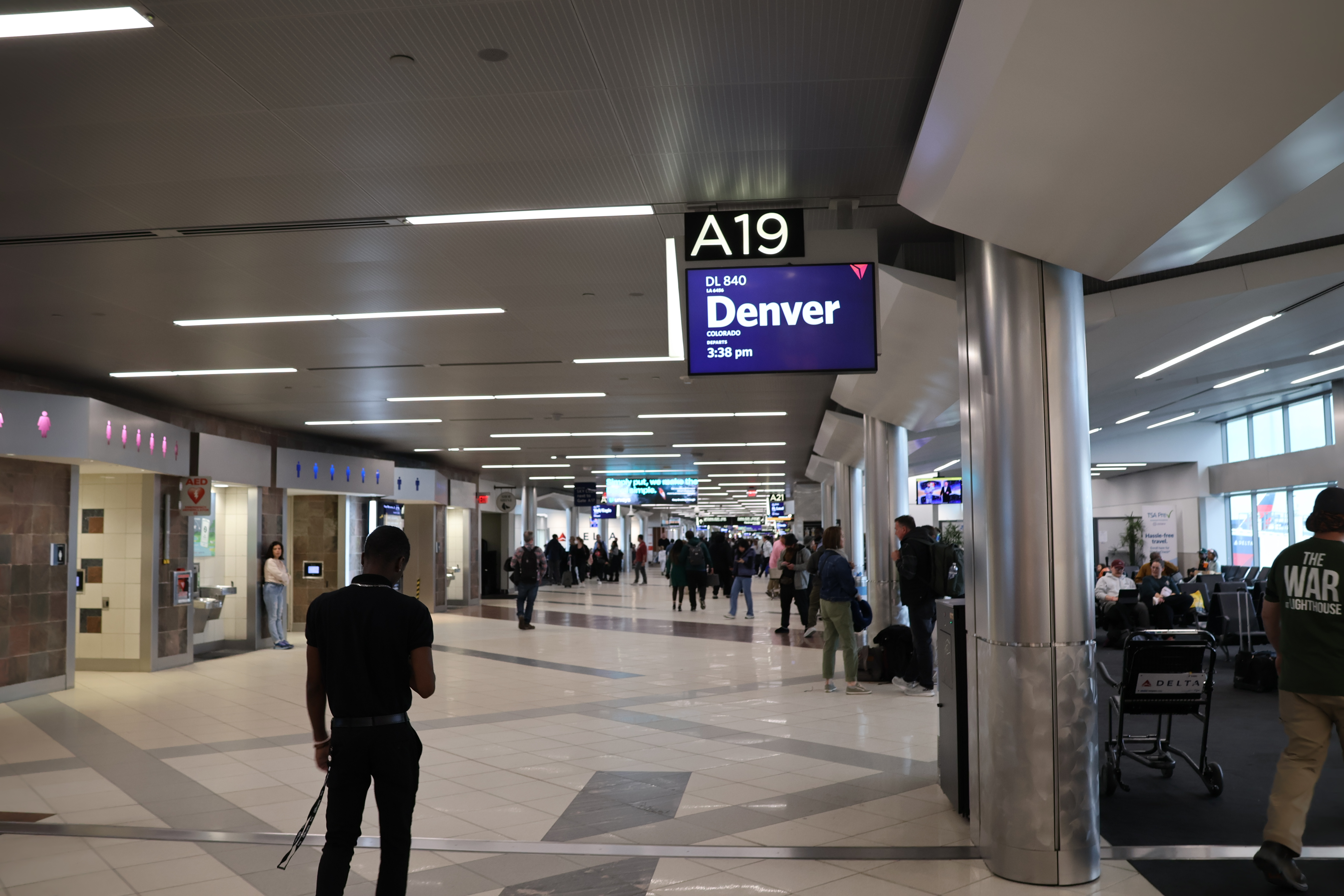
Concourse A at gate A19, December 2023. Photo: DiscoA340, CC BY-SA 4.0, via Wikimedia Commons.
4.5 Concourses B and C
Concourse B hosts Delta Air Lines held, with a Delta Sky Club near
gate B18.
Concourse B
AT&T
T-Mobile
Verizon
Over the building: healthy · median
72% · −91.0 dBmn=181
74% · −92.0 dBmn=228
71% · −91.5 dBmn=208
Building verdict
Three-way tie (AT&T, T-Mobile, Verizon); top share margin 2 points, top median margin 0.5 dB
Healthy gate points
26 of 32 (81%)
3 of 32 (9%)
3 of 32 (9%)
Gate-area median 5G
−93.3 dBm
−97.2 dBm
−97.5 dBm
Strongest 5G at a gate (count)
AT&T 24 · tie within 1 dB 8
Zone tiles healthyspread 19 points
50%
31%
31%
Concourse C hosts Delta Connection and Southwest Airlines held, with a
Delta Sky Club near gate C37.
Concourse C
AT&T
T-Mobile
Verizon
Over the building: healthy · median
89% · −87.0 dBmn=166
80% · −92.0 dBmn=211
65% · −91.5 dBmn=196
Building verdict
AT&T leads; share margin 8 points, median margin 4.5 dB
Healthy gate points
34 of 34 (100%)
12 of 34 (35%)
6 of 34 (18%)
Gate-area median 5G
−90.5 dBm
−95.4 dBm
−96.7 dBm
Strongest 5G at a gate (count)
AT&T 34
Zone tiles healthyspread 28 points
59%
36%
31%
Spirit Airlines held gates C4 and C6 until it ceased operations on May 2, 2026, inside this window.
Delta bid for those gates in July 2026 held. Whether that assignment closed inside the
window is not held.
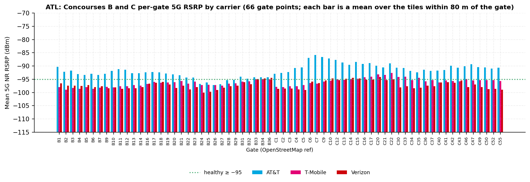
Concourse C has the sharpest carrier split on the campus
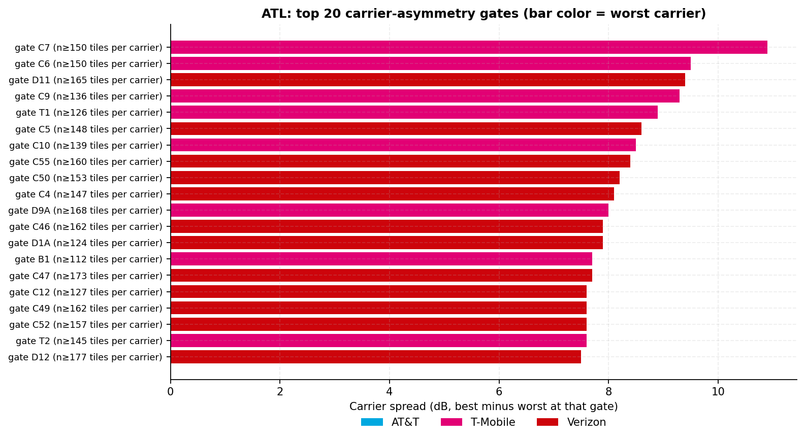
At 18 of its 34 gate points, AT&T reads 5 dB or more above both other carriers: C1, C2, C3, C4, C5, C6,
C7, C9, C10, C12, C13, C14, C15, C16, C17, C42, C47 and C55. AT&T signal quality there runs +13.1 to +20.5 dB,
and 13 of the top 20 asymmetry gate points in section 10 are in Concourse C.
C-band is the mid-band 5G spectrum that the NR3700 band carries (section 9.1). On C-band, a margin that size
over one stretch of pier is consistent with a dedicated nearby source rather than a macro sector. This is a weak
inference, because only 2,223 AT&T tiles report a 5G band. Which system it belongs to is not held. It is the first stop for the walk test in
Recommendation 4, and this report draws no further conclusion.
Fig. 16 · Per-gate 5G RSRP · 66 Concourse B and C gate pointsSource · Ookla
FIG. 16. Per-gate 5G RSRP across the 66 Concourse B and C gate points (OpenStreetMap inventory). Each bar is a mean over the tiles within 80 m of the gate. Bars rise from −115 dBm, so a longer bar is a stronger signal. Source: Ookla Cell Analytics per-carrier RF tile export, 2025-09-01 to 2026-08-31.
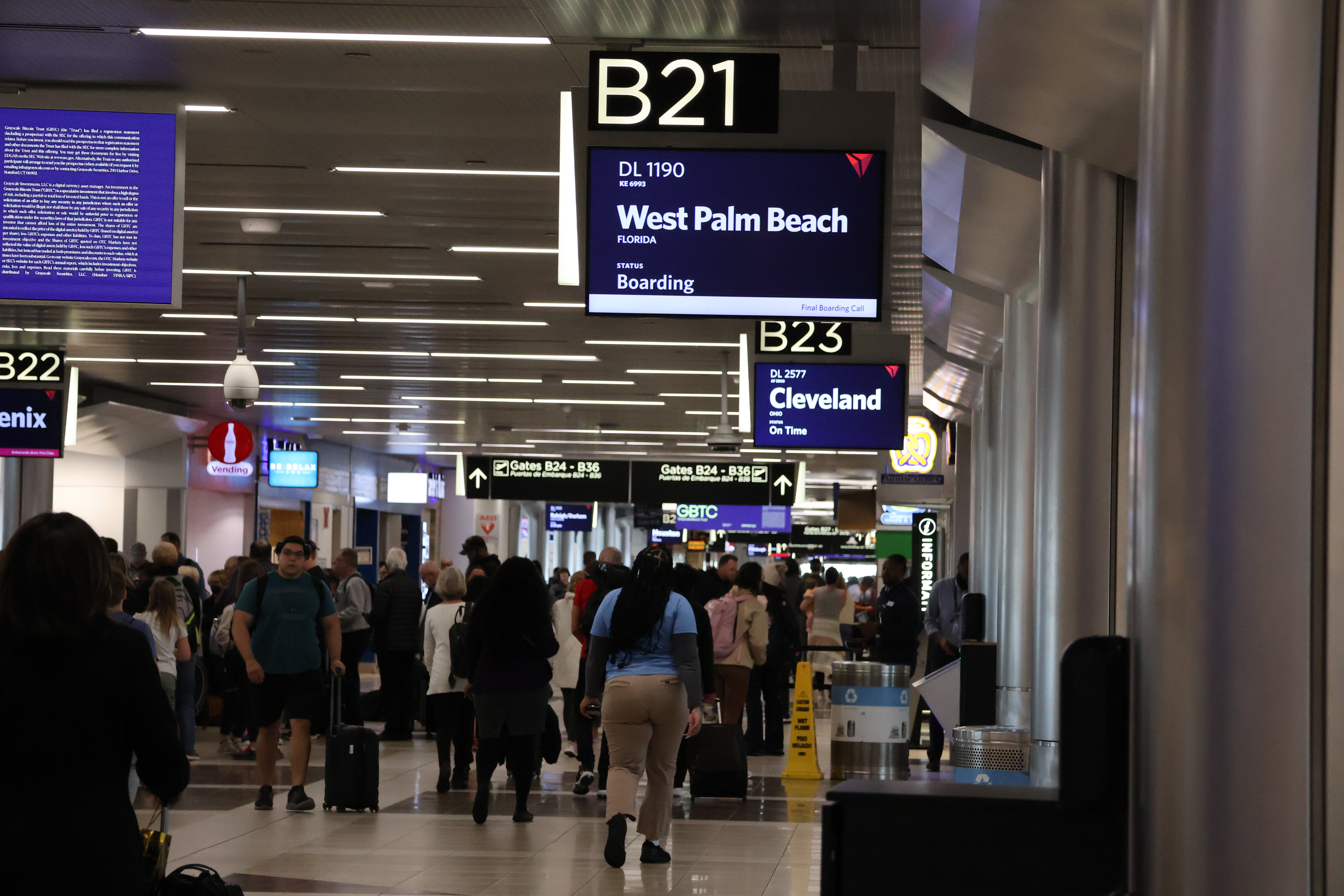
Photo · Concourse B at gate B21Wikimedia Commons
Concourse B, boarding queue at gate B21, December 2023. Photo: DiscoA340, CC BY-SA 4.0, via Wikimedia Commons.
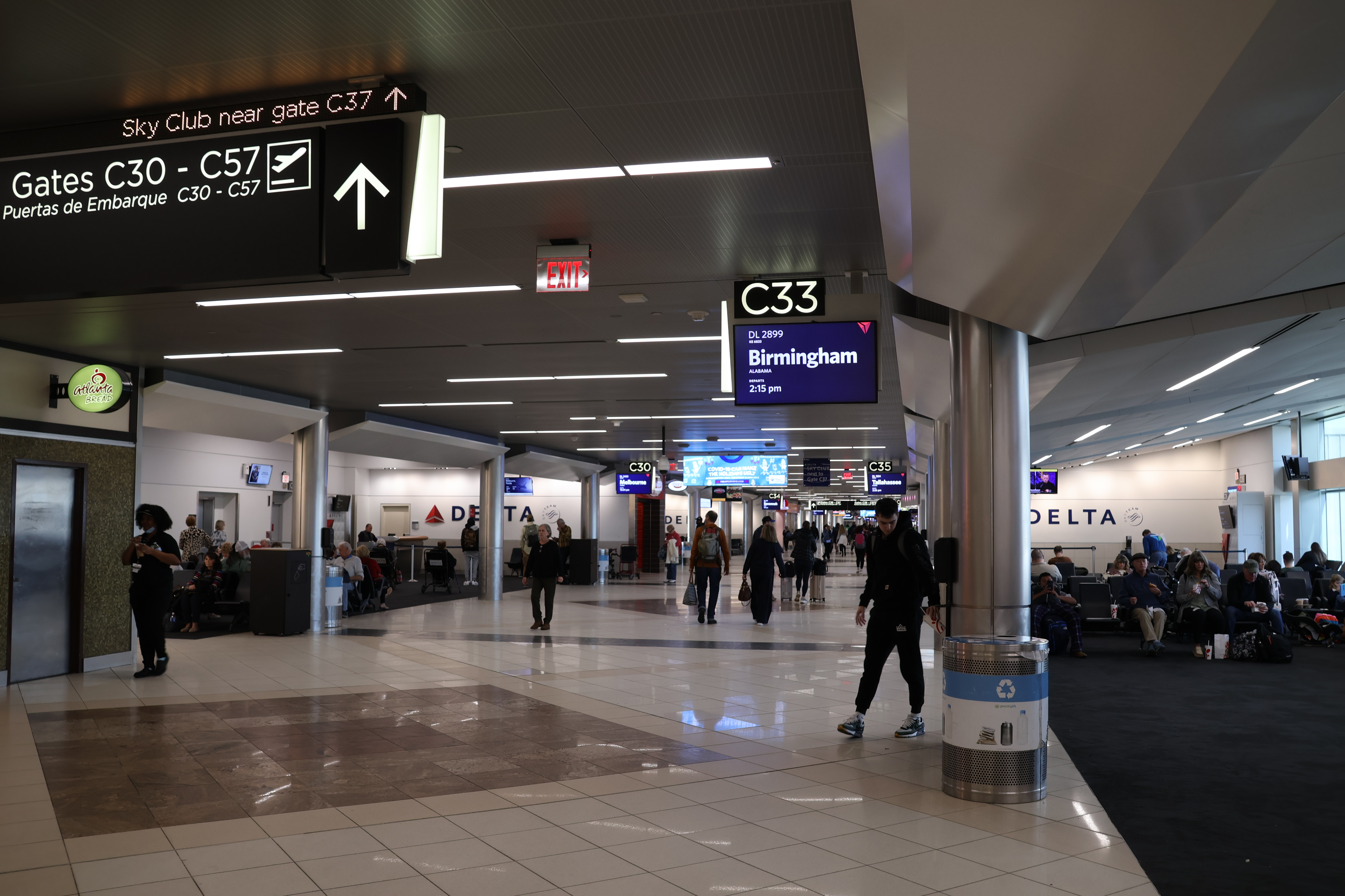
Photo · Concourse C at gate C33Wikimedia Commons
Concourse C at gate C33, December 2023. Photo: DiscoA340, CC BY-SA 4.0, via Wikimedia Commons.
4.6 Concourses D, E and F
Concourse D hosts Delta Air Lines held. The widening program's new
gates were turned over to Delta, and a Delta Sky Club sits at the D centerpoint.
Concourse D
AT&T
T-Mobile
Verizon
Over the building: healthy · median
87% · −88.0 dBmn=119
60% · −93.0 dBmn=150
77% · −90.5 dBmn=142
Building verdict
AT&T leads; share margin 11 points, median margin 2.5 dB
Healthy gate points
34 of 41 (83%)
1 of 41 (2%)
0 of 41 (0%)
Gate-area median 5G
−92.4 dBm
−97.5 dBm
−98.6 dBm
Strongest 5G at a gate (count)
AT&T 41
Zone tiles healthyspread 30 points
55%
29%
25%
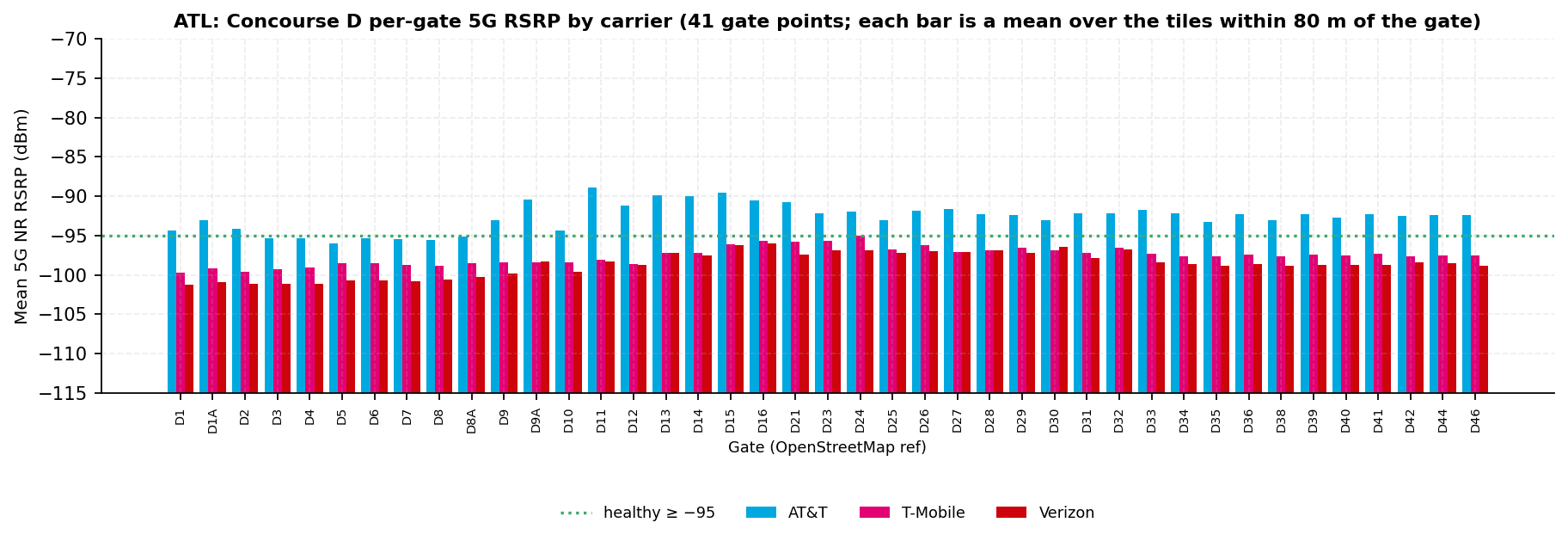
Concourse D was under construction all window
The $1.4 billion widening program, 2024 to 2029, replaces the concourse module by module and widens it from
60 to 90 feet held. Five added gates opened on September 17, 2025 and three more on
June 4, 2026, both inside this window.
Sections of the old concourse were closed throughout. Which gates were out of service on which dates is not
held, so the Concourse D figures blend construction phases.
FIG. 17. Per-gate 5G RSRP across the 41 Concourse D gate points (OpenStreetMap inventory). Each bar is a mean over the tiles within 80 m of the gate. Bars rise from −115 dBm, so a longer bar is a stronger signal. Source: Ookla Cell Analytics per-carrier RF tile export, 2025-09-01 to 2026-08-31.
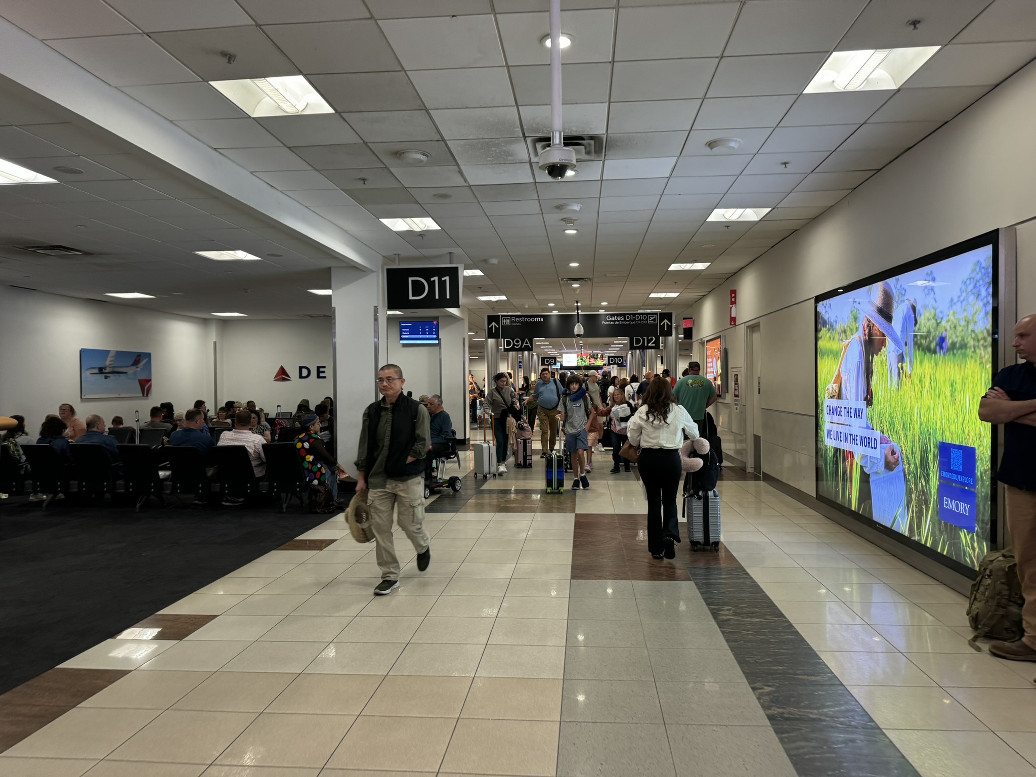
Photo · Concourse D gate D11 hold room, August 2024Wikimedia Commons
Concourse D gate D11 hold room, August 2024, during the widening program. Photo: Vmzp85, CC BY-SA 4.0, via Wikimedia Commons.
The Maynard H. Jackson Jr. International Terminal opened in 2012. Concourse F is attached to it,
and Concourse E is reached through the E-F connector. The airport fact sheet publishes 43 international gates
held.
Concourse E hosts Delta and international carriers held. It has a
Delta Sky Club across from gate E15 and an American Express Centurion Lounge next to gate E11. Per-airline
assignments are not held.
Concourse E
AT&T
T-Mobile
Verizon
Over the building: healthy · median
69% · −92.0 dBmn=339
50% · −95.0 dBmn=464
53% · −95.0 dBmn=379
Building verdict
AT&T leads; share margin 17 points, median margin 3.0 dB
Healthy gate points
18 of 32 (56%)
0 of 32 (0%)
1 of 32 (3%)
Gate-area median 5G
−95.0 dBm
−97.5 dBm
−97.5 dBm
Strongest 5G at a gate (count)
AT&T 20 · tie within 1 dB 12
Zone tiles healthyspread 23 points
52%
29%
29%
Concourse F hosts Delta long-haul and foreign-flag carriers held. The
official 2012 map shows gates F1 to F14. A Delta Sky Club and The Club at ATL sit on the mezzanine level. The
table adds the International Terminal building itself.
Concourse F
AT&T
T-Mobile
Verizon
Over the building: healthy · median
55% · −94.0 dBmn=157
38% · −97.0 dBmn=217
36% · −99.0 dBmn=166
Building verdict
AT&T leads; share margin 17 points, median margin 3.0 dB
International Terminal building: healthy · median
49% · −96.0 dBmn=49
27% · −97.0 dBmn=60
61% · −93.0 dBmn=59
International Terminal verdict
Verizon leads; share margin 12 points, median margin 3.0 dB
Healthy gate points (count)
2 of 12
0 of 12
0 of 12
Gate-area median 5G
−97.1 dBm
−97.6 dBm
−98.5 dBm
Strongest 5G at a gate (count)
Tie within 1 dB 6 · AT&T 4 · T-Mobile 2
Zone tiles healthyspread 21 points
36%
42%
57%
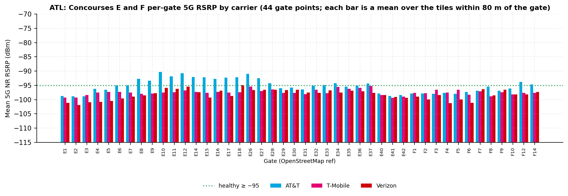
Fig. 18 · Per-gate 5G RSRP · 44 Concourse E and F gate pointsSource · Ookla
FIG. 18. Per-gate 5G RSRP across the 44 Concourse E and F gate points (OpenStreetMap inventory). Each bar is a mean over the tiles within 80 m of the gate. Bars rise from −115 dBm, so a longer bar is a stronger signal. Source: Ookla Cell Analytics per-carrier RF tile export, 2025-09-01 to 2026-08-31.
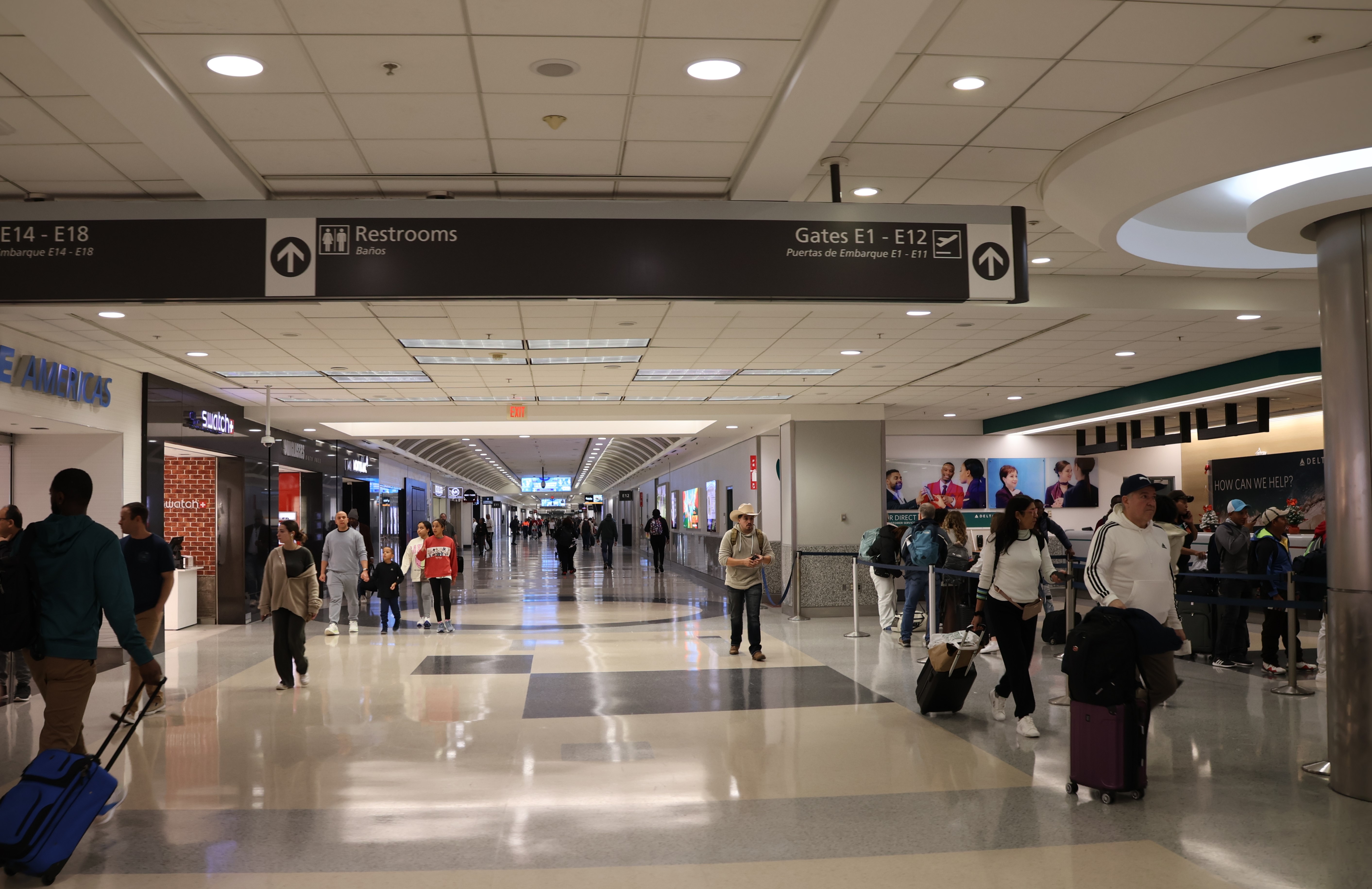
Photo · Concourse E, gates E1 to E12Wikimedia Commons
Concourse E, gates E1 to E12 signage, December 2023. Photo: DiscoA340, CC BY-SA 4.0, via Wikimedia Commons.
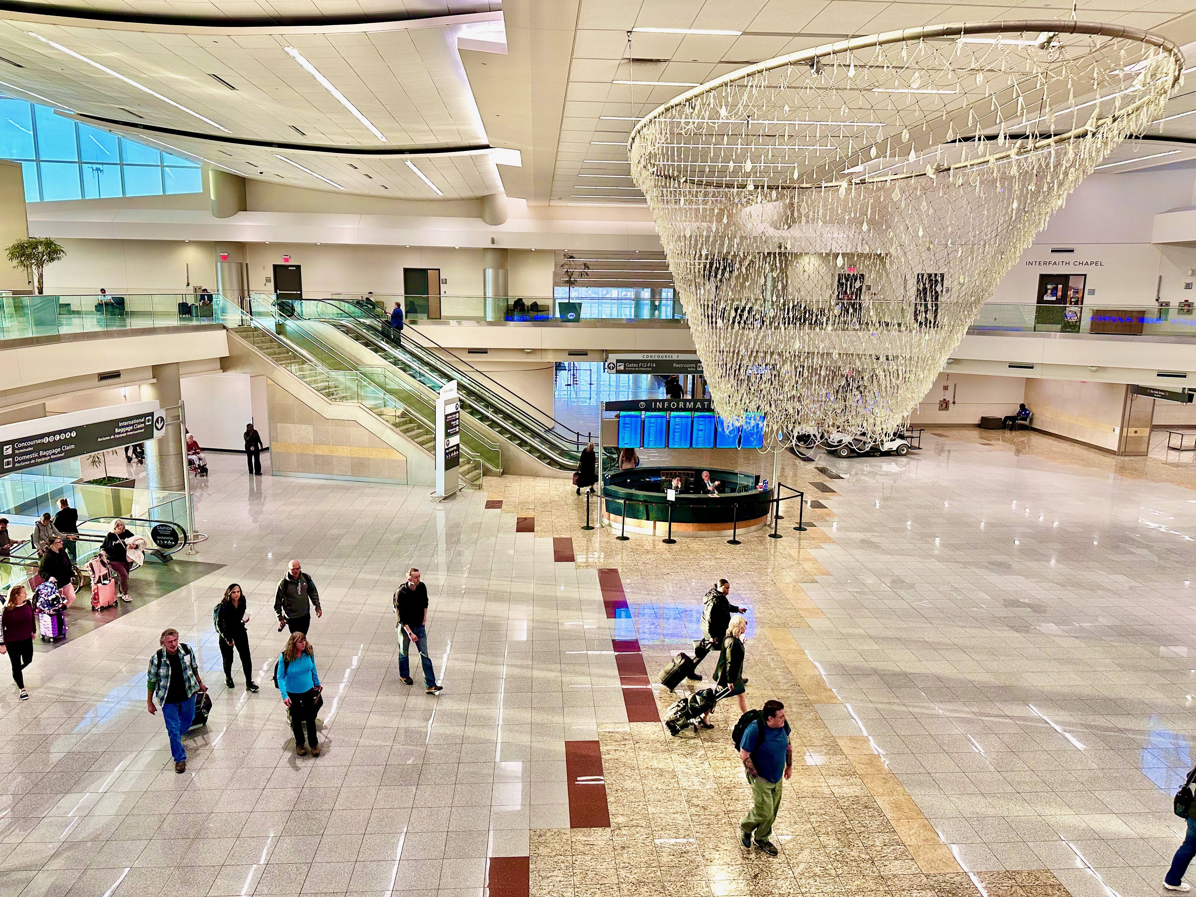
Photo · Concourse F central atriumWikimedia Commons
Concourse F central atrium, May 2023. The International Terminal building is the lowest building reading for T-Mobile and AT&T, and Concourse F is the lowest for Verizon (section 4.7). Photo: Harrison Keely, CC BY 4.0, via Wikimedia Commons.
4.7 Building-masked view (OSM polygons)
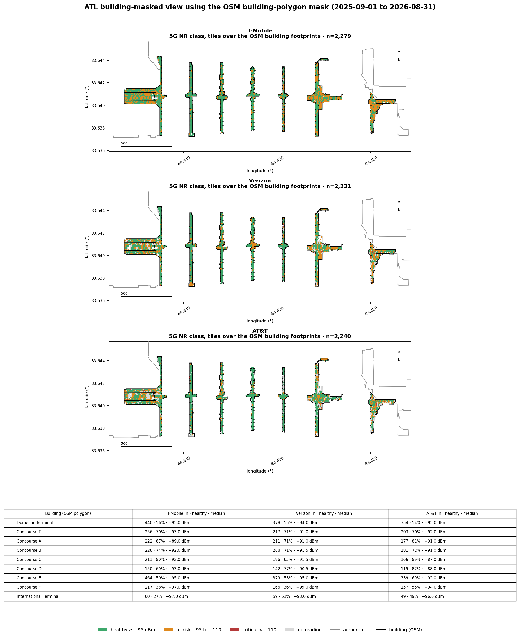
This is the only basis on which the report names a leader. Over the nine passenger buildings, the
three carriers are far closer than at the gate areas.
Three buildings are ties: the Domestic Terminal, Concourse T and Concourse B. AT&T leads over
Concourses C, D, E and F. T-Mobile leads over Concourse A, and Verizon over the International Terminal.
Leader rule, stated once
A carrier leads a building only when it is alone at the top on both measures: the healthy share by more than
1 point and the median by more than 1 dB. Otherwise every carrier within those margins of the top on either measure is tied.
The rule runs on unrounded values, so a printed 70% can sit more than 1 point from a printed 71%. The margins
shown are the unrounded ones. Every ranked cell clears the 30-tile floor.
Fig. 19 · 5G NR class for tiles over the nine OSM building footprintsSource · Ookla · OSM
FIG. 19. Tiles whose centroid falls inside a pinned OSM passenger-building polygon, colored by 5G NR class, with the per-building per-carrier table. The polygons are the seven concourses, the Domestic Terminal, and the International Terminal. This is our OSM building-polygon mask, not Ookla's Indoor layer. Source: Ookla Cell Analytics per-carrier RF tile export, 2025-09-01 to 2026-08-31.
Building (OSM polygon)
AT&T · n · healthy · median
T-Mobile · n · healthy · median
Verizon · n · healthy · median
Leader (tie-aware)
Domestic Terminal
354 · 54% · −95.0 dBm
440 · 56% · −95.0 dBm
378 · 55% · −94.0 dBm
Three-way tieshare margin 0 points · median 1.0 dB
Concourse T
203 · 70% · −92.0 dBm
256 · 70% · −93.0 dBm
217 · 71% · −91.0 dBm
Two-way tie (AT&T, Verizon)share margin 1 point · median 1.0 dB
Concourse A
177 · 81% · −91.0 dBm
222 · 87% · −89.0 dBm
211 · 71% · −91.0 dBm
T-Mobile leadsshare margin 6 points · median 2.0 dB
Concourse B
181 · 72% · −91.0 dBm
228 · 74% · −92.0 dBm
208 · 71% · −91.5 dBm
Three-way tieshare margin 2 points · median 0.5 dB
Concourse C
166 · 89% · −87.0 dBm
211 · 80% · −92.0 dBm
196 · 65% · −91.5 dBm
AT&T leadsshare margin 8 points · median 4.5 dB
Concourse D
119 · 87% · −88.0 dBm
150 · 60% · −93.0 dBm
142 · 77% · −90.5 dBm
AT&T leadsshare margin 11 points · median 2.5 dB
Concourse E
339 · 69% · −92.0 dBm
464 · 50% · −95.0 dBm
379 · 53% · −95.0 dBm
AT&T leadsshare margin 17 points · median 3.0 dB
Concourse F
157 · 55% · −94.0 dBm
217 · 38% · −97.0 dBm
166 · 36% · −99.0 dBm
AT&T leadsshare margin 17 points · median 3.0 dB
International Terminal
49 · 49% · −96.0 dBm
60 · 27% · −97.0 dBm
59 · 61% · −93.0 dBm
Verizon leadsshare margin 12 points · median 3.0 dB
5G over the building footprints. Healthy = tile 5G RSRP ≥ −95 dBm; median over the tiles whose centre falls within the polygon. n counts tiles, not scans.
Carrier
Lowest building
Healthy
Highest building
Healthy
AT&T
International Terminal
49%
Concourse C
89%
T-Mobile
International Terminal
27%
Concourse A
87%
Verizon
Concourse F
36%
Concourse D
77%
LTE is the fall-back layer when 5G is weak. Over the same footprints it reads as follows.
Building (OSM polygon)
AT&T · n · LTE healthy · median
T-Mobile · n · LTE healthy · median
Verizon · n · LTE healthy · median
Domestic Terminal
438 · 77% · −92.0 dBm
436 · 49% · −96.0 dBm
431 · 69% · −93.0 dBm
Concourse T
259 · 78% · −91.0 dBm
258 · 66% · −93.0 dBm
250 · 60% · −93.0 dBm
Concourse A
212 · 88% · −89.0 dBm
215 · 72% · −91.0 dBm
220 · 83% · −90.5 dBm
Concourse B
226 · 85% · −91.0 dBm
226 · 71% · −93.0 dBm
229 · 71% · −92.0 dBm
Concourse C
207 · 84% · −89.0 dBm
210 · 72% · −91.5 dBm
211 · 81% · −92.0 dBm
Concourse D
150 · 86% · −90.0 dBm
150 · 69% · −92.0 dBm
152 · 80% · −90.0 dBm
Concourse E
450 · 76% · −91.0 dBm
453 · 71% · −92.0 dBm
447 · 73% · −91.0 dBm
Concourse F
218 · 80% · −91.0 dBm
214 · 49% · −96.0 dBm
206 · 32% · −98.0 dBm
International Terminal
61 · 85% · −90.0 dBm
58 · 33% · −98.0 dBm
59 · 51% · −95.0 dBm
LTE over the building footprints, the graceful-degradation floor on the leader basis. n counts tiles.
Why the gate areas cannot name a leader. The area within 80 m of each gate reaches the apron on
both sides of each pier. Across the 201 gate points, a median of 22.4% of those tiles sit over a building. The
highest at any gate is 68%. So a gate-area figure is mostly an outdoor apron reading.
Concourse
Median share of gate-area tiles over a building
Concourse T
21.8%
Concourse A
22.8%
Concourse B
23.2%
Concourse C
23.9%
Concourse D
15.2%
Concourse E
22.6%
Concourse F
34.2%
At the gate areas, T-Mobile and Verizon sit below the line at nearly every gate. Over the buildings,
the three are tied at three buildings and T-Mobile leads over Concourse A.
What the building mask can and cannot show
The mask tests each tile's centre against the pinned OpenStreetMap footprints. It selects tiles over a
building, not tiles measured inside it (section 16). Ookla's own Indoor layer is not used here (section 15).
The gap between the building and apron readings fits an in-building system that serves the pier interiors and
hands off to the macro layer at the building edge. It fits equally well with a pier's own structure weakening a
mid-band macro signal. The export cannot separate the two. Recommendation 1 asks for the record that would.
4.8 What the readings mean along the passenger journey (interpretation)
Read this as a walk, not a leader board. Every number is a crowdsourced tile aggregate, and the basis
changes by stage.
Photo · MARTA Airport Station fare gatesWikimedia Commons
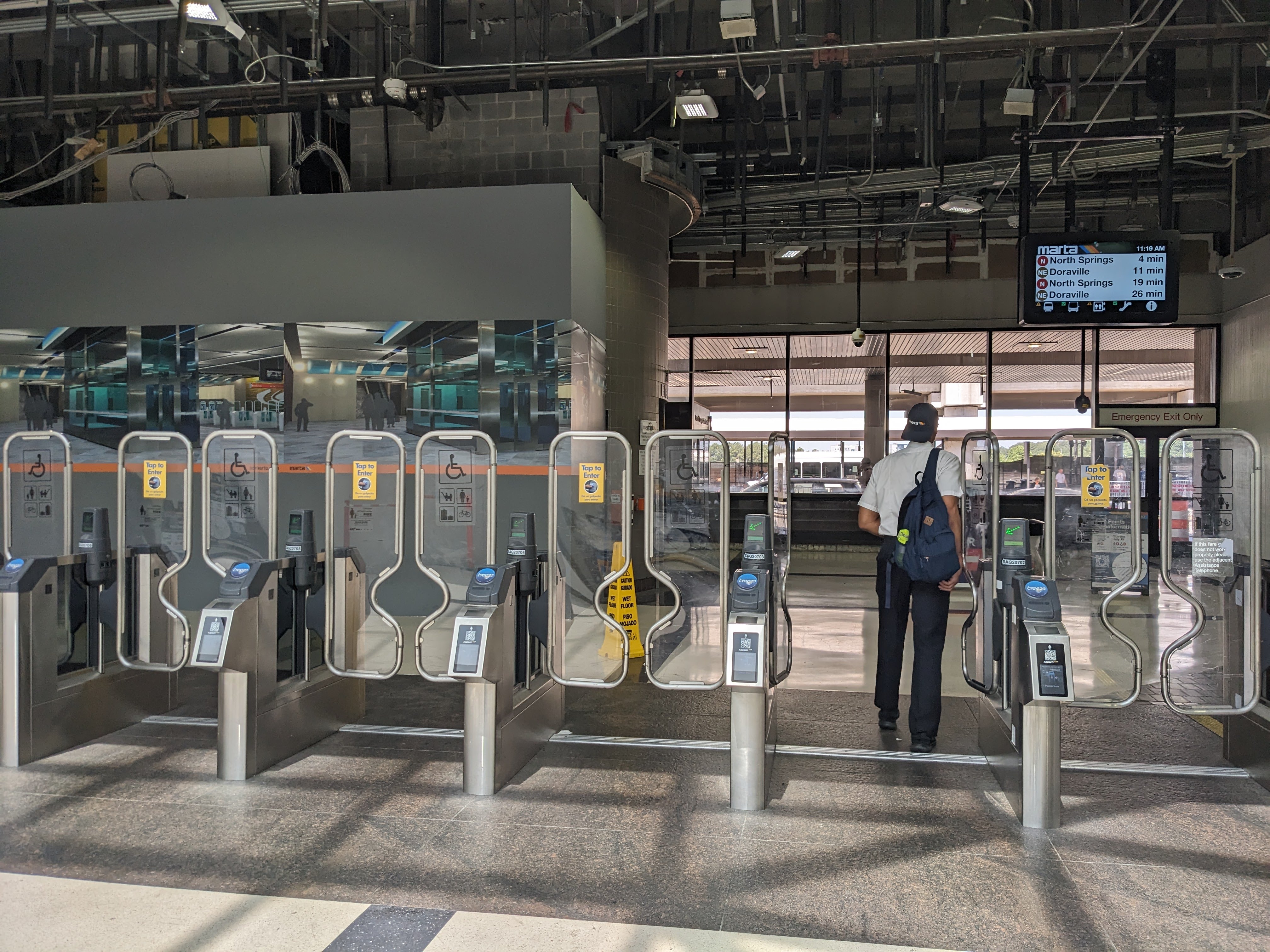
MARTA Airport Station fare gates at the west end of the Domestic Terminal, June 2024. This is the first place an arriving rail passenger's handset meets the airport network. Photo: ElToAn123, CC BY-SA 4.0, via Wikimedia Commons.
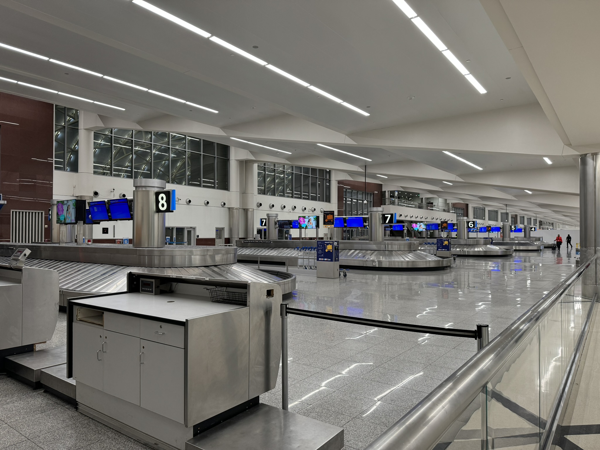
Domestic Terminal baggage claim, carousel 8, August 2024. Photo: Vmzp85, CC BY-SA 4.0, via Wikimedia Commons.
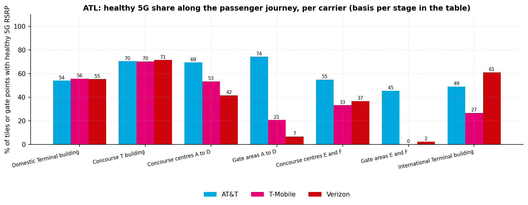
Fig. 20 · Healthy 5G share per carrier at each stage of the passenger journeySource · Ookla · OSM
FIG. 20. Healthy 5G share per carrier at each stage of a passenger's path. The stages are the Domestic Terminal building, Concourse T, the concourse centres at the Plane Train, the gate areas, and the International Terminal. The basis changes by stage (building mask, 80 m pools around the concourse centres, per-gate means) and is named in the table. Source: Ookla Cell Analytics per-carrier RF tile export, 2025-09-01 to 2026-08-31; OpenStreetMap footprints.
Journey stage (basis)
AT&T: healthy · median
T-Mobile: healthy · median
Verizon: healthy · median
Domestic Terminal buildingcheck-in, security, baggage claim; tiles over the footprint
54% · −95.0 dBmn=354
56% · −95.0 dBmn=440
55% · −94.0 dBmn=378
Concourse T buildingthe first pier, reached on foot
70% · −92.0 dBmn=203
70% · −93.0 dBmn=256
71% · −91.0 dBmn=217
Concourse centres A to DPlane Train station; tiles within 80 m of the centre
69% · −91.0 dBmn=392
53% · −95.0 dBmn=730
42% · −97.0 dBmn=672
Gate areas A to Dper-gate means within 80 m; mostly apron
74% · −92.7 dBmn=136
21% · −96.2 dBmn=136
7% · −97.5 dBmn=136
Concourse centres E and FPlane Train station
55% · −94.0 dBmn=182
33% · −97.0 dBmn=370
37% · −98.0 dBmn=226
Gate areas E and Fper-gate means within 80 m
45% · −95.3 dBmn=44
0% · −97.5 dBmn=44
2% · −98.0 dBmn=44
International Terminal buildinginternational check-in and arrivals; tiles over the footprint
49% · −96.0 dBmn=49
27% · −97.0 dBmn=60
61% · −93.0 dBmn=59
n counts tiles for building and centre rows and gate points for gate-area rows.
Check-in, security and baggage claim are even. In the Domestic Terminal building the three
carriers are within 2 points of each other. Every median sits at or near the healthy line, so the experience is
middling but similar whatever the handset.
Over the domestic pier footprints, every carrier is above half. The Plane Train delivers
passengers to a concourse centre (the journey table in this section). Over the Concourse A to D
buildings, the lowest share for any carrier is 60%.
Carrier
Healthy over Concourses A to D (buildings)
Lowest pier building
AT&T
72 to 89%
Concourse B (72%)
T-Mobile
60 to 87%
Concourse D (60%)
Verizon
65 to 77%
Concourse C (65%)
The apron-weighted gate areas are where the carriers separate. Apron-weighted means most of the
80 m pool around each gate is apron, not building. At the A to D gate areas, AT&T is healthy at 74% of gate
points, T-Mobile at 21% and Verizon at 7%. So on the apron side of these gates, T-Mobile and Verizon read below
the line on 5G more often than not, and AT&T does not. The data does not reach the jet bridge itself.
The international side holds each carrier's lowest building. AT&T and T-Mobile read lowest
over the International Terminal (49% and 27%), and Verizon over Concourse F (36%). Verizon is also the one carrier
above half over the International Terminal building (61%). At the E and F gate areas, T-Mobile and Verizon are
healthy at almost no gate points.
LTE holds over the pier footprints and thins on the apron. Over the building footprints, LTE is
healthy on 76 to 88% of tiles for AT&T, 33 to 72% for T-Mobile and 32 to 83% for Verizon. At the gate points,
the LTE medians are AT&T −92.4, T-Mobile −95.8 and Verizon −96.4 dBm. Section 9.2 gives service availability.
Section 5
Tenant level
284 points · tile basis behind each category
Tenant readings use 284 mapped points. They come from a Google Places and OpenStreetMap capture pinned 2026-09-21.
Most categories hold 30 points or fewer, so comparisons do not run on points. They run on the tiles within 80 m of each category's points, deduplicated. Point counts appear on every axis.
How to read this section
Every tenant pool includes apron and roadway tiles. Tile RSRP is a whole number of dB, so medians and differences move in 1 dB steps. A margin of 1 dB or less is a tie, not a ranking.
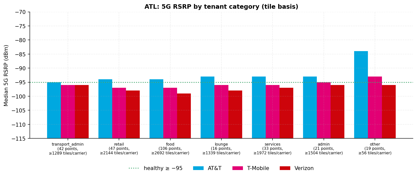
5.1 Category signal strength and quality
Seven categories clear the 30-tile floor for every carrier: transport_admin, retail, food, lounge, services, admin and other. The spread between carriers differs by category.
Category
Carrier-to-carrier spread (tile median)
transport_admin
1 dB
retail
4 dB
food
5 dB
lounge
5 dB
services
4 dB
admin
3 dB
other
12 dB
This report does not publish a category ordering. Read the charts as a pattern.
Fig. 21 · Median 5G RSRP by tenant categorySource · Ookla
FIG. 21. Median 5G RSRP by tenant category (tile basis; points and minimum tiles per carrier on the axis). Bars rise from −115 dBm, so a longer bar is a stronger signal. Source: Ookla Cell Analytics per-carrier RF tile export, 2025-09-01 to 2026-08-31.
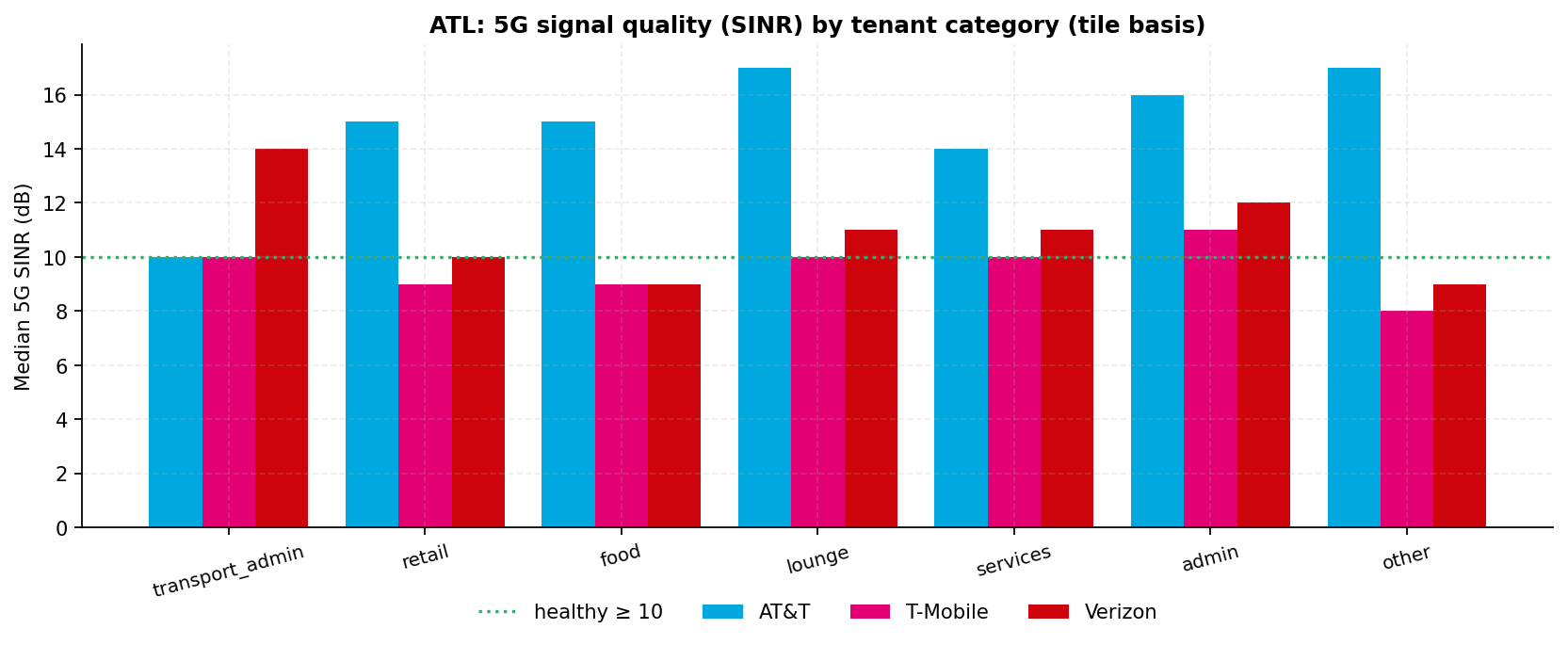
Fig. 22 · Median 5G SINR by tenant categorySource · Ookla
FIG. 22. Median 5G SINR by tenant category (tile basis). Source: Ookla Cell Analytics per-carrier RF tile export, 2025-09-01 to 2026-08-31.
5.2 Terminal vs periphery RSRP proxy
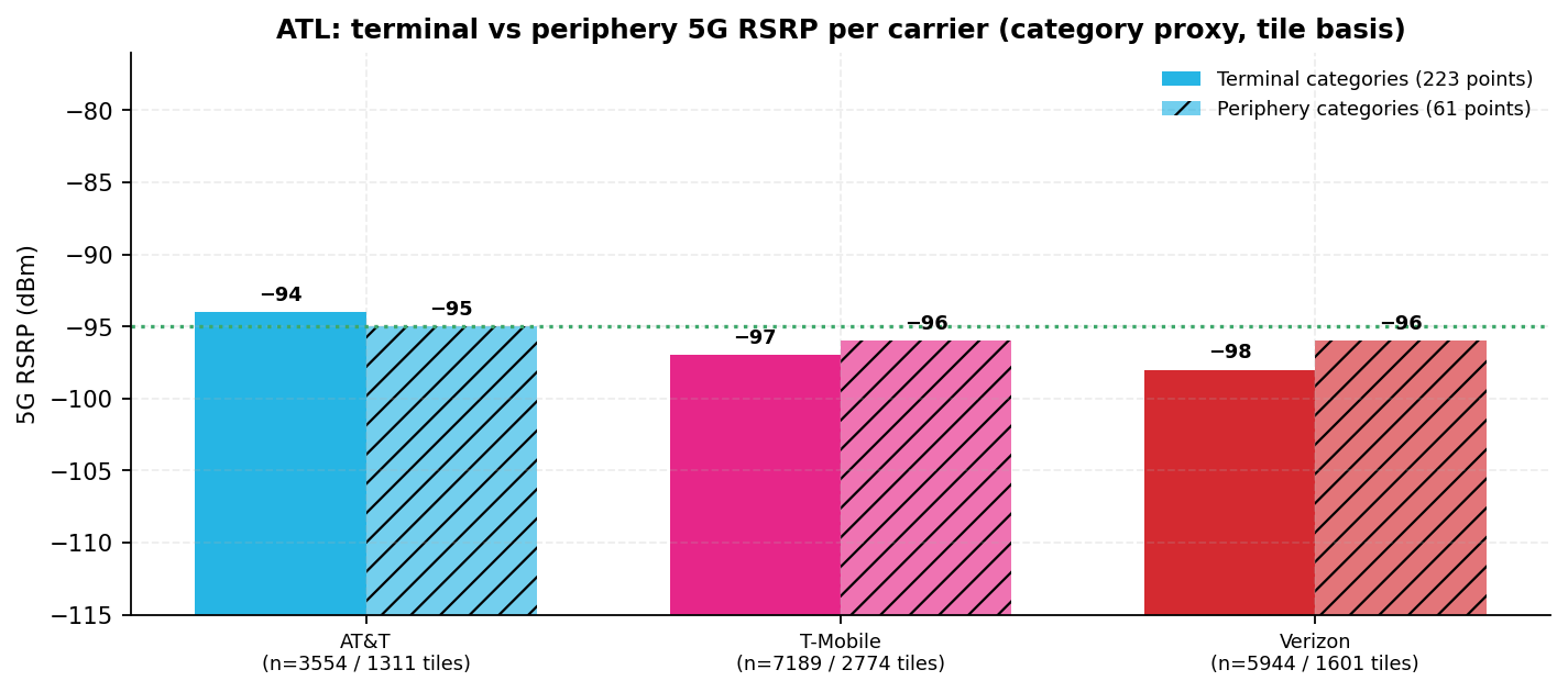
This proxy compares tenants over the building footprints with tenants outside them. Terminal categories are the concessions, lounges and services in the concourse and terminal footprints. Periphery categories are the parking decks and lots, the hotel and the fire stations.
Periphery minus terminal median 5G RSRP, tile basis.
A large positive delta is consistent with macro signal spilling in from outside. A negative delta, where the terminal reads stronger, is consistent with an in-building source serving the concourses.
Two of the three deltas sit within the 1 dB noise floor. AT&T at −1.0 dB and T-Mobile at +1.0 dB are ties, so neither is evidence of an in-building source. Only Verizon's +2.0 dB clears the floor, and it is consistent with macro spill from outside.
Distance to macro sites confounds all three readings. Section 9.3 places the estimated macro sites.
Fig. 23 · Median 5G RSRP · terminal vs periphery tenant categoriesSource · Ookla
FIG. 23. Per-carrier median 5G RSRP, terminal tenant categories vs periphery categories, on the tile basis. Proxy: category-based masking, not Ookla's building-polygon indoor mask (queued, section 15). Bars rise from −115 dBm, so a longer bar is a stronger signal. Source: Ookla Cell Analytics per-carrier RF tile export, 2025-09-01 to 2026-08-31.
5.3 Airline gate clusters
An airline sees its exposure through its concourse and its passengers' carriers. The airline column is the set the airport's published concourse guide places in each concourse.
Concourse groupings, not airline measurements
A per-airline gate assignment is not held. Each row is a concourse, and its tile pool includes apron and roadway.
Concourse: airlines held
Gate points (n)
AT&T median 5G RSRP
T-Mobile median 5G RSRP
Verizon median 5G RSRP
Concourse T (Domestic Terminal complex): American, United and Delta, with other domestic carriers
21
−95.0 dBmn=2518
−97.0 dBmn=4995
−99.0 dBmn=3403
Concourse A (Domestic Terminal complex): Delta Air Lines
29
−96.0 dBmn=612
−98.0 dBmn=1696
−100.0 dBmn=1535
Concourse B (Domestic Terminal complex): Delta Air Lines
32
−96.0 dBmn=539
−100.0 dBmn=1829
−100.0 dBmn=1554
Concourse C (Domestic Terminal complex): Delta Connection and Southwest Airlines
34
−93.0 dBmn=387
−99.0 dBmn=1514
−100.0 dBmn=1259
Concourse D (Domestic Terminal complex): Delta Air Lines
41
−94.0 dBmn=440
−99.0 dBmn=1548
−102.0 dBmn=1361
Concourse E (International Terminal complex): Delta and international carriers
32
−95.0 dBmn=845
−99.0 dBmn=2595
−100.0 dBmn=2068
Concourse F (International Terminal complex): Delta long-haul and foreign-flag carriers
12
−99.0 dBmn=1107
−97.0 dBmn=3283
−93.0 dBmn=1895
Tile basis; n = tiles per carrier per concourse. Airline sets transcribed from the airport's published concourse guide.
5.4 Retail and food brand coverage
Brands with several locations are a consistency check across zones, not a comparison. Each has 6 points at most, so no carrier ordering is read from this table.
30 of the 45 cells sit below the healthy line. Every cell carries its coverage class, so a sub-healthy value cannot pass unmarked. Each point value is a mean over the tiles within 80 m of the point. Each cell is the median of those point values across the brand's points, and n sums the tiles behind them.
Brand (2 or more points)
Points (n)
AT&T median 5G RSRP (dBm)
T-Mobile median 5G RSRP (dBm)
Verizon median 5G RSRP (dBm)
Starbucks
6
−91.9healthy, n=917
−95.5at-risk, n=1020
−96.5at-risk, n=952
Chick-fil-A
2
−91.7healthy, n=316
−93.0healthy, n=357
−95.8at-risk, n=348
Popeyes
3
−93.7healthy, n=544
−96.9at-risk, n=570
−97.8at-risk, n=569
Dunkin
3
−94.3healthy, n=529
−95.7at-risk, n=563
−97.7at-risk, n=542
TGI Friday
3
−93.1healthy, n=525
−96.4at-risk, n=551
−96.5at-risk, n=528
Auntie Anne
3
−91.9healthy, n=499
−96.2at-risk, n=531
−97.4at-risk, n=548
Five Guys
2
−91.1healthy, n=309
−94.7healthy, n=358
−95.7at-risk, n=342
McDonald
2
−93.8healthy, n=366
−95.7at-risk, n=388
−96.2at-risk, n=366
Burger King
2
−95.2at-risk, n=371
−96.5at-risk, n=382
−95.7at-risk, n=363
Caribou Coffee
2
−96.0at-risk, n=336
−97.7at-risk, n=355
−99.7at-risk, n=346
Qdoba
2
−92.5healthy, n=385
−95.2at-risk, n=391
−94.3healthy, n=368
Asian Chao
2
−94.1healthy, n=327
−96.8at-risk, n=359
−97.7at-risk, n=358
Hudson
4
−95.5at-risk, n=402
−96.9at-risk, n=479
−97.9at-risk, n=406
InMotion
5
−93.8healthy, n=883
−95.6at-risk, n=941
−97.0at-risk, n=899
Tumi
2
−93.7healthy, n=366
−97.5at-risk, n=384
−96.5at-risk, n=352
Count-only view (fewer than 30 points per brand); never ranked. n = tiles. Per-point tile n in Appendix A of the report.
5.5 Airline and premium lounges present in the pinned capture
The capture holds 16 lounge points. A hygiene pass refiled the airline and card-issuer lounges that the capture had listed as food or restaurant.
Each lounge is a single point, reported for scope and not ranked. Names are printed as the capture spells them.
Carrier
Lounge points healthy (count)
Median 5G RSRP across points
AT&T
12 of 16
−92.8 dBm
T-Mobile
3 of 16
−96.8 dBm
Verizon
1 of 16
−97.5 dBm
Counts of single lounge points, not a ranking.
Lounge point
Zone
AT&T 5G RSRP
T-Mobile 5G RSRP
Verizon 5G RSRP
Admirals Club
Concourse T
−94.6 dBmhealthy, n=185
−95.2 dBmat-risk, n=186
−97.3 dBmat-risk, n=171
Delta Sky Club (Concourse T)
Concourse T
−95.4 dBmat-risk, n=186
−97.6 dBmat-risk, n=191
−100.0 dBmat-risk, n=182
USO Hartsfield-Jackson Atlanta International Airport
Concourse T
−92.8 dBmhealthy, n=189
−93.8 dBmhealthy, n=192
−90.8 dBmhealthy, n=188
United Club
Concourse T
−95.5 dBmat-risk, n=174
−94.9 dBmhealthy, n=179
−97.1 dBmat-risk, n=157
Delta Sky Club (Concourse A near Gate A17)
Concourse A
−92.7 dBmhealthy, n=190
−94.3 dBmhealthy, n=193
−96.3 dBmat-risk, n=193
Minute Suites - ATL B24
Concourse B
−92.3 dBmhealthy, n=178
−96.6 dBmat-risk, n=187
−98.0 dBmat-risk, n=185
Delta Sky Club (Concourse C)
Concourse C
−91.9 dBmhealthy, n=173
−95.3 dBmat-risk, n=193
−97.4 dBmat-risk, n=185
Delta Sky Club (Concourse D)
Concourse D
−90.4 dBmhealthy, n=174
−95.5 dBmat-risk, n=175
−95.8 dBmat-risk, n=174
Delta Skyclub Lounge
Concourse D
−91.9 dBmhealthy, n=140
−97.0 dBmat-risk, n=165
−97.7 dBmat-risk, n=168
American Express Centurion Lounge
Concourse E
−91.8 dBmhealthy, n=182
−97.4 dBmat-risk, n=191
−97.5 dBmat-risk, n=182
Delta Sky Club (Concourse E)
Concourse E
−93.6 dBmhealthy, n=169
−98.1 dBmat-risk, n=193
−99.7 dBmat-risk, n=184
Delta Skyclub Lounge
Concourse E
−92.1 dBmhealthy, n=161
−97.6 dBmat-risk, n=191
−99.1 dBmat-risk, n=174
Minute Suites ATL – Concourse E, Atrium
Concourse E
−92.1 dBmhealthy, n=182
−96.6 dBmat-risk, n=188
−96.4 dBmat-risk, n=174
Delta Sky Club (Concourse F)
Concourse F
−95.7 dBmat-risk, n=186
−98.0 dBmat-risk, n=187
−98.1 dBmat-risk, n=182
Minute Suites ATL - Concourse F
Concourse F
−96.7 dBmat-risk, n=150
−97.0 dBmat-risk, n=186
−98.9 dBmat-risk, n=135
The Club at ATL
Concourse F
−94.7 dBmhealthy, n=192
−97.0 dBmat-risk, n=193
−96.1 dBmat-risk, n=189
Single-point aggregates over the tiles within 80 m of each point; n = tiles. Reported for scope, not ranked.
A lounge is where a passenger sits for an hour with a laptop. Section 5.6 reads these results together with the Wi-Fi figures.
5.6 What the readings mean for tenants (interpretation)
A concessionaire's question is not which carrier wins. It is whether a customer at the counter, and the payment terminal behind it, has usable signal on whatever network they use.
Concessions sit at the concourse centres and along the pier interiors. The table reads the tiles within 80 m of the food and retail points in each concourse.
Fig. 24 · Healthy 5G share over the concession areas per concourse and carrierSource · Ookla · OSM
FIG. 24. Share of tiles with healthy 5G within 80 m of the food and retail points in each concourse, per carrier. The axis shows the point count per concourse. The pools sit over the concourse centres and the pier interiors, where the concessions are. Source: Ookla Cell Analytics per-carrier RF tile export, 2025-09-01 to 2026-08-31; OpenStreetMap venue points.
Concourse (concessions)
AT&T: healthy · median 5G
T-Mobile: healthy · median 5G
Verizon: healthy · median 5G
Device density around the concessions (12 months)
Concourse T28 food+retail points
57% · −94.0 dBmn=1,036
49% · −96.0 dBmn=1,532
41% · −98.0 dBmn=1,220
median 20 per tile over 1,664 usage tiles53,777 device-tile observations
Concourse A20 food+retail points
56% · −95.0 dBmn=478
45% · −97.0 dBmn=1,029
37% · −98.0 dBmn=946
median 12 per tile over 1,242 usage tiles32,595 device-tile observations
Concourse B23 food+retail points
57% · −94.0 dBmn=405
38% · −98.0 dBmn=1,035
37% · −99.0 dBmn=927
median 11 per tile over 1,237 usage tiles31,440 device-tile observations
Concourse C17 food+retail points
69% · −91.0 dBmn=279
48% · −96.0 dBmn=800
36% · −99.0 dBmn=678
median 8 per tile over 997 usage tiles23,395 device-tile observations
Concourse D24 food+retail points
62% · −92.0 dBmn=284
33% · −98.0 dBmn=820
31% · −101.0 dBmn=757
median 11 per tile over 1,011 usage tiles24,238 device-tile observations
Concourse E15 food+retail points
68% · −92.0 dBmn=271
41% · −97.0 dBmn=462
41% · −97.5 dBmn=334
median 17 per tile over 497 usage tiles15,062 device-tile observations
Concourse F26 food+retail points
48% · −96.0 dBmn=372
33% · −98.0 dBmn=714
42% · −97.0 dBmn=467
median 10 per tile over 812 usage tiles25,205 device-tile observations
Tile basis behind the food and retail points; n = tiles per carrier. Density is the per-tile median of User_Density (unique devices per tile over the window). The device-tile sum counts a device once per tile it crosses, so it is not used to rank.
Concourse T carries the densest concession floor, at a median of 20 devices per tile. Concourse D is where the weakest carrier's share over the concessions is lowest, at 31%.
Three practical readings follow. Each is an inference from crowdsourced tiles, not a site survey, and each uses the building basis of section 4.7.
On the international side, plan for Wi-Fi and LTE fallback
Over the Concourse F footprint, T-Mobile and Verizon 5G is below the healthy line more often than not (38% and 36% of tiles healthy). Payment terminals, order-ahead pickups and loyalty apps on those networks will lean on Wi-Fi or on LTE.
LTE over the same footprint is healthy on AT&T 80%, T-Mobile 49% and Verizon 32% of tiles. Over the International Terminal building, Verizon is the one carrier above half (61%) and T-Mobile the lowest (27%). There, the same caution applies to T-Mobile and AT&T customers.
Over the domestic piers, every carrier is above half on the building basis. The offload share in each zone (section 7) shows how much traffic already rides Wi-Fi.
Walk-test the lounges first
The lounges (section 5.5) are where passengers typically sit and work for a while. A lounge customer notices a bad hour in a way a passenger buying a coffee does not.
The Wi-Fi layer already exists at the concessions
Section 7.2 shows Wi-Fi observed at every mapped point in every category. What is not held is which of it is the public network and which is tenant-owned. Controller telemetry (section 15) would answer that.
Section 6
Load and density
Device density · zone level
Photo · Domestic Terminal South departures curb, October 2025Wikimedia Commons
Domestic Terminal South upper-level departures curb, October 2025, inside the window. Photo: Mccunicano, CC BY-SA 4.0, via Wikimedia Commons. Illustrative, resized only.
Device density is this dataset's demand signal. This section reports where devices are seen and where they meet weak signal. It does not rank zones or set re-measurement order, which Recommendation 3 sets on the building basis.
What User_Density counts
Ookla's User_Density field counts the unique Android devices seen on a tile over the window, deduplicated within the tile. It does not count simultaneous users, and it does not measure time spent. A sum over many tiles counts a device once per tile it crosses, so it is reported as device-tile observations, never as unique devices.
Density by concourse zone
Per-tile medians are low everywhere. The 95th percentile shows where crowds build. The on-airport median is 2 devices per tile across 44,155 usage tiles.
Zone
Median devices per tile
95th percentile
Usage tiles (n)
Concourse T
4
60
6,664
Concourse A
4
68
2,686
Concourse B
4
67
2,816
Concourse C
3
62
2,492
Concourse D
3
52
2,511
Concourse E
3
48
4,184
Concourse F
2
35
5,277
Demand where no carrier is healthy
This measure puts weak signal and demand in one number. For each zone, it adds up User_Density over the tiles where every carrier reporting 5G is below −95.0 dBm.
Only tiles where all three carriers report are counted, and that total is shown as the denominator. The usage and radio exports share one tile grid and are joined tile to tile. A coarser join would take the worst reading within about 110 m and saturate.
Zone
Device-tile observations where every carrier is below healthy
Of all counted (denominator)
Share
Weakest carrier in the zone tile pool (section 4.1)
Concourse T
10,783
73,153
15%
Verizon
Concourse F
5,918
28,097
21%
AT&T
Concourse E
5,490
27,714
20%
T-Mobile and Verizon tied
Concourse A
5,220
28,006
19%
Verizon
Concourse B
3,175
26,703
12%
T-Mobile and Verizon tied
Concourse D
2,515
20,471
12%
Verizon
Concourse C
1,063
19,619
5%
Verizon
Device-tile observations: a device counts once per tile it crosses, so the sum scales with the zone's tile count. It is not a count of unique devices and not a passenger count. The weakest-carrier column uses the zone basis. It names the carrier with the largest below-healthy share of the zone's tiles, and a margin within 1 point is a tie.
The zone basis and the building basis can disagree. In the Concourse F zone, AT&T has the lowest healthy share (36% of 1,107 tiles). Yet it leads over the Concourse F building by 17 points (section 4.7). The zone pool is mostly apron, taxiway and roadway, so it is not a building verdict.
Concourse T has the largest sum because its zone also holds the Domestic Terminal landside. That includes the hourly and daily decks, the economy lots and the MARTA station, so it carries the most usage tiles.
Fig. 25 · Device density by concourse zone · device-tile observations where no carrier is healthySource · Ookla
FIG. 25. Left: unique-device density by concourse zone (median and 95th percentile per tile; User_Density = unique devices per tile over the window, deduplicated within the tile). Right: device-tile observations on tiles where every carrier is below the healthy line. The count covers only tiles where all three carriers report 5G, and the chart shows that denominator. A sum over tiles counts a device once per tile it crosses. It scales with the zone's tile count and is not a count of unique devices. Source: Ookla Cell Analytics All Networks usage export, 2025-09-01 to 2026-08-31.
Observed data volume
Usage volume shows where bandwidth is consumed, by bearer and by zone. It is sample volume from the crowdsource panel, not total traffic.
Fig. 26 · Observed data volume by concourse zone and bearerSource · Ookla
FIG. 26. Observed data volume by concourse zone and bearer (GB over the 12-month window). Source: Ookla Cell Analytics All Networks usage export, 2025-09-01 to 2026-08-31.
Section 7
Wi-Fi as an augmentation layer
Venue and zone level only
Wi-Fi is already present in every concourse. Wi-Fi usage is observed on 58.4% of the 34,322 on-airport usage tiles that report the Wi-Fi field.
This presence rate is a different figure from the offload share in section 7.1. A tile that does not report the field has no measurement. It is left out of the denominator and is not evidence of no Wi-Fi.
The augmentation opportunity is largest where the worst-served carrier is weakest and Wi-Fi presence is high. At this venue, that is every concourse.
FIG. 27. By concourse zone: the share of tiles where the WEAKEST carrier is below the healthy line, beside the Wi-Fi presence rate. Both bars point the same way, so a tall red bar with a tall purple bar is a zone where Wi-Fi is already carrying the gap. Zone n counts usage tiles that report the Wi-Fi field, so it is smaller than the density n in FIG. 25. Source: Ookla Cell Analytics All Networks usage export, 2025-09-01 to 2026-08-31.
7.1 Offload share (venue and zone level only)
In the concourse zones, 41.7% of observed data volume moves over Wi-Fi.
Scope
Wi-Fi share of observed data volume
Usage tiles (n)
Tiles assigned to a concourse zone
41.7%
26,630
Usage tiles outside every zone
52.4%
17,525
Whole clip (aerodrome plus 200 m buffer)
42.5%
44,155
Offload share = Σ Wi-Fi MB ÷ Σ all MB on the All Networks panel.
The 200 m buffer around the aerodrome takes in the parking decks, the rental-car and hotel approaches, the cargo aprons and roadway. Those are not concourse tiles, so the concourse-zone figure is the headline.
No per-carrier offload
Locked rule (section 16): offload is computed at venue and zone level only. The export does not attribute Wi-Fi usage to any carrier's subscribers, so per-carrier offload cannot be derived and is not implied. The figure blends the public network with tenant, airline lounge, hotel and personal networks.
Fig. 28 · Wi-Fi share of observed data volume by concourse zoneSource · Ookla
FIG. 28. Wi-Fi share of observed data volume by concourse zone, with the venue reference line. Source: Ookla Cell Analytics All Networks usage export, 2025-09-01 to 2026-08-31.
7.2 Tenant-level Wi-Fi footprint
Wi-Fi is observed at every mapped point in every tenant category. Presence does not tell categories apart here. Volume does, and FIG. 29 shows it.
Category
Wi-Fi presence
Points (n)
transport_admin
100%
35
retail
100%
47
food
100%
106
lounge
100%
16
services
100%
32
admin
100%
21
other
100%
13
Fig. 29 · Median observed Wi-Fi data volume per tile by tenant categorySource · Ookla
FIG. 29. Median observed Wi-Fi data volume per tile behind each tenant category. The companion presence-rate chart is not drawn because presence is at or near 100% in every category; the rates and point counts are in the text. Source: Ookla Cell Analytics All Networks usage export, 2025-09-01 to 2026-08-31.
The public network: ATL Free Wi-Fi held
The airport operates ATL Free Wi-Fi on its own network. It launched free in June 2014, with several hundred access points installed by airport IT staff and contractors at a City-approved cost of $5,622,249.
No third-party Wi-Fi concessionaire was found in the public record. The current equipment generation is not held.
The Wi-Fi figures here come only from the Ookla usage layer. Controller telemetry (section 15) would turn presence into capacity.
Section 8
Private wireless and the in-building layer
DAS replacement · CBRS · open items
Hartsfield-Jackson owns its in-building cellular system, and it was being replaced inside this window. The window therefore blends the end-of-life legacy system and the new one.
The airport-owned DAS
A distributed antenna system (DAS) carries the carriers' signals indoors over one shared infrastructure. At ATL it is airport-owned and neutral-host, meaning any carrier can ride it.
Fact
Record
Original system
First commissioned in 2010, with more than 700 antennas across the terminal, atrium, concourses and the underground transportation mall, plus a separate layer for public-safety radio held
Replacement approved
May 19, 2025: the Atlanta City Council approved carrier agreements for a replacement DAS held
Carriers signed
T-Mobile and AT&Theld
Target completion
January 2026, inside this window held
What changes
The airport states the replacement moves the system from 4G to 5G on a neutral-host design that can carry any future carrier, and upgrades the radio distribution used by public-safety personnel held
What the Imagine knowledge graph adds
The reconciled Airport DAS Master (2026-07-28) in the Imagine knowledge graph describes the earlier system.
ATL's DAS is self-owned and neutral host
The record marks DAS, self-owned, and neutral host as yes, and the operator as unknown.
The integrator of the 2018 system
Johnson Controls integrated the 2018 system. Contract term 2018 to 2022 at year precision. A field note records a 50 million dollar project installed by Johnson Controls and SMS that was due to expire in 2022.
Later records name the upgrade but no vendor or dollar figure
A neutral-host DAS deployment row dated 2025 has no vendor recorded. The airport's FY2025 annual comprehensive financial report names a Distributed Antenna System Upgrade as a major capital project, with no dollar figure. The City's FY2026 adopted budget book carries no individual DAS, Wi-Fi or cellular line.
The graph names the integrator of the 2018 system, not of the 2025 replacement. It narrows none of the open items below.
Not held at this issue (asked for in Recommendation 1)
The replacement's integrator and equipment vendor, and the City Council file for the May 19, 2025 carrier agreements.
Verizon's participation in the replacement system. The 2025 release does not name Verizon. Verizon was on the 2010 system.
The actual per-building cutover dates against the January 2026 target, and which buildings were live on the replacement system during this window.
The International Terminal and Concourse F cellular architecture. The airport's technology leadership described it in November 2025 as different from the rest of the campus.
Everything measured in this report stands without these items. They decide what the after reading is measured against.
Private wireless
No public record of a Citizens Broadband Radio Service (CBRS), private LTE or private 5G network at the airport was located. Public-safety radio rides a separate layer of the airport-owned DAS, and the 2025 replacement upgrades that layer not independently verified.
The Ookla drop also held a separate five-tile export labelled with a CBRS operator. Five tiles is below the 30-tile floor, so it is kept in the audit dossier as a count and not surfaced here.
The public Ookla layer does not characterize private networks. AT&T's FirstNet Band 14 (LTE700PS) appears on 2,085 AT&T LTE tiles (section 9.1).
The following table is illustrative, not a finding. It lists typical large-hub workloads and the parties a private program would involve. Nothing in the data supports or selects any row.
Workload
Why a private network fits
Coordination required
Baggage handling system instrumentation
Deterministic latency, contained RF, isolation from passenger traffic
Department of Aviation, baggage system vendors
Ramp and ground-service vehicle telematics
Outdoor airside coverage with controlled SIM provisioning
Airside operations, Delta ramp operations
Push-to-talk and operational voice
Guaranteed-quality voice independent of public carriers
Atlanta Police Department Airport Section, Atlanta Fire Rescue, ground handlers
Fixed cameras and IoT in non-public areas
Bandwidth without consuming public-carrier capacity
Facilities maintenance
Construction-phase connectivity (Concourse D modernization)
Coverage that survives phased construction sequencing
Program management, contractors
Section 9
Spectrum, service availability, and estimated site positions
Bands · availability · Site Finder
9.1 Band distribution
The band a tile attaches to most often shows which spectrum each carrier puts to work at the venue. Sub-1 GHz attachment implies coverage-grade bands. Mid-band attachment implies strong penetration or an in-building source.
Reading the band labels
Labels are Ookla's, printed verbatim: technology plus approximate frequency in MHz. NR2500 and NR2600 are both 2.5 GHz spectrum. LTE800 and NR850 are both 850 MHz cellular spectrum.
NR3700 is C-band, a block of mid-band 5G spectrum.
LTE700PS is FirstNet Band 14, the public-safety broadband band. LTE1800 is an Ookla label as exported, not a United States band allocation.
Band fields populate only where Ookla resolved a serving cell, so band n is smaller than RSRP n (section 16).
Fig. 30 · Strongest-serving band distribution per carrier, 5G NR and LTESource · Ookla
FIG. 30. Strongest-serving band distribution per carrier, 5G NR and LTE (n on each panel). Source: Ookla Cell Analytics per-carrier RF tile export, 2025-09-01 to 2026-08-31.
AT&T (n = 2,223 NR tiles, 24,687 LTE tiles)
NR band
Tiles (n)
Share
LTE band
Tiles (n)
Share
NR3700
1,054
47.4%
LTE1900
7,833
31.7%
NR850
582
26.2%
LTE2100
5,728
23.2%
NR3500
550
24.7%
LTE2300
4,809
19.5%
NR2100
25
1.1%
LTE700
3,965
16.1%
NR1900
11
0.5%
LTE700PS
2,085
8.4%
NR2500
1
0.0%
LTE800
250
1.0%
all other LTE bands
17
0.1%
T-Mobile (n = 26,021 NR tiles, 21,271 LTE tiles)
NR band
Tiles (n)
Share
LTE band
Tiles (n)
Share
NR2500
14,411
55.4%
LTE2100
12,039
56.6%
NR1900
5,356
20.6%
LTE1900
7,316
34.4%
NR2600
3,875
14.9%
LTE700
1,111
5.2%
NR600
2,376
9.1%
LTE1800
765
3.6%
NR3700
3
0.0%
LTE600
40
0.2%
Verizon (n = 9,964 NR tiles, 23,342 LTE tiles)
NR band
Tiles (n)
Share
LTE band
Tiles (n)
Share
NR3700
6,282
63.0%
LTE2100
18,162
77.8%
NR1900
1,990
20.0%
LTE700
2,770
11.9%
NR850
1,095
11.0%
LTE800
1,959
8.4%
NR3500
588
5.9%
LTE1900
450
1.9%
NR2100
8
0.1%
LTE5500
1
0.0%
NR2500
1
0.0%
Share = band tiles ÷ the carrier's band-reporting tile footprint (report Appendix B).
9.2 Service availability
A device keeps a usable LTE layer almost everywhere on the campus. That holds even where the LTE level itself is below the healthy line at the piers (section 4.8).
Carrier
Mean own-network availability
Tiles (n)
Mean general-LTE availability
Tiles (n)
Share of on-airport tiles reporting
AT&T
97%
19,841
100%
19,861
77%
T-Mobile
98%
25,521
99%
25,561
77%
Verizon
98%
22,919
100%
22,947
85%
Availability fields are not populated on every tile. The field-population table in section 16 lists every field on the same basis.
9.3 Estimated site positions (Ookla Site Finder)
Site Finder is Ookla's estimate of where each serving node sits, computed from the same crowdsourced tiles. It is a layer of estimated positions, not a registry.
How this report reads the layer, and no further
A centroid inside a 60 m wide concourse pier is consistent with a node in that pier, not with a macro site outside it. But a centroid is the position of the devices that reported a cell. An in-building remote in the pier produces the same result as a macro sector whose reporting devices were all inside the pier. The layer cannot tell them apart.
That in-building infrastructure exists rests on the held DAS record (section 8), not on this layer. That record names T-Mobile and AT&T as signed to the replacement system. Verizon's participation in this window is not held. The layer is read as consistent with that record and no further.
Fig. 31 · Ookla Site Finder LTE and 5G centroids over the terminal and concourse areaSource · Ookla
FIG. 31. Ookla Site Finder LTE (circles) and 5G (triangles) centroids over the terminal and concourse area, per carrier, with the passenger-building footprints. Centroids are Ookla's ESTIMATED site positions derived from crowdsourced RF, not carrier registry data. Source: Ookla Cell Analytics Site Finder LTE and 5G centroid workbooks (estimated site positions), pulled with the 2026-09-21 drop.
All three carriers show estimated nodes of both technologies inside the building footprints.
Tech
Carrier
Centroids (all)
On-airport
Within a passenger-building footprint
Per building
Median distance to the nearest building (on-airport)
LTE
AT&T
72
61
40
Domestic Terminal 6, T 4, A 6, B 5, C 6, D 6, E 4, F 2, International Terminal 1
20 m
LTE
T-Mobile
33
23
12
Domestic Terminal 2, T 2, A 1, B 2, C 1, D 1, E 2, F 1
24 m
LTE
Verizon
76
67
31
Domestic Terminal 5, T 4, A 5, B 5, C 4, D 4, E 3, F 1
38 m
5G
AT&T
40
33
9
Domestic Terminal 2, A 1, B 2, C 1, D 1, E 1, F 1
42 m
5G
T-Mobile
75
55
28
Domestic Terminal 4, T 4, A 2, B 4, C 4, D 2, E 6, F 2
29 m
5G
Verizon
75
59
29
Domestic Terminal 4, T 4, A 3, B 5, C 3, D 3, E 6, F 1
24 m
Estimated positions, not a registry. 8 centroids labelled with 2 networks other than the three carriers of record are counted in the audit dossier and not surfaced.
Estimated node counts differ by carrier. The export cannot say whether that reflects sectorization, remotes per carrier or panel size. It is recorded as an observation for Recommendation 1.
The export also cannot say what any node carries, such as which bands and at what power. It cannot say whether each carrier's 5G rides on the node or on the macro layer. It cannot show how the hand-off at the jet bridge behaves. Those are the open items in section 8.
The concourse with the most estimated 5G nodes is not by itself the concourse with the highest healthy share (section 4.7). That is a second reason this layer is read as context, not as a ranking.
Section 10
Carrier-asymmetry atlas
Tie-aware weakest-carrier tally · 201 gate points
At 20 gate points, a passenger's 5G experience depends most on which carrier they use. The spread between the strongest and weakest carrier there is 8 to 11 dB.
AT&T is the strongest carrier across those 20 gate points. Each gate point is the area within 80 m of the gate, so these are gate-area counts, not building results.
Weakest-carrier tally across the 201 gate points
A gate counts for a carrier only when that carrier trails the next one by more than 1 dB. Anything closer counts as a tie.
Weakest carrier at the gate point
Gate points (of 201)
Tie within 1 dB
103
Verizon
88
T-Mobile
10
The five widest spreads
Gate (OpenStreetMap ref)
Concourse
Lowest reading this window
Spread
C7
Concourse C
T-Mobile
10.9 dB
C6
Concourse C
T-Mobile
9.5 dB
D11
Concourse D
Verizon
9.4 dB
C9
Concourse C
T-Mobile
9.3 dB
T1
Concourse T
T-Mobile
8.9 dB
Spread is the strongest minus the weakest carrier's 5G RSRP at the gate point. Only gate points where every carrier has at least 30 tiles are included.
These gate points do two jobs. They are the worst-case examples for the stakeholder narrative. They are also the validation points for post-deployment monitoring (section 14).
An in-building system that carries 5G for all three carriers would be expected to narrow these spreads.
Fig. 32 · Top 20 gate points by carrier-to-carrier 5G spreadSource · Ookla
FIG. 32. Top 20 gate points by best-minus-worst carrier 5G RSRP spread, among the 201 gate points where every carrier's per-gate n is at least 30 tiles. Bar color is the worst carrier at that gate. Gate refs follow the OpenStreetMap inventory. Source: Ookla Cell Analytics per-carrier RF tile export, 2025-09-01 to 2026-08-31.
Fig. 33 · Weakest-carrier 5G class per tile, with device densitySource · Ookla
FIG. 33. Top: each terminal-area tile colored by the worst carrier's 5G NR class where all three carriers report. Bottom: User_Density per usage tile (unique devices, deduplicated) on a log scale over the same extent. Source: Ookla Cell Analytics per-carrier RF tile export and All Networks usage export, 2025-09-01 to 2026-08-31.
FIG. 33 answers two questions an operator asks first: where is the weakest carrier weak, and where are the devices?
Amber covers the apron between the piers and both landside terminals. Green runs along the pier interiors. The density panel shows the concourse centres and the Domestic Terminal with the highest device counts per tile.
Section 11
Federal and operational-critical tenants
Single-point aggregates · scope only · not ranked
5 operational-critical points are identifiable by name in the pinned capture: three fire stations and two United States Postal Service points.
No other federal or operational-critical point is identifiable by name. The Customs and Border Protection hall inside the International Terminal is not a mapped point.
AT&T's FirstNet Band 14 (LTE700PS) appears on 2,085 AT&T LTE tiles (section 9.1). Public-safety coverage posture is a section 15 layer.
Point
Zone
AT&T 5G RSRP
T-Mobile 5G RSRP
Verizon 5G RSRP
Atlanta Fire Rescue Station 35
outside zones
−70.0 dBm · n=12 · below the 30-tile floor, no class
−90.9 dBm · healthy · n=30
−93.3 dBm · n=12 · below the 30-tile floor, no class
Atlanta Fire Station 40
outside zones
−110.5 dBm · n=5 · below the 30-tile floor, no class
−94.7 dBm · n=4 · below the 30-tile floor, no class
−91.6 dBm · n=11 · below the 30-tile floor, no class
Atlanta Station 24 Fire Station
outside zones
−88.0 dBm · n=19 · below the 30-tile floor, no class
−94.3 dBm · healthy · n=30
−99.6 dBm · at-risk · n=69
United States Postal Service
outside zones
−100.0 dBm · n=3 · below the 30-tile floor, no class
−98.2 dBm · n=6 · below the 30-tile floor, no class
−99.9 dBm · n=8 · below the 30-tile floor, no class
United States Postal Service
outside zones
−103.3 dBm · n=12 · below the 30-tile floor, no class
−97.2 dBm · n=12 · below the 30-tile floor, no class
−100.2 dBm · n=15 · below the 30-tile floor, no class
n = tiles within 80 m of the point. A class is assigned only where a carrier has at least 30 tiles. Smaller cells are shown as readings with n visible.
Scope only, not a coverage assessment
Each row is a single-point aggregate of crowdsourced tiles. The rows are reported for scope and are not ranked. Recommendation 6 asks for a walk test at the fire stations.
Photo · Maynard H. Jackson Jr. International Terminal check-in hall, August 2024Wikimedia Commons
Maynard H. Jackson Jr. International Terminal check-in hall, August 2024. Photo: Vmzp85, CC BY-SA 4.0, via Wikimedia Commons. Illustrative, resized only.
Section 12
Share of gate points below the healthy line, and why passenger exposure is not derivable
Gate-area counts · exposure proxy not tabulated
In this window, most gate points sit below the healthy 5G line for T-Mobile and Verizon, and about a third do for AT&T.
A gate point is the area within 80 m of the gate. Healthy means 5G reference signal received power (RSRP) at or above −95 dBm. The last column shows how many of those gate points sit within 1 dB of the line, where a small change would move them across it.
These counts are conditional on a tile reporting 5G at all. AT&T reports 5G on 40% of its tiles, T-Mobile on 84% and Verizon on 70% (section 3).
Carrier
Gate points below healthy 5G
Share of gate points
Within 1 dB of the line (sensitivity)
AT&T
68 of 201
33.8%
60
T-Mobile
170 of 201
84.6%
72
Verizon
189 of 201
94.0%
34
Why this report does not convert gate points into passengers
Per-gate passenger volumes are not held. Two annual totals are held, and they measure different things:
Figure
Value
Source
Revenue enplanements, calendar 2024
52,511,402
FAA held
Total passengers, 2025 (both directions)
106,302,208
Airport monthly traffic report held
The two bases are not interchangeable. Only the FAA enplanement figure belongs in any translation.
Illustrative proxy, kept in prose
Spreading annual enplanements evenly across the 201 measured gate points would put the same share of enplanements below healthy 5G as the share of gate points. It is not a measurement. It gives every gate the same volume regardless of airline, so it is not tabulated.
A gate-level passenger feed (section 15) would replace it. The gate-point shares in this section's table stand without it.
Section 13
Prioritized recommendations
Ordered by dependency · each with an owner
Seven asks, ordered by dependency. Each is a record, a re-measurement or a walk test.
No capital recommendation from this instrument alone
Crowdsourced tiles show where signal is weak and for whom. They do not size a system, price it, or tie a reading to a system.
Obtain the in-building record the public sources do not hold
Ask for these items:
The integrator and equipment vendor of the replacement system. The City Council file for the May 19, 2025 carrier agreements.
Verizon's participation in the new system. Verizon is not named in the 2025 release. It was on the 2010 system.
The actual per-building cutover dates against the January 2026 target, and which buildings were live on the new system during this window.
The International Terminal and Concourse F cellular architecture. The airport's technology leadership described it in November 2025 as different from the rest of the campus.
For each of AT&T, T-Mobile, and Verizon: which bands (LTE, 5G NR) ride on the in-building system in each of the nine passenger buildings. The record also needs the power levels and the hand-off setup to the macro layer at the jet bridge.
Why it comes first: two carriers sit below the healthy line at nearly every gate area. Site Finder places their nodes inside the piers (section 9.3). More than one explanation fits that pattern. The record decides which.
Owner · City of Atlanta Department of Aviation with the in-building system operator and the three carriers
Adopt this window as the baseline and re-measure per building
Section 14 lists the per-carrier, per-building criteria. Start with the 5 lowest carrier-building cells over the building footprints (section 4.7):
Carrier
Building
Healthy 5G
Tiles (n)
T-Mobile
International Terminal
27%
60
Verizon
Concourse F
36%
166
T-Mobile
Concourse F
38%
217
AT&T
International Terminal
49%
49
T-Mobile
Concourse E
50%
464
Four of these cells are below half. T-Mobile over Concourse E prints as 50% and is above half before rounding. That is why Concourse E counts among the 7 of 9 buildings where every carrier is healthy on more than half the tiles.
The zone basis is weighted toward the apron, so it answers a different question: signal over the apron around the gates. Its lowest cells are re-measured as apron cells, not as buildings:
Carrier
Zone (apron-weighted)
Healthy 5G
Tiles (n)
Verizon
Concourse D zone
25%
1,361
T-Mobile
Concourse D zone
29%
1,548
T-Mobile
Concourse E zone
29%
2,595
Owner · Imagine Wireless with the Department of Aviation
Re-measure Concourse F and the International Terminal first, for all three carriers
Each carrier's single lowest building is one of these two. For AT&T it is the International Terminal (49%), for T-Mobile the International Terminal (27%) and for Verizon Concourse F (36%). They are also where an arriving international passenger first turns a handset on.
Building
AT&T healthy
T-Mobile healthy
Verizon healthy
Concourse F
55%
38%
36%
International Terminal
49%
27%
61%
Re-measure against the section 14 criteria, which are monitoring targets, not acceptance criteria.
Owner · Department of Aviation with the in-building system operator and AT&T, T-Mobile and Verizon
Walk-test T-Mobile and Verizon 5G inside two piers
Use one pier where all three carriers tie over the footprint (Concourse B) and one where AT&T leads (Concourse C).
Walk from the concourse centre to the gate hold room and onto the jet bridge. That measures the building-versus-apron gap in section 4.7 instead of inferring it.
Owner · Imagine Wireless with the two carriers
Treat Wi-Fi as a capacity layer that coexists with cellular
41.7% of observed data volume in the concourse zones rides Wi-Fi (section 7.1). That figure blends the public network with tenant, lounge, hotel and personal Wi-Fi, so it is not attributable to any one network.
Obtain controller telemetry for the public network to size it. Section 5.6 gives the tenant-side reason.
Owner · City of Atlanta Department of Aviation, Wi-Fi operator
Verify public-safety coverage at the fire stations by walk test
Atlanta Fire Rescue Station 35, Atlanta Fire Station 40 and Atlanta Station 24 Fire Station are mapped points. The section 11 readings are single-point crowdsourced aggregates, not a coverage assessment.
Confirm the FirstNet Band 14 posture inside the piers. Emergency responder radio coverage is governed by the authority having jurisdiction and NFPA 1221, not by this instrument.
Owner · Department of Aviation with Atlanta Fire Rescue, the Atlanta Police Department Airport Section and the authority having jurisdiction
Decide the CBRS and private-wireless question with the in-building program
Decide it alongside the in-building program (section 8), not after it. Keep the Concourse D construction phases in view.
Owner · City of Atlanta Department of Aviation
Section 14
Post-deployment monitoring criteria and re-measurement plan
Indicative · baseline-and-after · locked ladder
This window is the baseline. After any in-building change, re-measure with the same instrument and compare each building against the numbers below.
Indicative monitoring criteria, not acceptance criteria
These criteria are indicative and not contractual. They are not the acceptance test for any system. Do not write them into a carrier agreement or a DAS acceptance document. Acceptance is per-carrier commissioning by walk test and scanner survey.
Every threshold is the locked ladder from section 16: healthy means −95.0 dBm or better. This report sets no target share. A target depends on the design, and on window-to-window variation that a single window cannot estimate.
Over the building footprints: the criteria that apply
Criterion for each building and carrier: the median over the footprint at or above −95.0 dBm, and the healthy share compared against this window's baseline. Re-test over a like-for-like window after that building's change.
Building (OSM footprint)
AT&T
T-Mobile
Verizon
Domestic Terminal
−95.0 dBm · 54% (n=354)
−95.0 dBm · 56% (n=440)
−94.0 dBm · 55% (n=378)
Concourse T
−92.0 dBm · 70% (n=203)
−93.0 dBm · 70% (n=256)
−91.0 dBm · 71% (n=217)
Concourse A
−91.0 dBm · 81% (n=177)
−89.0 dBm · 87% (n=222)
−91.0 dBm · 71% (n=211)
Concourse B
−91.0 dBm · 72% (n=181)
−92.0 dBm · 74% (n=228)
−91.5 dBm · 71% (n=208)
Concourse C
−87.0 dBm · 89% (n=166)
−92.0 dBm · 80% (n=211)
−91.5 dBm · 65% (n=196)
Concourse D
−88.0 dBm · 87% (n=119)
−93.0 dBm · 60% (n=150)
−90.5 dBm · 77% (n=142)
Concourse E
−92.0 dBm · 69% (n=339)
−95.0 dBm · 50% (n=464)
−95.0 dBm · 53% (n=379)
Concourse F
−94.0 dBm · 55% (n=157)
−97.0 dBm · 38% (n=217)
−99.0 dBm · 36% (n=166)
International Terminal
−96.0 dBm · 49% (n=49)
−97.0 dBm · 27% (n=60)
−93.0 dBm · 61% (n=59)
Each cell: this window's median 5G RSRP over the footprint · healthy share (n = tiles over the footprint). Building basis: tiles whose centroid falls inside a pinned OSM passenger-building footprint.
At the gate areas: baseline counts
Criterion: the healthy 5G share of all measured gate points rises above this window's baseline. No target share is set. Re-test over a like-for-like window.
Basis
AT&T
T-Mobile
Verizon
Healthy 5G gate points (baseline)
66% (133 of 201)
15% (31 of 201)
6% (12 of 201)
Concourse zones: apron-weighted context, not building criteria
Each zone pools the tiles nearest its gates, which are mostly apron. Compare the zone tile median and healthy share against this window's values after the concourse's in-building change.
Zone (apron-weighted context)
AT&T
T-Mobile
Verizon
Concourse T zone
−95.0 dBm · 52% (n=2,518)
−97.0 dBm · 41% (n=4,995)
−99.0 dBm · 33% (n=3,403)
Concourse A zone
−96.0 dBm · 49% (n=612)
−98.0 dBm · 36% (n=1,696)
−100.0 dBm · 32% (n=1,535)
Concourse B zone
−96.0 dBm · 50% (n=539)
−100.0 dBm · 31% (n=1,829)
−100.0 dBm · 31% (n=1,554)
Concourse C zone
−93.0 dBm · 59% (n=387)
−99.0 dBm · 36% (n=1,514)
−100.0 dBm · 31% (n=1,259)
Concourse D zone
−94.0 dBm · 55% (n=440)
−99.0 dBm · 29% (n=1,548)
−102.0 dBm · 25% (n=1,361)
Concourse E zone
−95.0 dBm · 52% (n=845)
−99.0 dBm · 29% (n=2,595)
−100.0 dBm · 29% (n=2,068)
Concourse F zone
−99.0 dBm · 36% (n=1,107)
−97.0 dBm · 42% (n=3,283)
−93.0 dBm · 57% (n=1,895)
Each cell: this window's zone tile median 5G RSRP · healthy share (n = tiles in the zone).
No row is a per-gate apron threshold. The area within 80 m of a gate is mostly apron (section 16), and an in-building system is not built to meet an apron reading.
Validation gate points: carrier-to-carrier spread
Use the five widest spreads in section 10 (gates C7, C6, D11, C9 and T1) as the validation gate points. Compare each spread against this window's value. A multi-carrier in-building source should narrow it. Re-test over a like-for-like window.
Gate inventory behind the gate-named criteria
Gate refs and counts come from the OpenStreetMap inventory. Reconcile gate-named criteria against the Department of Aviation's gate plan before adopting them.
Concourse
T
A
B
C
D
E
F
Gate points (OpenStreetMap)
21
29
32
34
41
32
12
The airport fact sheet publishes 155 domestic and 43 international gates, 198 in all, with no per-concourse count held. The official 2012 International Terminal map publishes gates F1 to F14 for Concourse F.
The Concourse D widening program adds and retires gate positions through 2029. A published per-concourse count for this window is not held.
How re-measurement works
Use the same instrument as this baseline: Ookla Cell Analytics, with identical thresholds. Match the window: the same 12-month length, or a shorter matched window disclosed with the result.
Ookla's date-range comparison renders the before and after directly. Imagine Wireless re-measures after any in-building change goes live. The crowdsourced tiles give the before-and-after comparison. Acceptance itself is per-carrier commissioning.
Section 15
Next layers to add
Queued for the next revision
Each layer below answers a question this issue cannot. Most of them come from the airport, the carriers or an Ookla portal pull.
Layer
What it resolves
Source
In-building system record
The items section 8 lists as not held, plus the per-building, per-carrier band and power plan and the jet-bridge hand-off design (Recommendation 1)
City of Atlanta Department of Aviation, in-building system operator
Imagine knowledge-graph contracts
The graph's contracts query was not available at this issue. The DAS master, deployment and leadership rows are pinned and quoted (section 2).
Imagine knowledge graph
Indoor mask
The OSM building-polygon mask shipped in this issue (section 4.7). The Ookla native Indoor layer is to be pinned as portal captures.
Ookla portal captures (Imagine Wireless)
Date-range comparison
Before and after for each building as the in-building layer changes. Turns this snapshot into a trend.
Ookla portal pull
Poor multi-network coverage
Vendor-ranked split between building problems and carrier problems. Corroborates section 4.3.
Ookla portal pull
3D Z-axis view
15 m vertical bands. The export is flat but the portal is not, and the Plane Train runs a level below the concourses.
Ookla portal pull
Per-gate passenger counts
Replaces the section 12 uniform-distribution proxy with measured exposure
Department of Aviation, airline schedules
Gate plan reconciliation
Aligns OpenStreetMap gate refs with the Department of Aviation's gate list and the Concourse D construction phases before gate-named criteria are adopted
City of Atlanta Department of Aviation
Wi-Fi controller telemetry
Airtime, retries and client density. Turns presence into capacity.
Wi-Fi operator, Department of Aviation
Public-safety (NFPA 1221) coverage
Emergency responder radio coverage posture. FirstNet Band 14 is present in the data.
Authority having jurisdiction, integrator
Throughput and latency series
The Speedtest series per concourse and per carrier would pair throughput with the signal readings in this report, which carries neither
Ookla portal pull (Imagine Wireless)
Walk test: jet bridges, Plane Train tunnel, baggage corridors, construction zones
Areas crowdsourced data cannot reach. This is the acceptance instrument.
Scanner survey
Section 16
Method, thresholds, confidence, and caveats
Thresholds · provenance · reproducibility
Every number on this page comes from Ookla crowdsourced tile data for a 12-month window, joined to mapped gates, tenants and buildings. This section states how, and what the data cannot show.
Nothing here is measured indoors
There is no indoor mask beyond the building-polygon selection, and no Z-axis. A gate value is the tiles within 80 m of a gate point, which straddle the apron on both sides of a pier.
Only a median of 22.4% of that area sits over a building (highest 68%). That is why building and terminal leaders are named only on the building basis, and gate-area results are reported as counts.
Data and joins
Rule
Value
Measurement source
Ookla Cell Analytics per-carrier RF tile exports, the All Networks usage export and the Site Finder centroid workbooks for ATL. Window: 2025-09-01 through 2026-08-31 (12 months).
Clip
The KATL aerodrome polygon (OpenStreetMap way 208889095) plus a 200 m buffer, intersected with the one export rectangle shared by all four tile files (latitude 33.6248 to 33.6556, longitude -84.4601 to -84.3901). The rectangle holds the whole terminal and concourse area. The buffer extends beyond it only over the south airfield and the north cargo apron, with no terminal and no gate in either strip.
Tiles retained
85,763 carrier-tile observations on the airport (one per carrier per tile) from 135,967 exported. 44,155 usage tiles from 69,977.
Freshness
21 days at issue, within the 90-day policy. The 90-day policy is Imagine Wireless's reporting policy.
Tile geometry
Each RF tile is 0.0001° by 0.0001°, about 9 m by 11 m at 33.6° N. The three carrier panels cover 44,634 unique tile centroids on the airport; 15,063 are seen by all three carriers.
What n counts
The export carries no per-tile scan count, so every n counts tiles, not scans. The 30-tile floor guards spatial support, not scan volume. Ookla aggregates each tile from its panel over the window.
Gates
201 gate points from a pinned OpenStreetMap inventory. The concourse letter in each ref sets the zone, and a ref must carry a digit. The build checks every gate against the pinned concourse footprint, with a 150 m nearest-footprint fallback, and fails on any disagreement. Reconcile gate-named criteria against the Department of Aviation's gate plan before adoption (section 14).
Tenants
284 points after hygiene, from a Google Places and OpenStreetMap capture pinned 2026-09-21. Points only: no polygons, no Z-axis.
Joins and zones
Tiles join to gate and tenant points within an 80 m radius. Tiles are assigned to a zone by the nearest gate or tenant point within 500 m (disclosed proxy). A tenant's zone is the concourse footprint it sits in, else the concourse of the nearest lettered gate within 400 m (disclosed proxy).
Building mask
Point-in-polygon of tile centroids against the nine pinned OSM passenger-building footprints (section 4.7). It selects tiles over a building, not tiles measured inside it.
Site Finder
One LTE and one 5G workbook, deduplicated on technology, network, node id and position. Centroids are Ookla's estimated positions.
Maps
Equirectangular axes in degrees, north up, no basemap tiles, rebuilt from the pinned CSVs.
Central tendency
Median for every headline figure. Means only where labeled.
Carrier names and order
The export's AT&T US, T-Mobile US and Verizon operators are printed as AT&T, T-Mobile and Verizon. Order is strongest at the gates first: AT&T, then T-Mobile and Verizon, which are tied at the gate median only. The build asserts this order against the data.
Thresholds
Metric
Healthy
At risk
Critical
5G NR SS-RSRP and LTE RSRP
≥ −95 dBm
−95 to −110 dBm
< −110 dBm
5G SS-SINR
≥ 10 dB
0 to 10 dB
< 0 dB
RSRQ
≥ −10 dB
—
—
One locked ladder applies everywhere. No venue-specified threshold was provided.
Noise floor. A margin under 1 dB is not a ranking. Every rank statement prints its margin. The T-Mobile-to-Verizon gate-median margin of 0.9 dB is reported as a tie. The tie is at the median only. Verizon is the weakest carrier by more than 1 dB at 88 gate points, and T-Mobile at 10 (section 10).
Minimum sample. No chart or comparative claim ships on fewer than 30 tiles or points. Concourses B, C, D and E clear the gate floor. Concourse T (21), Concourse A (29) and Concourse F (12) do not. Most tenant categories hold fewer than 30 points. Those tallies appear as counts with n visible and are not ranked. Zone, terminal, building and category comparisons run on the tile basis.
Units and inference limits
User_Density is the count of unique Android devices seen in a tile over the window, deduplicated. It does not count simultaneous users or time spent. A zone sum of it is device-tile observations.
Wi-Fi offload = Σ Wi-Fi MB ÷ Σ (Wi-Fi + Mobile) MB by volume, at venue and zone level only, on the All Networks panel. It cannot separate the public network from tenant or personal networks. Per-carrier offload is not derivable from this dataset and is not implied.
The panel. Background scans from consumer Android handsets, which Ookla puts at about 3% of devices. iOS devices are not sampled. Panel makeup differs by carrier, so cross-carrier comparisons carry a device-population bias the export cannot correct.
Supported
Not supported
Medians, shares and distributions at venue, zone, gate-cluster, building and tenant-category level, with n disclosed
Throughput, latency or jitter (not in this export); per-carrier Wi-Fi offload; sub-tile positioning; floor separation
The passenger-journey and tenant readings in sections 4.8 and 5.6 are interpretations of the same aggregates, and are labelled as such.
Caveats
The data is weighted toward gate areas and public corridors. It does not cover jet-bridge interiors, the Plane Train tunnel or baggage corridors.
PCI diversity, serving-cell volatility, band distributions and Site Finder positions are aggregate proxies or estimates. They are not active traces, registry data or carrier network-management data. The optimization priority index is Ookla's vendor-defined layer. Inferences about cause are labeled as inferences.
Population key
One carrier can show several n on this page. This table shows which population each one counts. Cell, PCI and band fields are smaller still (next table).
Population
AT&T
T-Mobile
Verizon
All on-airport tiles
25,823
32,992
26,948
Tiles inside the terminal extent drawn on the maps
13,951
17,370
15,081
5G-reporting tiles
10,316
27,860
18,800
5G-reporting tiles inside the map extent
5,506
14,764
11,229
Field population
Cell, PCI and band fields fill only where Ookla resolved a serving cell. Their n is smaller than the RSRP n for the same carrier. The table shows how many on-airport tiles fill each field.
Field
AT&T
T-Mobile
Verizon
NR_SS_RSRP
10,316
27,860
18,800
NR_Strongest_Cell
2,223
26,016
9,964
NR_Strongest_PCI
2,223
26,021
9,963
NR_Strongest_Band
2,223
26,021
9,964
LTE_RSRP
24,687
21,275
23,342
LTE_Strongest_Cell
24,709
21,412
23,371
LTE_CQI
6,261
7,420
7,254
Optimization_Priority
22,026
16,924
21,171
General_LTE_Service
19,861
25,561
22,947
All on-airport tiles
25,823
32,992
26,948
Confidence tags
Tag
Meaning
held
An entity fact whose source document is pinned in this build and checksummed in the verification bundle. A held fact, never a measurement.
not independently verified
A public record this build cites without holding a copy.
Imagine knowledge graph
Quoted from the Imagine knowledge-graph snapshot pinned in the build's source folder. The graph's contracts query was not available at this issue. Its leadership rows are held without names.
Untagged numbers
Measured. Computed from the Ookla exports at build time and reproducible from the raw exports through the audit dossier.
The audit dossier also records capture dates for transcribed values (concourse airline assignments) and the public source behind every entity statement. No value is estimated or invented.
Terms
Term
Meaning
5G NR
The 5G New Radio air interface
SS-RSRP
Synchronization-signal reference-signal received power: the 5G signal level, in dBm
RSRP
LTE reference-signal received power
SINR
Signal-to-interference-plus-noise ratio, in dB
RSRQ
Reference-signal received quality
p90, p95
The 90th and 95th percentiles
OSM
OpenStreetMap
DAS
Distributed antenna system
MARTA
The Metropolitan Atlanta Rapid Transit Authority
NFPA 1221
The National Fire Protection Association standard for emergency communications systems
Tie-aware
A comparison that prints a tie whenever the margin is at or under the noise floor (1 dB, or 1 point of healthy share)
Leader rule (buildings)
A carrier leads a building only when it is alone at the top on both the healthy share, by more than 1 point, and the median, by more than 1 dB. Otherwise every carrier within those margins of the top on either measure is tied. That is why Concourse B, with a 2-point share margin but a 0.5 dB median margin, is a three-way tie.
Building basis
Tiles whose centroid falls inside a pinned OSM passenger-building footprint
Apron-weighted gate basis
The area within 80 m of each gate point. Most of it is apron, not building (the callout at the top of this section).
C-band
Mid-band 5G spectrum, labeled NR3700 in the export
PCI
Physical cell identity: the identifier a handset reads from the serving cell
Site Finder centroid
Ookla's estimate of where a serving node sits, computed from the same crowdsourced tiles. An estimate, not registry data.
Audit dossier
The claims ledger, methodology, provenance manifest, findings log and cold-read record that accompany this report and reproduce every measured number from the raw exports
Photo credits
Photograph
Author
License
Date
Domestic Terminal ticketing and check-in hall
Harrison Keely
CC BY 4.0
2023-05-03
Aerial view over the airfield
Zixed11
CC0
2026-05-26
Plane Train in-car display
DiscoA340
CC0
2023-12-27
Concourse T corridor at gate T10
DiscoA340
CC BY-SA 4.0
2023-12-27
Concourse A at gate A19
DiscoA340
CC BY-SA 4.0
2023-12-27
Concourse B, boarding queue at gate B21
DiscoA340
CC BY-SA 4.0
2023-12-27
Concourse C at gate C33
DiscoA340
CC BY-SA 4.0
2023-12-27
Concourse D gate D11 hold room
Vmzp85
CC BY-SA 4.0
2024-08-13
Concourse E, gates E1 to E12 signage
DiscoA340
CC BY-SA 4.0
2023-12-27
Concourse F central atrium
Harrison Keely
CC BY 4.0
2023-05-03
MARTA Airport Station fare gates
ElToAn123
CC BY-SA 4.0
2024-06-26
Domestic Terminal baggage claim, carousel 8
Vmzp85
CC BY-SA 4.0
2024-08-13
Domestic Terminal South upper-level departures curb
Mccunicano
CC BY-SA 4.0
2025-10-22
Maynard H. Jackson Jr. International Terminal check-in hall
Vmzp85
CC BY-SA 4.0
2024-08-13
All photographs via Wikimedia Commons, used unmodified except for resizing. Every photograph dates from 2023 or later. Photographs are illustrative material, not measurements.
Audit trail and appendices
Every measured value on this page comes from the sealed report. Its numbers compute from the pinned Ookla exports at build time and reproduce through the audit dossier that accompanies it.
Appendices A, B and C (lowest-reading mapped points per carrier, strongest-serving band tables per carrier, and the full gate table) are in the PDF report.